
Good morning! Welcome to this month’s color installment! Today I’m taking a look at fall colors. I know that for many this is a favorite color season to stamp, but I’m more of a spring/summer/rainbow girl, so I thought I’d challenge myself to find some “trendy” fall color combos to try. When I’m looking for something new, I will often look to wedding and fashion trends for ideas because many of their annual trends are often mirrored in ours, so that’s exactly where I started for this post.
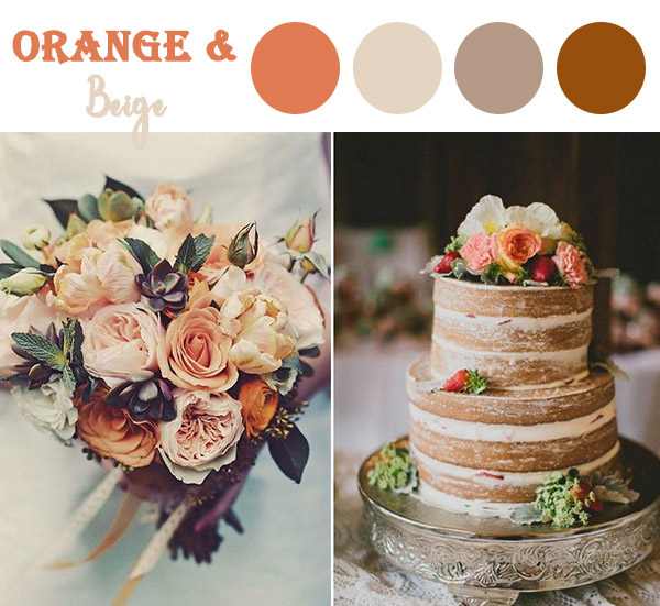
I found my first two color combos in an article called, “The 10 Perfect Fall Wedding Combos to Steal in 2018.” There are a few more in the article I want to try, but I decided to start with this one because it is a bit more traditional.
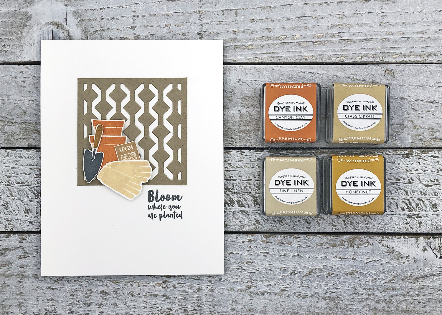
The inspiration color combo focuses on orange but with lighter shades of beige or browns to set it off, rather than lots of oranges together, and I liked that about it. Canyon Clay and Fine Linen play the lead roles of orange and beige with Classic Kraft and Honey Nut rounding out the colors as in the inspiration.
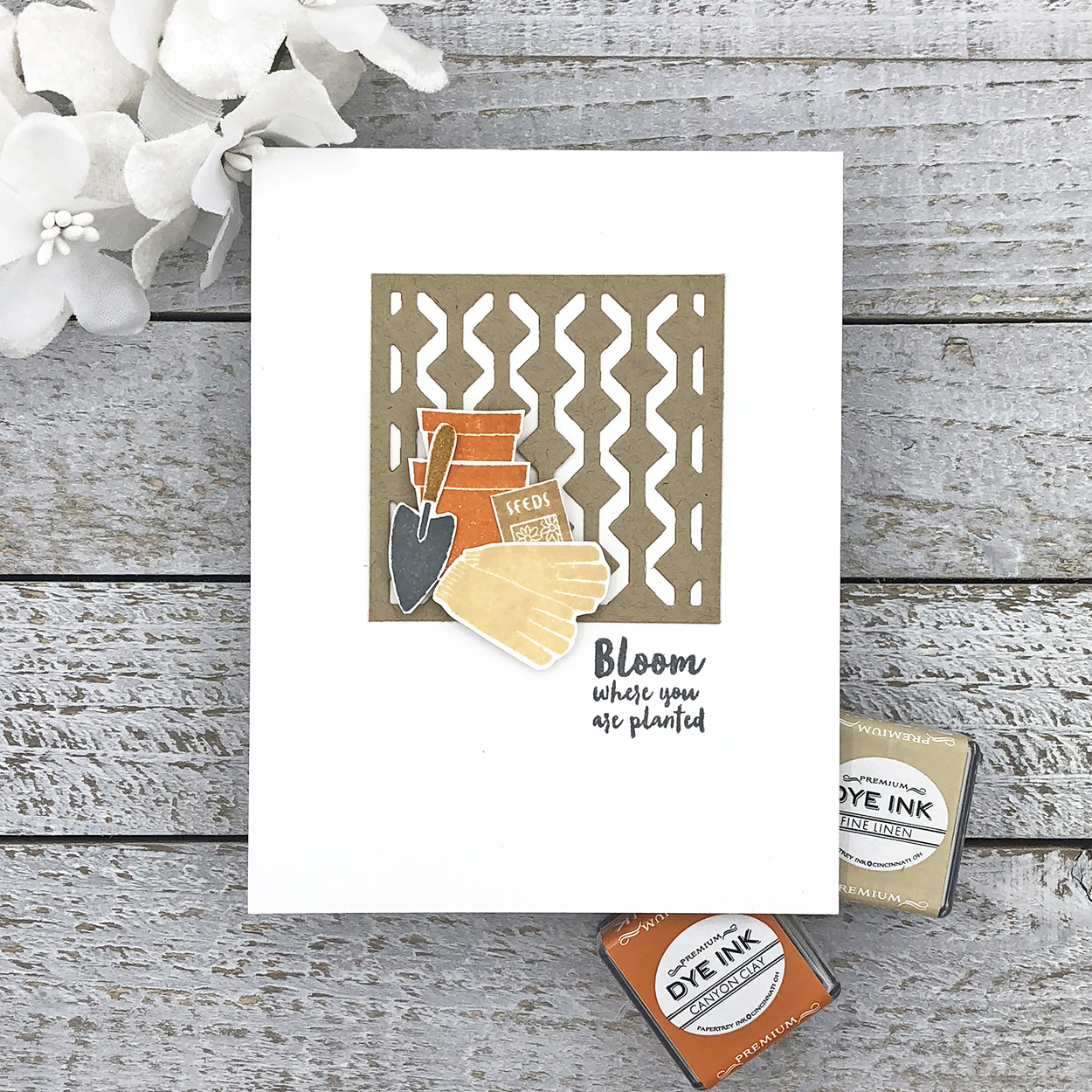
And for a slight modern edge, I added in Weathervane. Grays are good for that, especially a neutral gray. If you want to stick with warm colors without a touch of modern, brown would work nicely as well.
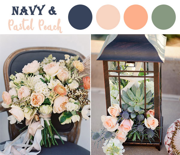
Next, I was drawn to a navy and pastel peach wedding combo. Again, a form of orange is present, which is a fall staple. But the look is lighter and brighter without being too spring-like.
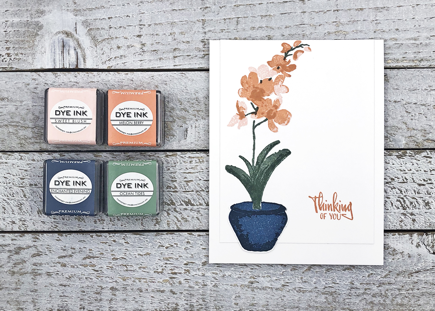
I translated the inspiration into Papertrey Ink with Enchanted Evening and Melon Berry as the focal colors, and Sweet Blush and Ocean Tides tying everything together. When you’re stamping florals, a green is usually helpful and I love how the soft, sort of grayish, green of Ocean Tides plays with navy and peach.
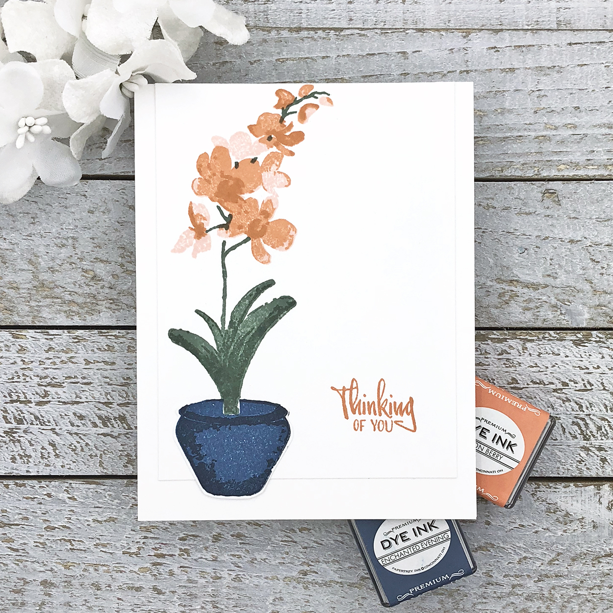
The overall look is still fall inspired, but I really like the pastel touch. Plus a blue and orange combo is straight from the color wheel basics – opposites attract!
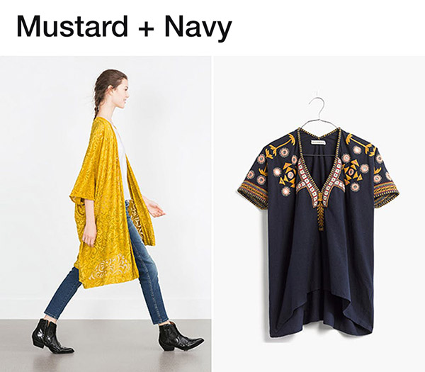
For my last color scheme, I found an article called “11 Unexpected Fall Color Combos You Need to Try Now.” Unexpected was just what I was looking for and I think mustard and navy fit the bill. Yes, the color combo is somewhat in line with my love of yellow. Although my favorite shades of yellow lean more toward sunshine and buttercup, and not mustard so much.
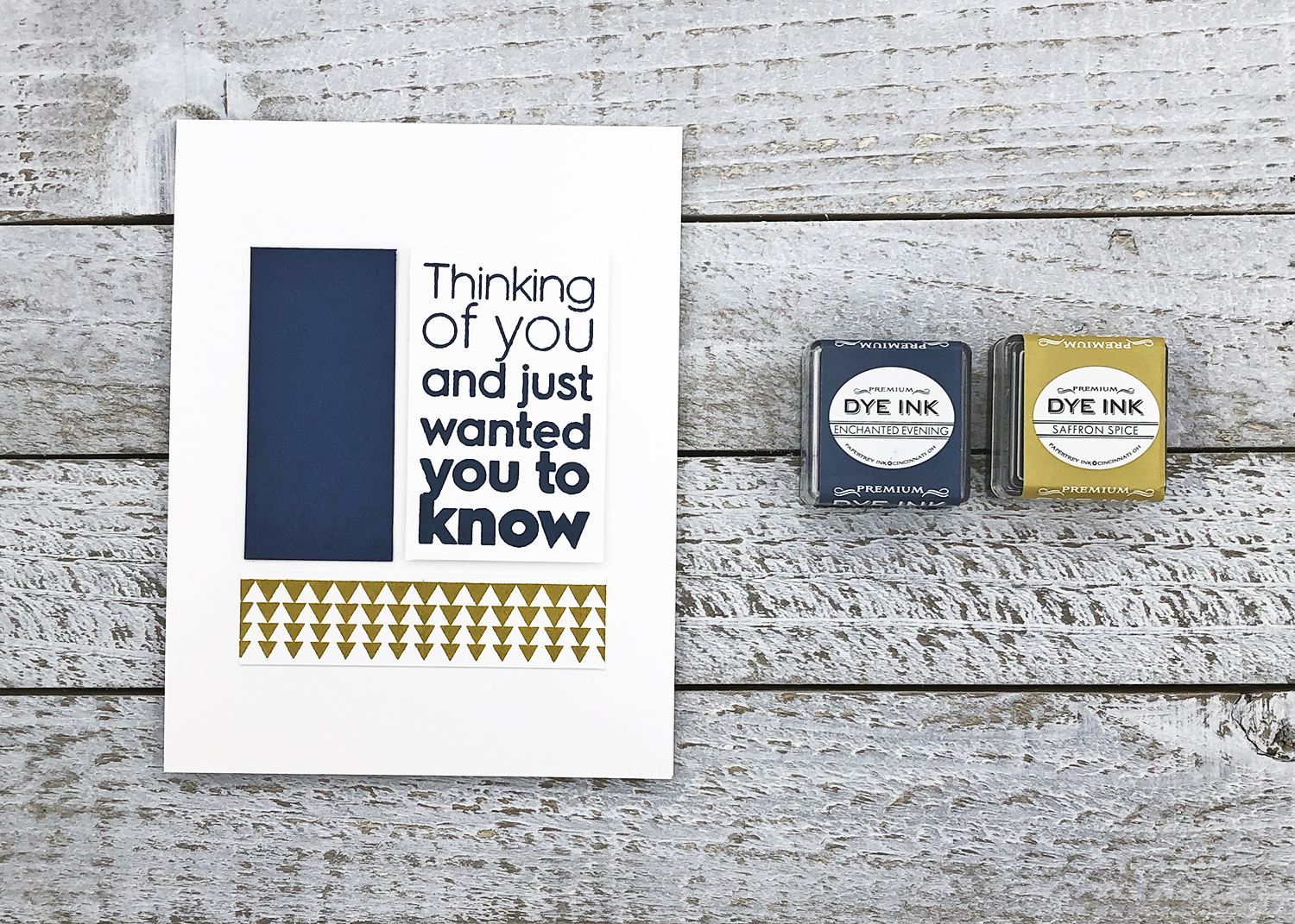
This look seemed very modern to me, so I decided to create a modern color-blocked card. The closest I could come to mustard in the Papertrey Ink offerings was Saffron Spice, but I wanted it to be a little brighter, so I added an extra layer of Bright Buttercup to kind of pull out the yellow. Once again Enchanted Evening was the perfect navy.
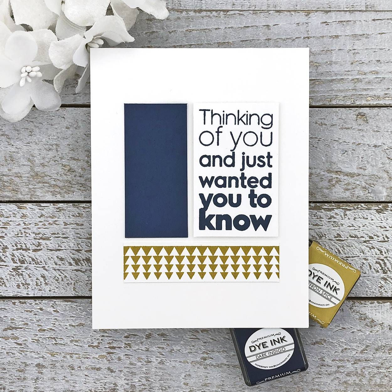
This darker version of blue and yellow is a nice fall counterpart to one of my favorite color combos. I still like the brighter spring/summer version better, but I can see how this works too. I think it would make a pretty floral card with bold flowers – where is Gran’s Garden when I need it?!
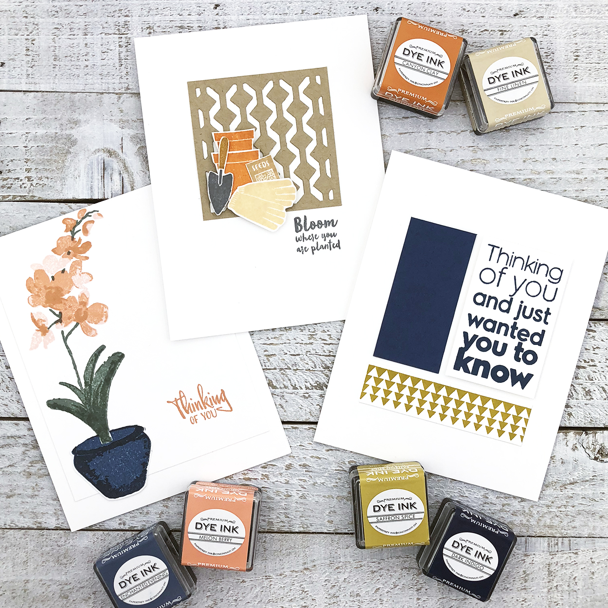
So there you have it – my attempts at finding a few seasonal looks I could fall for. Rainbows are still my favorite year-round, but I can see myself using each of these combos again. If you have any unexpected or trendy fall faves, I’d love to try them too, so please share in the comments! It’s good to get out of my typical roygbiv box once in a while…
Have a colorful day!
? lexi
Supplies:
Bloom Where You’re Planted card
STAMPS: Community Garden, Flower Power
INK: Canyon Clay, Fine Linen, Classic Kraft, Honey Nut, Weathervane
PAPER: Stamper’s Select White, Classic Kraft
DIES: Shape Shifters: Square 1
OTHER: foam tape, 2-Way glue pen
Thinking of You orchid card
STAMPS: Orchid Expressions
INK: Melon Berry, Sweet Blush, Enchanted Evening, Dark Indigo, Ocean Tides
PAPER: Stamper’s Select White
OTHER: MISTI
Thinking of You modern card
STAMPS: Ombre Sentiments: Thinking of You, Ombre Builders
INK: Enchanted Evening, Saffron Spice
PAPER: Stamper’s Select White, Enchanted Evening
OTHER: foam tape, ruler
Leave a Reply