The holiday season is right around the corner and the team at Ink to Paper is excited to create and share projects. Fall is the season of gratitude, which leads right into the Christmas season of giving. We wanted to dedicate the month of November to a marathon of creative inspiration using our holiday themed stamps and dies. Crafting during the holiday season is very popular, and our collection of stamps and dies will surely inspire you to create along with us throughout the month.
Get ready to learn some fun facts about the company, designers, and of course amazing new ways to create cards, gift tags, and more!
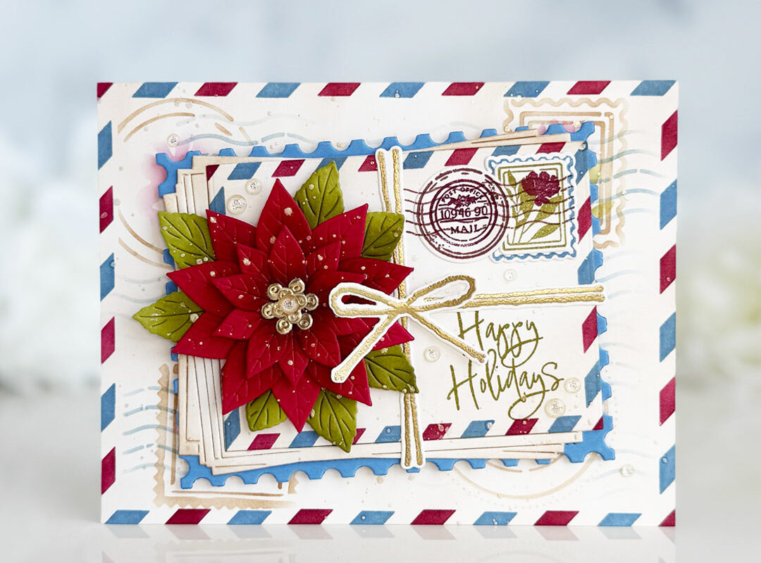
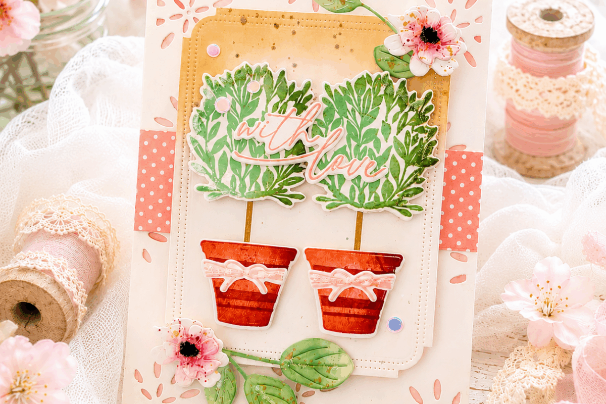
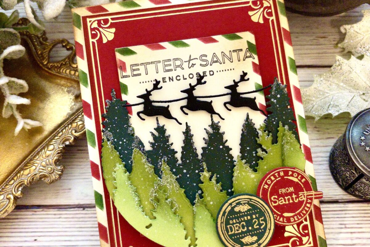
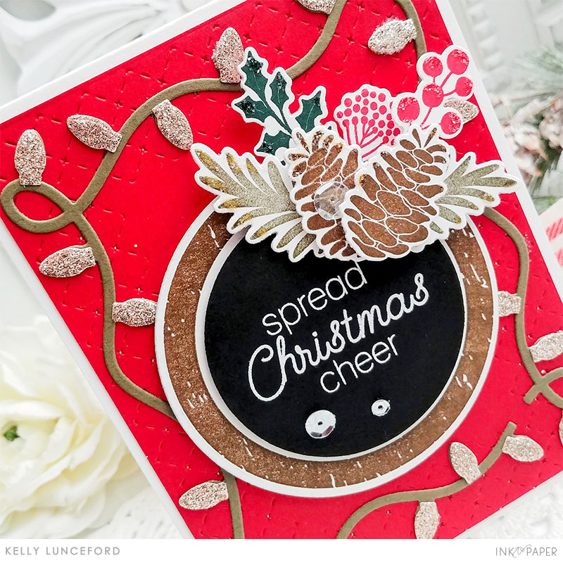
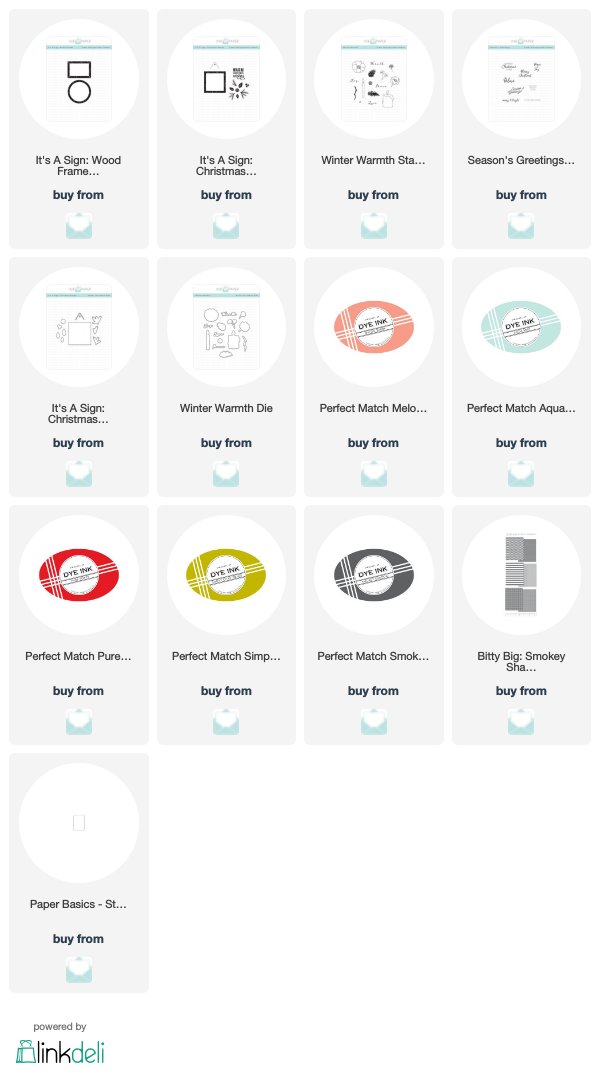
Let’s take a closer look at this simple, versatile product collection we are featuring for today’s CreateAthon! Kelly Lunceford and Melissa Bickford have created beautiful Christmas cards with this adorable set.
It’s A Sign: Wood Frames Stamps + Dies
![]() |
![]() |
“I love decorating for Christmas and inviting guests to my home to share in the joys of the season. The new Border Bling: String Lights paired with this festive sentiment from the new Season’s Greetings set invoke those same cheery feelings!”
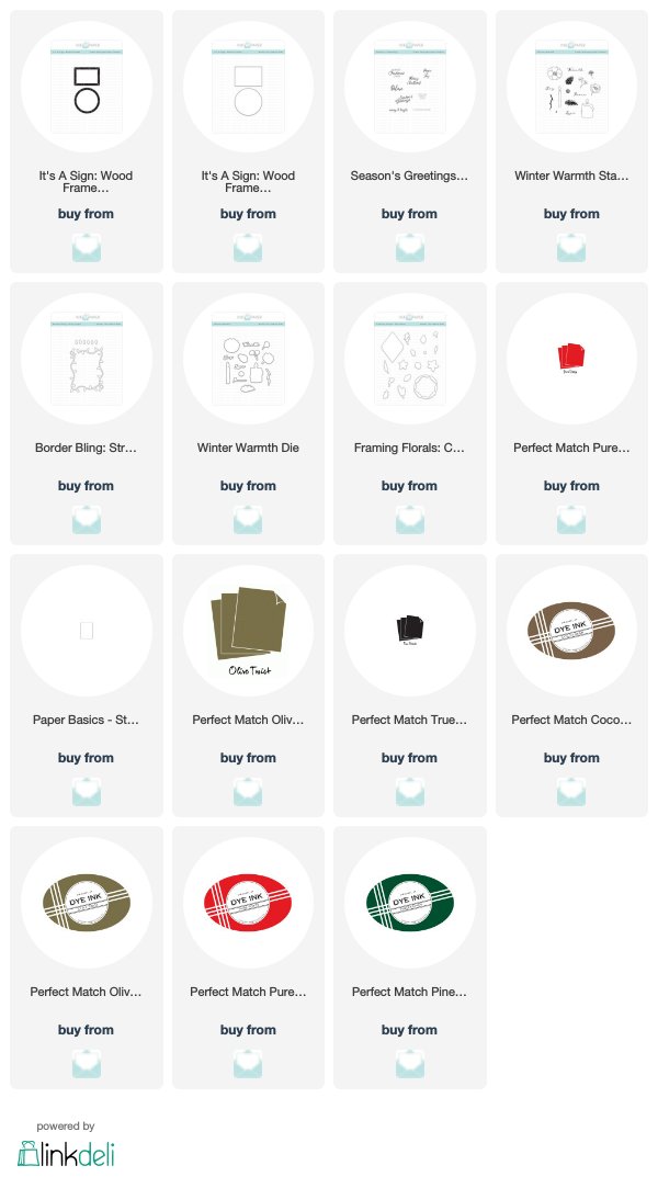
“The woodgrain sign images from It’s A Sign: Wood Frames make the perfect backdrop for any project. You could stamp your images and sentiment directly inside the frame or choose to embellish around it with beautiful flowers, like I did for today! And creating with a crisp white background, and just a few pops of color, truly makes that frame stand out!“
PRIZE
During Holiday CreateAthon, we are offering a weekly $100 Ink to Paper Gift Certificate!
RULES
Participants may enter the challenge once a day. To enter, participants are required to answer the contest challenge question (posted below) in the comments of the daily post. HINT: Answers to questions may be discovered by reading a designer’s blog post from the respective day. A randomly selected winner with the correct answer will gain an entry to be eligible for the weekly prize. Participants can receive an entry each day a Holiday CreateAthon post is published.
This post will be updated with the randomly selected winner who gains an entry for this week’s prize.
Weekly winners will be posted on the Holiday CreateAthon page.
CHALLENGE
Answer the following question: On Melissa’s card, what makes the frame stand out?
EDITED TO ADD THE RANDOMLY SELECTED WINNER
Congratulations, Colleen B! You will be entered to win the weekly prize!
A crisp white background. Cheers.
Creating with a crisp white background, and just a few pops of color.
A crisp white background and a few pops of color make the frame stand out!
The white background with a few pops of color makes the frame stand out..
The crisp white background and a few pops of color make the frame stand out. Beautiful card, Melissa!
By creating on a crisp white background, and adding a few pops of color, the frame stands out.
A crisp white background and a few pops of color make the frame stand out.
Creating with a crisp white background and Just a few pops of color
A crisp white background and a few pops of color makes the frame stand out. The colors look beautiful.
a white background with pops of color!
Melissa’s white background with just a few pops of color, really helps the frame to Pop!
Melissa said ‘creating with a crisp white background, and just a few pops of color, truly makes that frame stand out’.
Melissa created a card using a crisp white background with a few pops of color, that makes the frame stand out.
Creating on a crisp, white background with a few pops of color makes the frame stand out.
the white background
Melissa uses a crisp white background and a few pops to make her frames stand out.
Making it the focus by having it in the center and just adding a few florals, and also using aqua mist a non-traditional colour and then using the stamps that fit perfectly inside. I absolutely love this card! So pretty having a simple design, really makes the elements stand out.
A crisp white background and a few pops of color make the frame on Melissa’s card stand out.
Great cards today!
Creating with a crisp white background, and just a few pops of color, truly makes that frame stand out
Thanks for the giveaway!
A crisp white background and pops of color make the frame stand out! Nicely done Melissa!
Melissa suggests that creating with a crisp white background, and adding just a few pops of color, makes the frame stand out.
Melissa’s frame stands out because she created her card with a crisp white background, and just a few pops of color!
The Aqua Mist ink she used for the frame really stands out and looks awesome!
A crisp white background with a few pops of color really makes the frame stand out.
The woodgrain sign image against a white background with a few pops of color.
“A crisp white background, and just a few pops of color” makes the frame stand out. What a gorgeous card!!
A crisp white background and a few pops of color make that frame stand out.
The crisp white background and a few pops of color.
Stamping the frame in color on a white card base and adding just a few pops of color makes the frame stand out.
The it’s a sign series sentiments.
She created a card with a crisp white background and just a few pops of color to truly make the frame stand out.
A white background and a few pops of color make the frame stand out according to Melissa.
a crisp, white background and just a few pops of color
To make the frame stand out, Melissa uses a crisp white background and just a few pops of color.
The string of lights is such a festive border. On Melissa’s card, the white background and minimal colours make the frame stand out.
The crisp white backgrounds and just a few pops of color
She made the frame stand out by using a crisp white background, and just a few pops of color.
A white background with a few pops of color allow the frame to stand out-thanks for the inspirations!
Melissa uses a crisp, white background to make her frame “pop!”
A crisp white background, and just a few pops of colour, are what makes the frame on Melissa’s card stand out.
She used a greeting and flowers, after stamping the frame directly onto the cardstock.
A crisp white background with just a few pops of colour makes the frame stand out.
Melissa uses a crisp white background and just a few pops of color to make the frames stand out.
Having a white background with just a few pops of color makes the frame stand out. And that’s a look I love!
The crisp white background & pops of color make the frame stand out. Thanks for the chance at the giveaway!
Using a crisp white background and just a few pops of color.
Creating with a crisp white background and just a few pops of color.
She uses a crisp white background and just a few pops of color in order for the frames to stand out.
Melissa uses a crisp white background and just a few pops of color to make her frames stand out. They really do look great.
Creating with a crisp white background, and just a few pops of color, make the frame stand out!
Melissa says that creating with a crisp white background with a few pops of color, makes that frame stand out.
Crisp white background, and just a few pops of color!
A crisp white background and a few pops of color.
A crisp white background and a few pops of color make the frame stand out–isn’t she talented?!
Melissa uses a crisp white background and a few pops on her frames to make them stand out.
Melissa uses a crisp white background and just a few pops of color to make her frames stand out.
A crisp white background with a few pops of color make her frame stand out.
The white background!
A crisp white background and a few pops of color make that frame stand out.
Melissa said that creating with a crisp white background with a few pops of color makes that frame stand out.
A white background with a few pops of color make the frame stand out. Love both of these cards today!
Crisp white background with pops of color.
Creating with a crisp white background and adding the pops of color truly do make that frame stand out! Love that card as I do all of yours, Melissa!