
Good morning! Welcome to this month’s color installment! Every year Pantone selects a “color of the year” that they believe sets the tone for the year and will pop up in various creative media. This week, they announced the color of the year for 2019, a shade of coral named “Living Coral.”

“Vibrant, yet mellow PANTONE 16-1546 Living Coral embraces us with warmth and nourishment to provide comfort and buoyancy in our continually shifting environment… Representing the fusion of modern life, PANTONE Living Coral is a nurturing color that appears in our natural surroundings and at the same time, displays a lively presence within social media.”
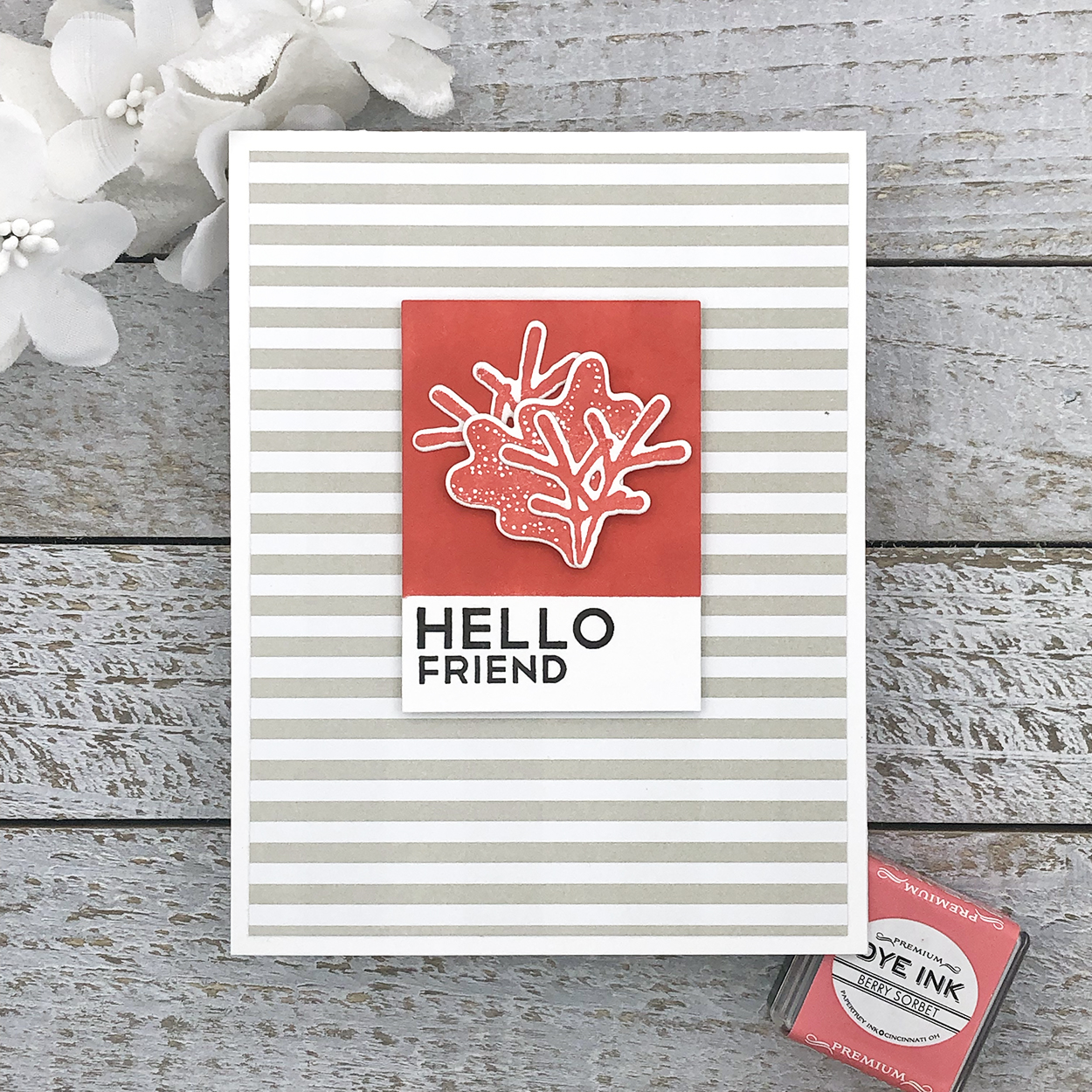
So, in honor of that announcement, I decided to take our very own coral, Berry Sorbet, for a spin. First up, a Pantone chip inspired card, of course!
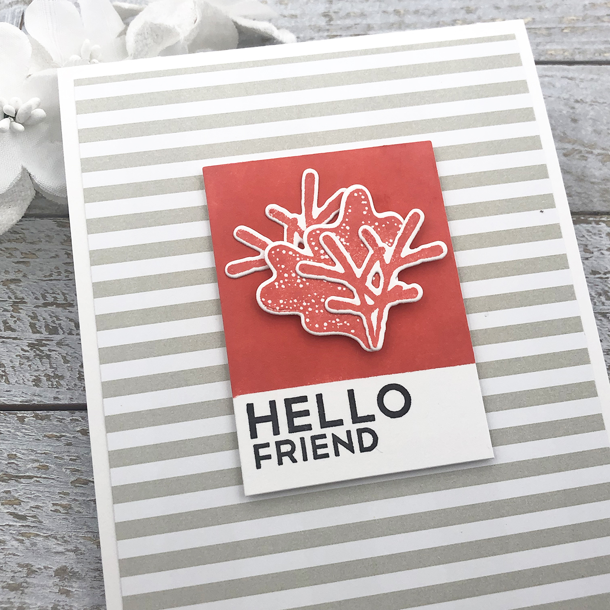
A little ink blending to create the color chip as I’ve done in the past with a few pieces of stamped and die cut coral to match, set off on the neutral backdrop of Soft Stone bitty big stripes. I just love the crisp look of Pantone’s color chips and how the look translates into a card – this will always be a favorite layout element for me.
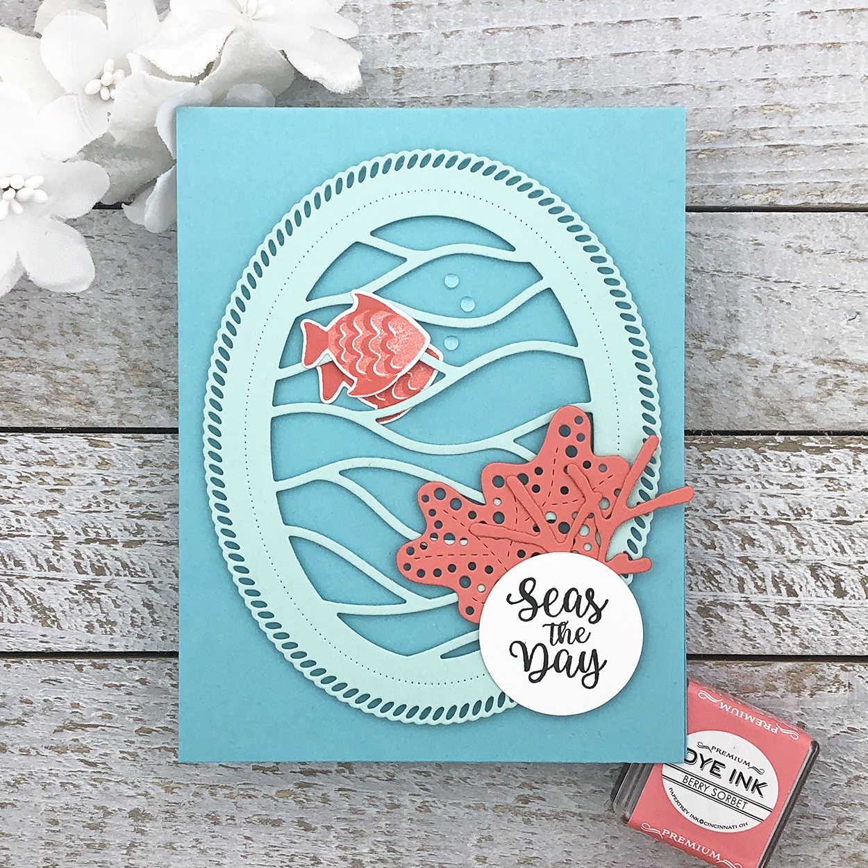
Next, I created a card inspired by the Living Coral banner. Shades of aqua offer a nice complementary color contrast to coral – in this case, Aqua Mist and Hawaiian Shores.
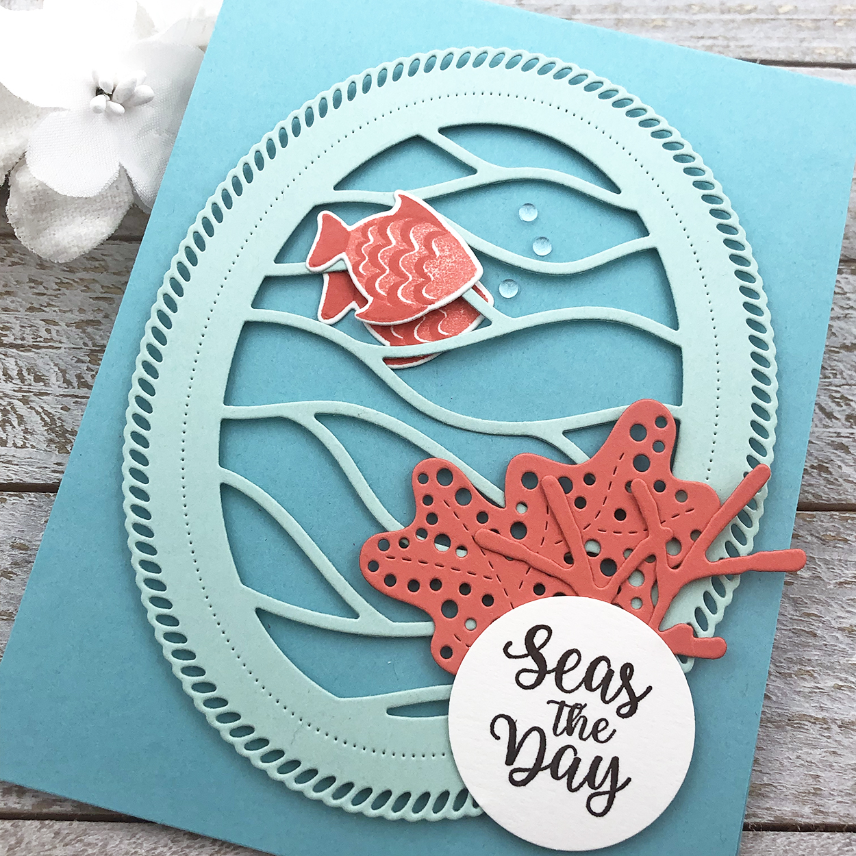
Add a few die cut coral pieces and coral fish to the watery Shape Shifter in these two blues and it’s the perfect re-creation of Pantone’s banner photo. Way to Seas the Day!
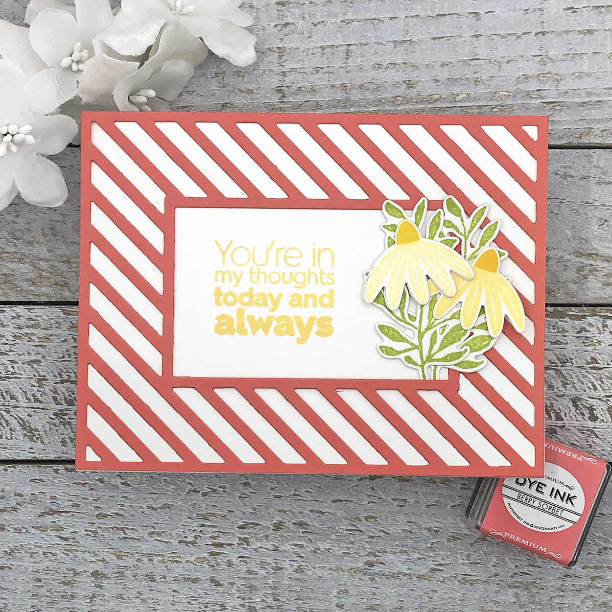
And last, I decided to focus on Berry Sorbet cardstock in the form of a bold border and frame out a sentiment and some flowers. Coral isn’t just for sea life!
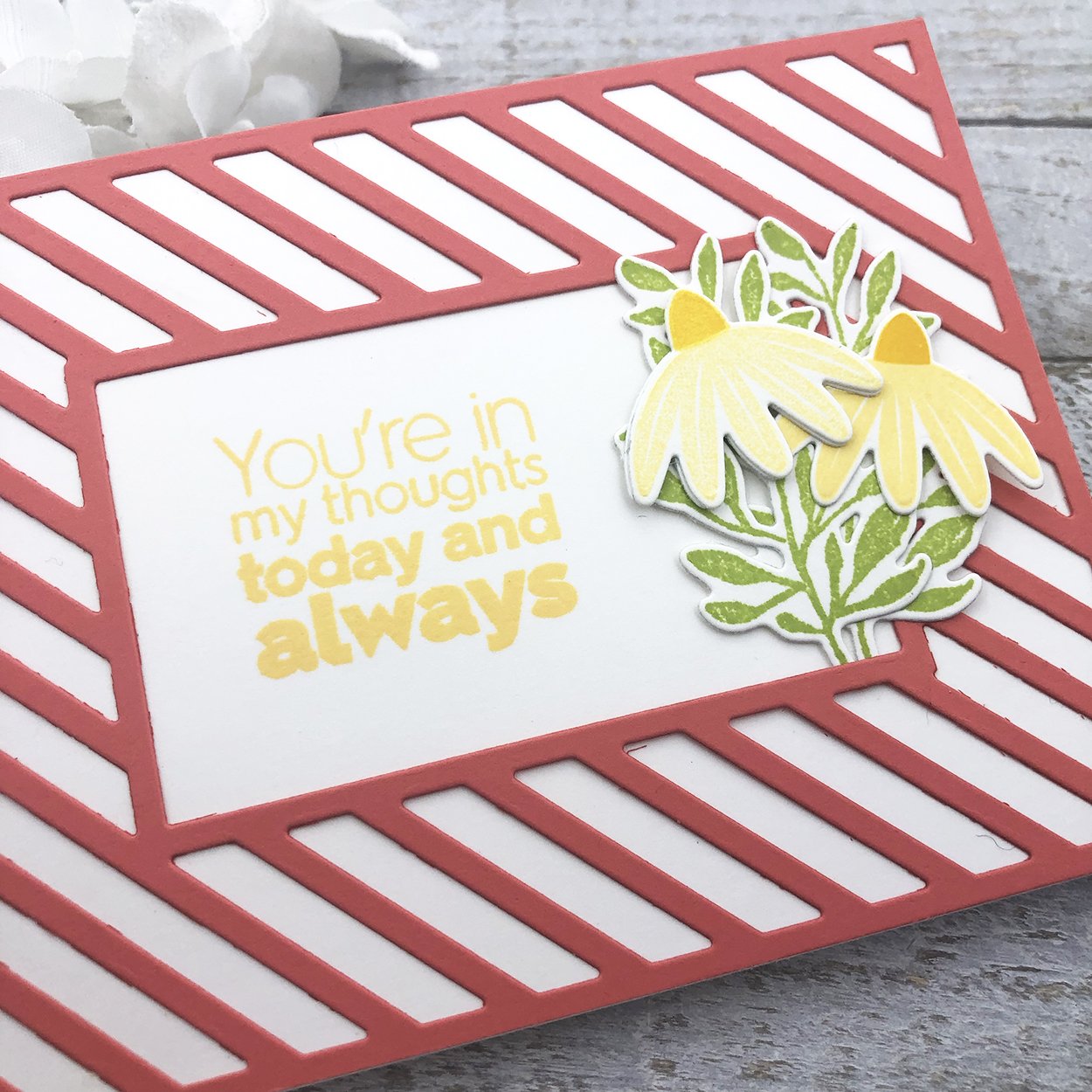
Although not perfectly next to each other on the color wheel, yellow and green are somewhat analogous colors to coral and thus play nicely together. I love the light and bright result here using Harvest Gold and Green Parakeet.
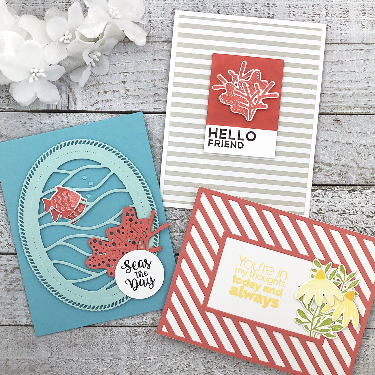 And there you have it – my own little Papertrey take on the Pantone Color of the Year for 2019. What do you think of their prediction? Do you see more Berry Sorbet popping up in your own projects moving into the new year? Inquiring minds want to know…
Have a colorful day!
? lexi
Supplies:
Hello Friend Card
STAMPS: Salt Air: Flora, Bold Basics
INK: Berry Sorbet, True Black
PAPER: Stamper’s Select White, Bitty Big Soft Stone
DIES: Salt Air: Flora
OTHER: MISTI, painter’s tape, ink blender, foam tape
Seas the Day Card
STAMPS: Salt Air: Fauna, Salt Air: Sentiments
INK: Berry Sorbet, True Black
PAPER: Stamper’s Select White, Berry Sorbet, Aqua Mist, Hawaiian Shores
DIES: Salt Air: Fauna, Reef Builder, Shape Shifters: Oval 2
OTHER: MISTI, foam tape, dew drops, circle punch
You’re In My Thoughts… Card
STAMPS: Flower Power, Botanical Bounty II, Ombre Sentiments: Thinking of You
INK: Harvest Gold, Lemon Tart, Green Parakeet
PAPER: Stamper’s Select White, Berry Sorbet
DIES:Flower Power, Botanical Bounty II
OTHER: MISTI, spray adhesive
Leave a Reply