
Good morning! Welcome to this month’s color installment. I’m taking the color wheel for another spin today, this time focusing on analogous color schemes. By simple definition, analogous colors are those next to each other on the color wheel. Because analogous colors sort of blend into each other, they tend to match well, resulting in designs that are serene, harmonious, and pleasing to the eye.
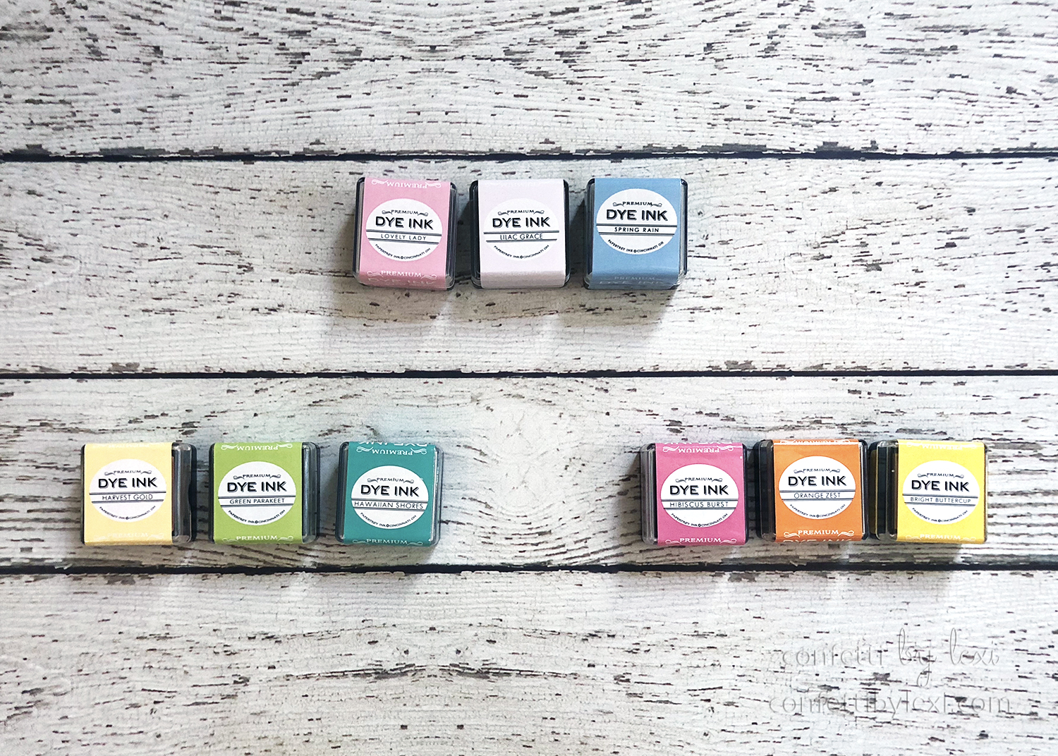
I decided to share three projects with three adjacent colors each: pink + purple + blue, yellow + green + blue, and pink + orange + yellow. Each of my groupings includes two colors that blend together to create a version of the third. You could also focus on two side-by-side colors and expand your color scheme with lighter or darker shades of one of them, as you would typically see on a larger, more expanded color wheel.
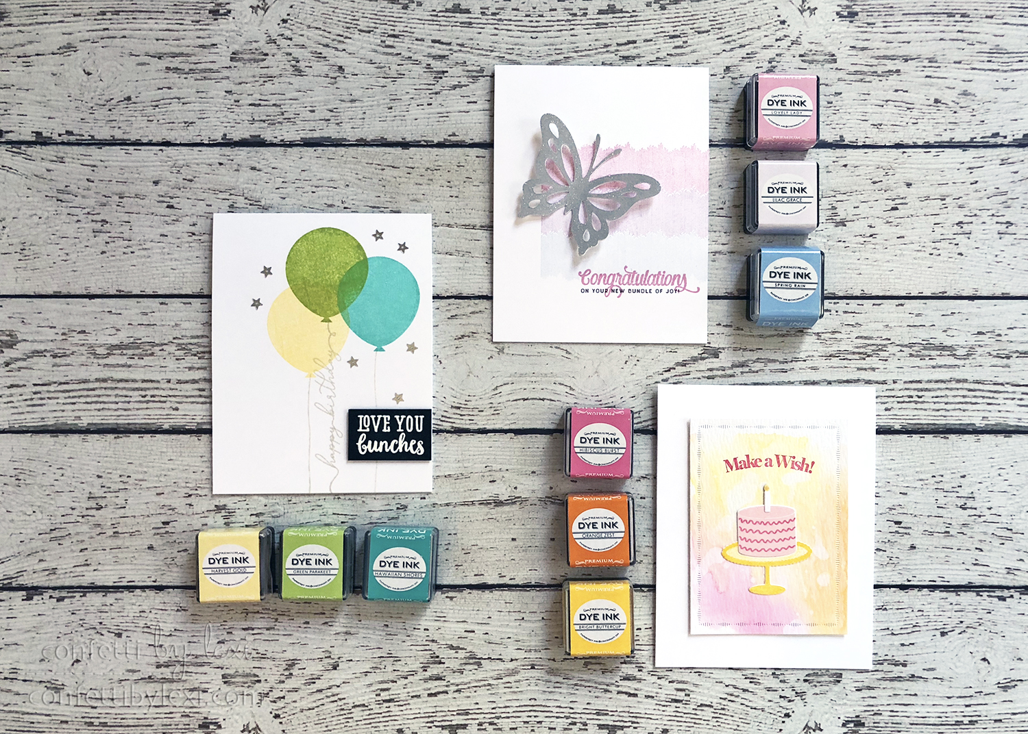
When choosing your analogous color scheme, you’ll want to be sure to pick colors that have enough contrast. And while some colors can play off of each other evenly in a design, others may be better in a design with one starring color, a second supporting and possibly a third, as an accent along with the neutral.
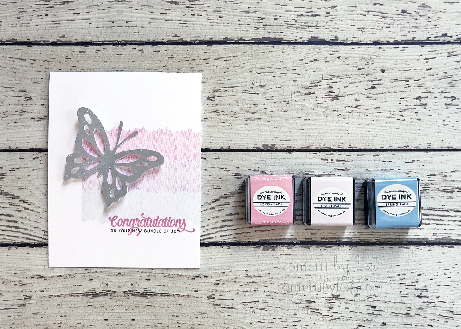
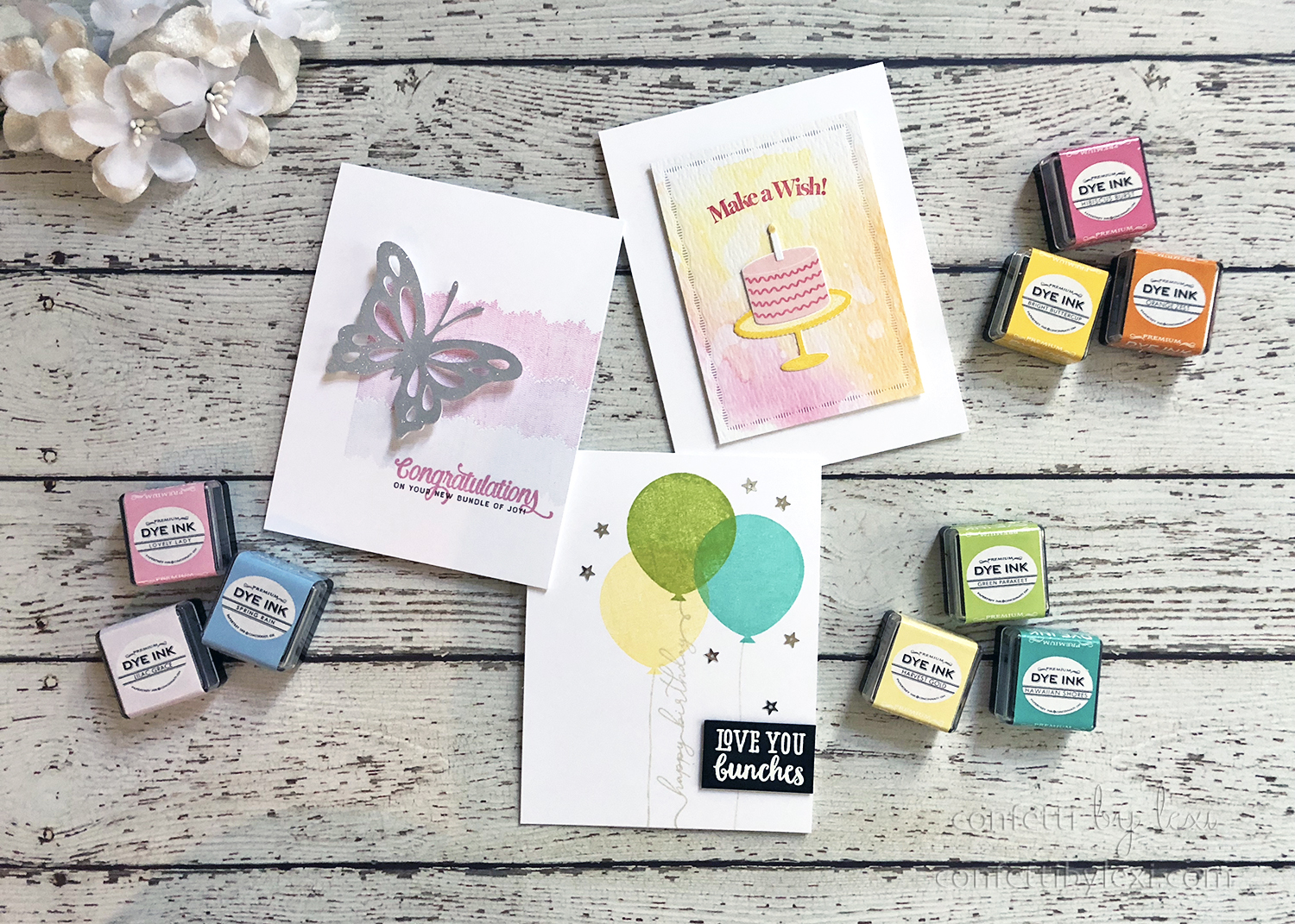
First up, pink + purple + blue with Lovely Lady, Lilac Grace, and Spring Rain. Analogous colors lend themselves well to ombre designs, in this case, my pink is “blending” with the blue to create purple in the middle. You could also create a more monochromatic ombre by focusing on only two colors as I mentioned above.
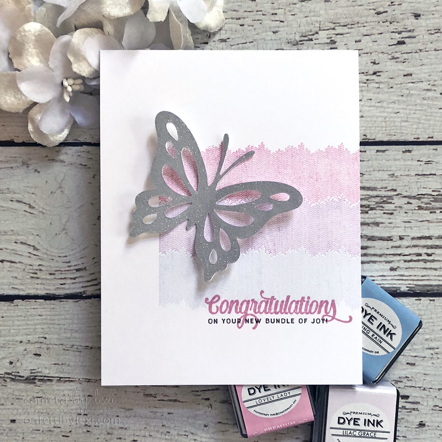
Ombre Builders in these pretty pastels set the perfect stage for my sparkly butterfly and baby sentiment. To create the butterfly, I cut it out from label paper and adhered it to a cardstock die cut for durability. Then I peeled off the backing (which was on the front) and covered it in glitter. I thought I had cut a scrap of Papertrey Ink label paper, but it turned out to be a scrap of Avery TrueBlock which is grey inside – a happy accident, with a sparkly silver result!
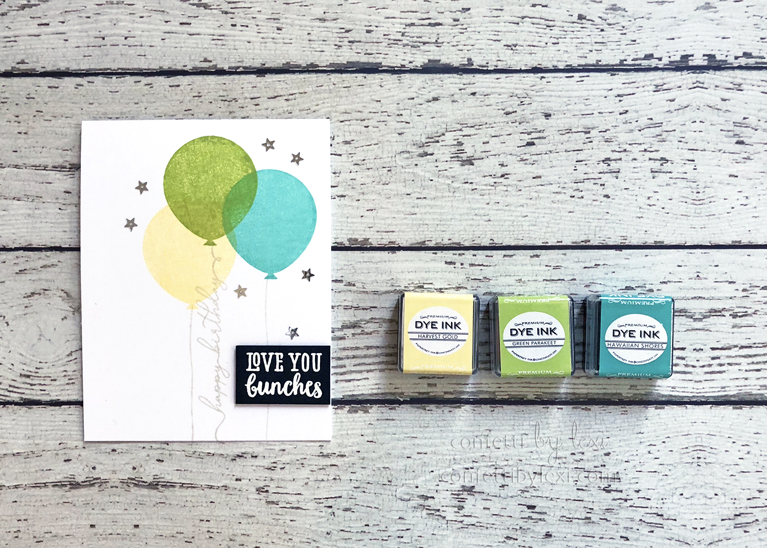
Next up, yellow + green + blue with Harvest Gold, Green Parakeet, and Hawaiian Shores. With analogous colors that blend into each other, a stamping side effect is that they can be easily layered without becoming muddy. They simply mix to create a new coordinating shade. In addition to standard two-step stamping, I love this effect with balloons because of their real-life transparency.
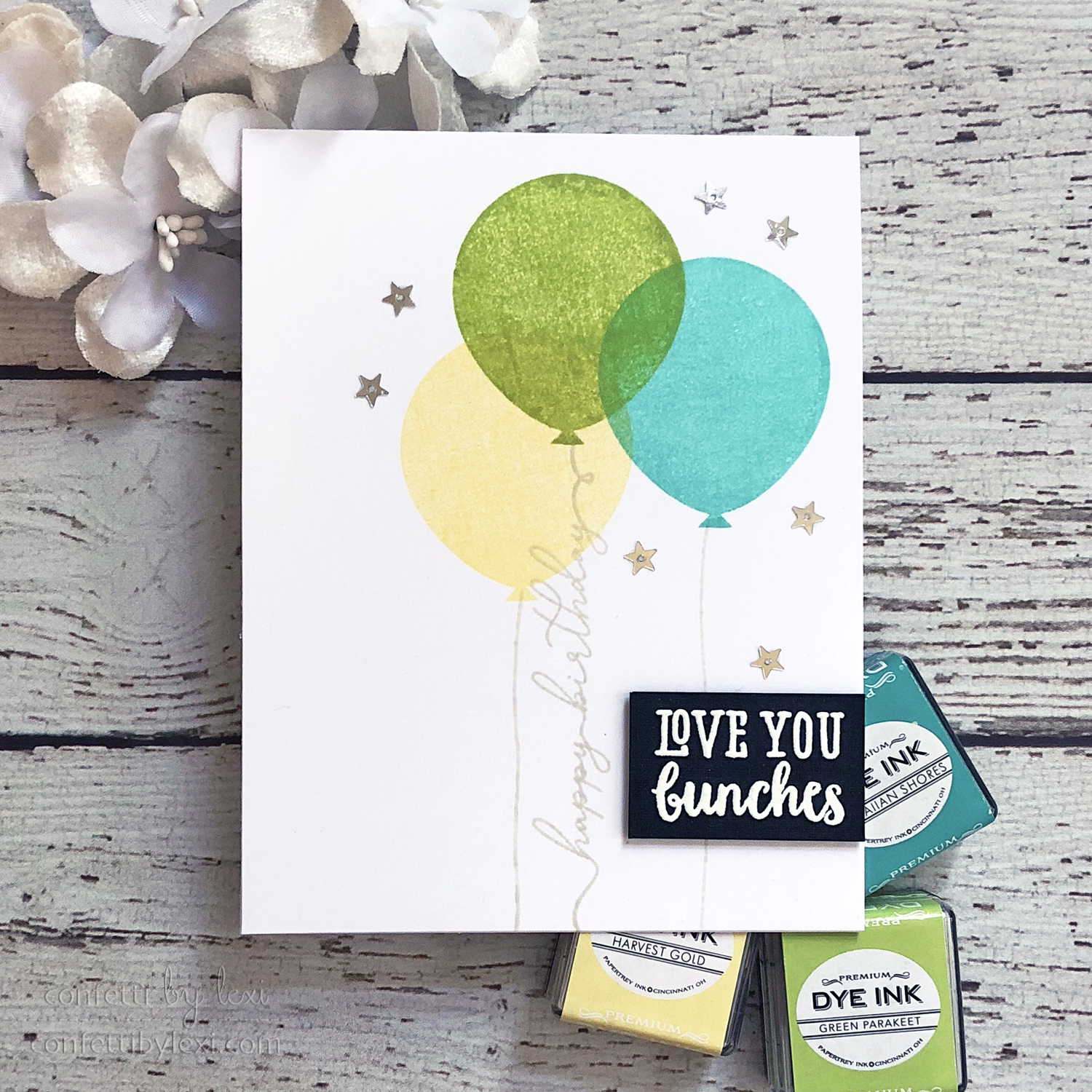
Especially the big balloon from Invitation Basics – more space to overlap! To dress up the balloons and add to the sentiment, I replaced one of the strings with the “happy birthday” string from Birthday Strings and completed it with “love you bunches” from Huggables: Monkey white embossed on black cardstock. This was popped up on foam tape, with a scattering of mini star sequins to finish it all off.
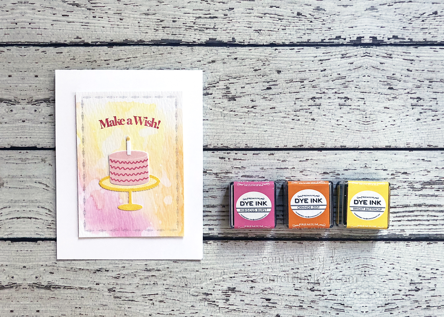
And last, for pink + orange + yellow, we have Hibiscus Burst, Orange Zest, and Bright Buttercup. For the same no-muddy-mess reason mentioned above, analogous colors are perfect for ink smooshing and blending, too. No clashing, only intermediate shades of color – mixing encouraged!
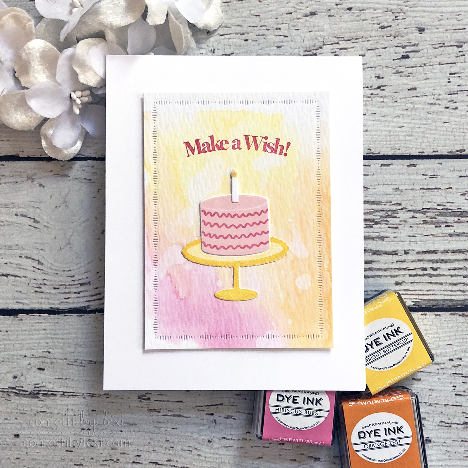
After smooshing, dripping, and drying, I added a birthday streamer frame from Mix & Mat: Confetti and trimmed around it for my focal layer. I stamped my die cut cake in the same colors and stamped “Make a Wish!” above it right on the smooshed background. To finish it off, I added a bit of Wink of Stella glitter pen to the cake decorations and candle for a little extra shine. Quick and easy, but the color coordination adds just the right punch!
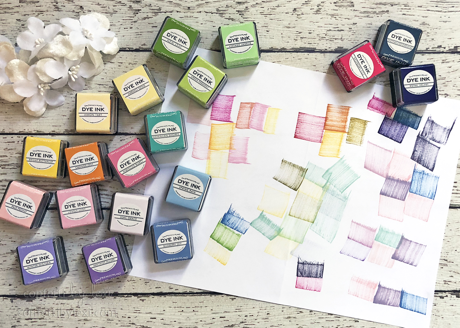
When I’m working through color schemes like this, I swipe my ink pad on my desk pad or a scrap of paper to test them out. It helps me to see the colors together before jumping in. This, in particular, was my test paper for variations to share. While I didn’t create with all of them for this post, I came up with several options to have in my back pocket…
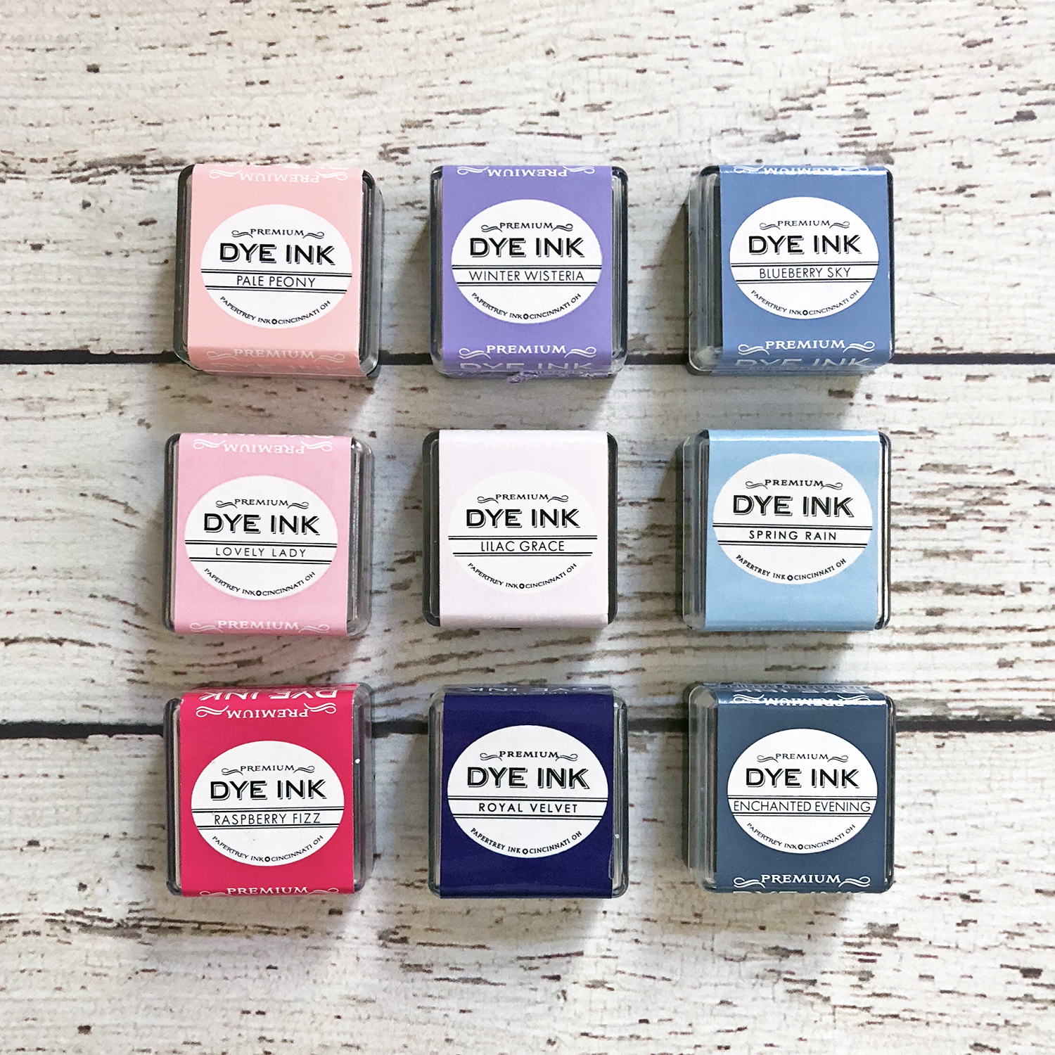
Pink + purple + blue. I immediately thought of a baby theme for my pastel card, but variations on these colors would also work well for a blended evening sky.
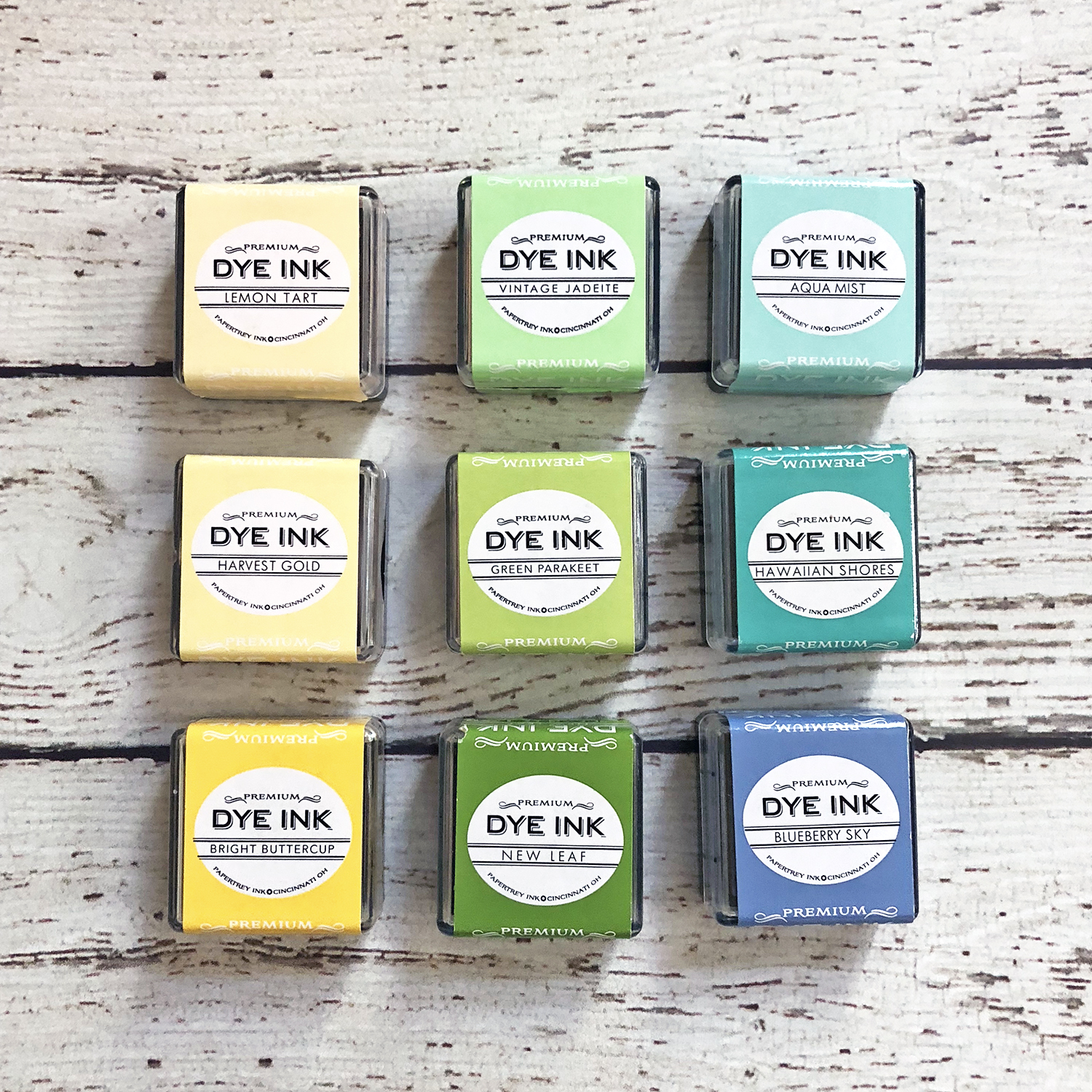
Yellow + green + blue. We have so many options for mixing and matching in this grouping. Many of these would be perfect for boy cards!
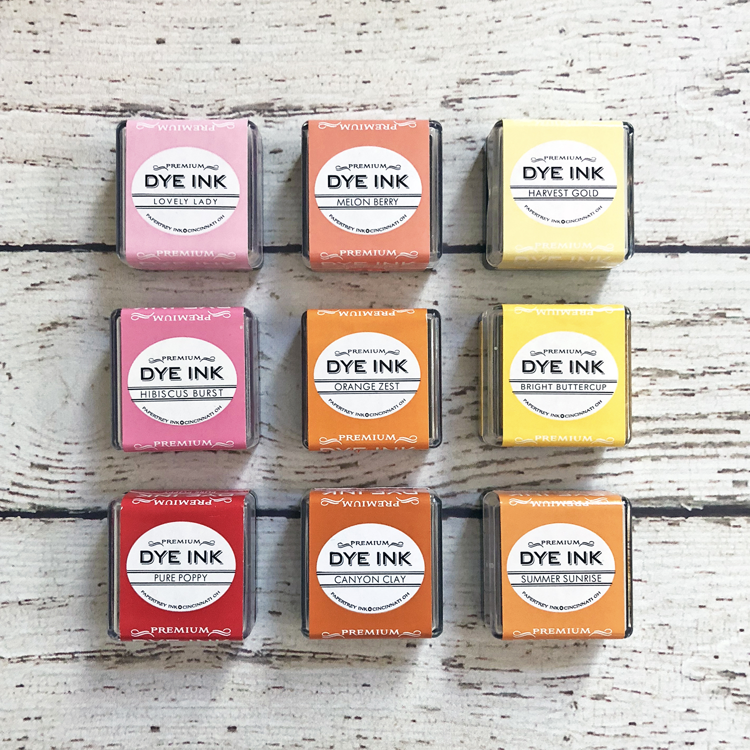
pink/red + orange + yellow. My original card screams girl to me – it’s such fun color scheme! Darker shades may make it harder to stamp detail layers, but they’d still mix well for great background effects. The bottom row, in particular, would also be great with brown neutrals for fall-inspired cards.
I hope you’ve enjoyed this look at stamping with analogous colors and I hope you enjoy designing with them even more! Do you have a favorite mix?
Happy stamping!
? lexi
Supplies:
Congratulations Baby Card
STAMPS: Ombre Builders, Simple Impressions: Celebrations
INK: Lovely Lady, Lilac Grace, Spring Rain, Smokey Shadow
PAPER: Stamper’s Select White, White Label Scrap
DIES: Life is Beautiful
Love You Bunches Birthday Card
STAMPS: Invitation Basics: Birthday, Birthday Strings, Huggables: Monkey
INK: Harvest Gold, Green Parakeet, Hawaiian Shores, Soft Stone, Versamark
PAPER: Stamper’s Select White, True Black
OTHER: white embossing powder, foam tape, mini star sequins
Make A Wish Cake Card
STAMPS: Fiesta Flag: Birthday
INK: Hibiscus Burst, Orange Zest, and Bright Buttercup
PAPER: Stamper’s Select White, Watercolor paper
DIES: Fiesta Flag: Birthday, Mix & Mat: Confetti
OTHER: Foam Tape, Clear Wink of Stell
Leave a Reply