![[img] color theory](https://blog.papertreyink.com/wp-content/uploads/2018/08/colorlove.jpg) Have you ever wondered why you gravitate towards certain colors? Maybe it’s blues or pinks or even white. Color is very much an art and science and there is a whole theory behind what each color means.
Have you ever wondered why you gravitate towards certain colors? Maybe it’s blues or pinks or even white. Color is very much an art and science and there is a whole theory behind what each color means.
Color Wheel Basics
We see colors in light waves – red, green, and blue. The light receptors in our eyes then transmit the message to our brain, which produces the sensations of color. As you probably recall from kindergarten, the color wheel, invented by Sir Isaac Newton in 1666, consists of three primary colors – red, yellow, and blue – and three secondary colors – green, orange, and purple, and six tertiary colors.
If you draw a line down the center of the wheel, you’ll separate the warm colors from the cool colors. Warm colors are often associated with brightness, action, and energy; whereas, cool colors translate to calm, peace, and serenity. Additionally, each color has its own meaning. Let’s take a look at what some of the most common colors mean.
Red
![[img] color theory](https://blog.papertreyink.com/wp-content/uploads/2018/08/neutrals_grays_papertreyink_lexidaly_1-1.jpg) The color red often has two polar opposite meanings. It’s commonly associated with love, passion, and Cupid. It’s why we use it so much for Valentine’s Day. On the other hand, color is also associated with fire, danger, and anger. In China, red means prosperity and happiness and is often used to attract good luck. In card designs, red makes a powerful accent color, especially in cards with a romance or love theme.
The color red often has two polar opposite meanings. It’s commonly associated with love, passion, and Cupid. It’s why we use it so much for Valentine’s Day. On the other hand, color is also associated with fire, danger, and anger. In China, red means prosperity and happiness and is often used to attract good luck. In card designs, red makes a powerful accent color, especially in cards with a romance or love theme.
Our favorite red Papertrey Color: Pure Poppy
Orange
![[img] color theory](https://blog.papertreyink.com/wp-content/uploads/2018/08/orangezest.jpg) Orange is a bright and energetic color. It’s often associated with autumn and the changing of the leaves, but it can also be associated with creativity and movement. Named for its fruit, orange is also associated with health and vitality. Orange is great to use for your fall-themed designs and as an accent color.
Orange is a bright and energetic color. It’s often associated with autumn and the changing of the leaves, but it can also be associated with creativity and movement. Named for its fruit, orange is also associated with health and vitality. Orange is great to use for your fall-themed designs and as an accent color.
Our favorite orange Papertrey Color: Orange Zest
Yellow
![[img] color theory](https://blog.papertreyink.com/wp-content/uploads/2018/08/LizzieJones_PapertreyInk_ThrowbackThursday_EnclosedCupcake_CelebrateYourSpecialDayCard2.jpg) Often associated with sunshine and happiness, yellow is one of the brightest colors on the color wheel. Thanks to the Livestrong Foundation, yellow is also associated with hope. Using bright yellows in your card designs will give the sense of happiness; whereas, softer more muted yellows are great for gender-neutral baby shower cards. Yellow is also fun to use for flower-themed cards.
Often associated with sunshine and happiness, yellow is one of the brightest colors on the color wheel. Thanks to the Livestrong Foundation, yellow is also associated with hope. Using bright yellows in your card designs will give the sense of happiness; whereas, softer more muted yellows are great for gender-neutral baby shower cards. Yellow is also fun to use for flower-themed cards.
Our favorite yellow Papertrey Ink color: Bright Buttercup
Green
![[img] color theory](https://blog.papertreyink.com/wp-content/uploads/2018/08/LizzieJones_PapertreyInk_DesignTeamTips_ThankfulCard3.jpg) Green is an earthy color that represents growth and renewal. As a cool color, it provides calming effects like blue but also has some elements of yellow’s energy. Green can also represent jealousy for some. You can use green in your card designs to display nature, growth and renewal, wealth, and stability.
Green is an earthy color that represents growth and renewal. As a cool color, it provides calming effects like blue but also has some elements of yellow’s energy. Green can also represent jealousy for some. You can use green in your card designs to display nature, growth and renewal, wealth, and stability.
Our favorite green Papertrey Ink color: Pinefeather
Blue
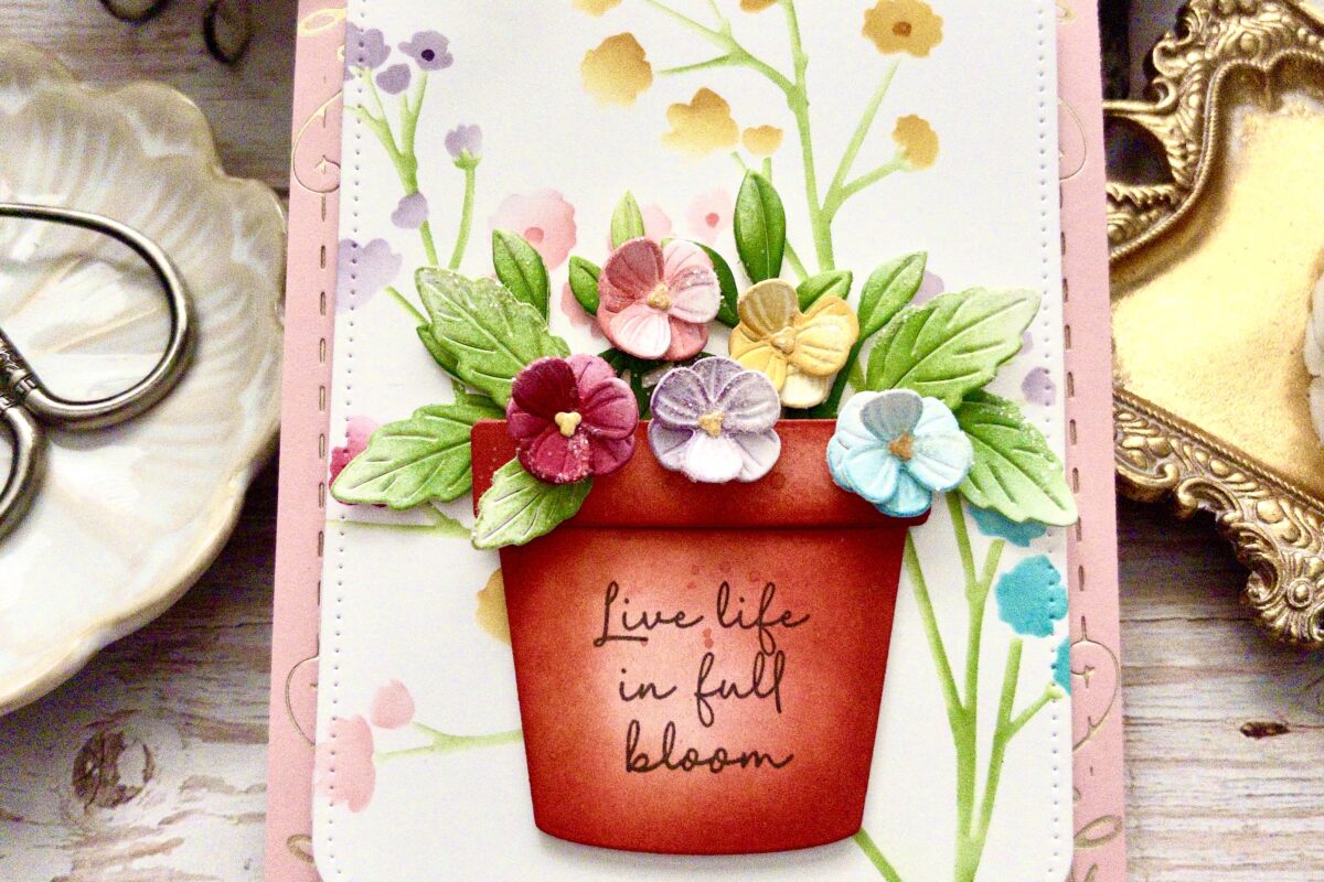
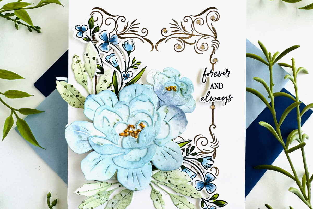
![[img] color theory](https://blog.papertreyink.com/wp-content/uploads/2018/08/enchantedevening.jpg) The color blue has many meanings but is often used to represent responsibility and strength. For many cultures, blue is associated with peace and spirituality. Light blues tend to be friendlier and refreshing; whereas, darker blues depict strength and reliability. Blue can also mean sadness. As a primary color, blue can be used in many different ways in your card designs. Light blues work best for condolence and get well cards. Bright blues are always fun in birthday or celebration cards. Blue is one of the most versatile colors in the color wheel.
The color blue has many meanings but is often used to represent responsibility and strength. For many cultures, blue is associated with peace and spirituality. Light blues tend to be friendlier and refreshing; whereas, darker blues depict strength and reliability. Blue can also mean sadness. As a primary color, blue can be used in many different ways in your card designs. Light blues work best for condolence and get well cards. Bright blues are always fun in birthday or celebration cards. Blue is one of the most versatile colors in the color wheel.
Our favorite blue Papertrey Ink color: Enchanted Evening
Purple
![[img] color theory](https://blog.papertreyink.com/wp-content/uploads/2018/08/yana-smakula-2018-PTI-Floral-Birthday-Card-8.jpg) Purple is a rich color and has historically been associated with royalty and wealth. Lighter shades of purple, like lavender, are often associated with romance and spring. Purple is one of our favorite colors to use with our spring and flower-themes cards.
Purple is a rich color and has historically been associated with royalty and wealth. Lighter shades of purple, like lavender, are often associated with romance and spring. Purple is one of our favorite colors to use with our spring and flower-themes cards.
Our favorite purple Papertrey Ink color: Amethyst Allure
We have over 55 colors available at Papertrey Ink. Tell us what your favorite color is in the comments below.
Leave a Reply