Join Erin Lincoln as she takes you back to the 1960's!
You can see Erin's complete 1960's Pinterest board HERE!
It would be easy to define the 60's as the time of hippies, bell bottoms, and free love. Those are certainly the cliched icons that come to mind when the decade first pops into our collective consciousness. And while all those hippies flashed the peace sign and participated in all kinds of psychedelic activity, something else was afoot and defining the era to move us forward into the 21st century.
The time was right. Big wars were over (well…for awhile anyway, in retrospect), the men were home, family units were prospering, and people had reasons to be carefree again. We were in a race to the moon against the Soviets and scientific achievement was taking a giant step forward. We craved what was new, sleek, shiny, and optimistic right along with it. All our hope seemed focused on what lay ahead and the promises yet to be fulfilled. We wanted our cars, houses, clothes, advertising, and music to reflect our readiness for stepping into that bright, bold future. Surely all of this was more of a winning attitude than what those Soviets sitting in ice box Russia had to offer the world. Fake it until you make it.
But it wasn't always easy. We weren't used to loosening our collars and kicking off our shoes. All that hard work and know-how that was pushing us forward to achieve what was bigger and better, could make us a bit too focused and straitlaced. Ah well…nothing a good stiff cocktail and a smoke couldn't fix at the end of the day. All the better if the little lady served them up to you dressed immaculately and in heels.
There was a conflict between the old school and the new, as a result. Things were definitely a'changing. And hopefully for the better. A new point of view was to emerge.
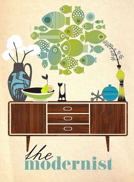
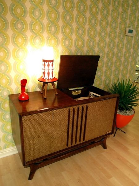
How does this all translate to modern day paper crafting? In print, home decor, and advertising, rules got redefined and structure got shown the door. It was a free thinker's paradise. Colors got bright and bold as new combinations got created. Lines got sleeker, curves more graceful. The shapes became more organic and there was a balanced asymmetry to art and print that was more thoughtful and deliberate underneath the surface than what could be seen at first glance. This era is ripe with inspiration for your projects. Almost like opening Pandora's box. Once you start, you might not be able to stop.
It is a design style that is at times both hard to define, yet instantly recognizable. Like Don Draper said, "Make it simple, but significant."
We'd like to add just a little extra thought to that. "Make it simple, but significant. And most of all, make it fun."
Enjoy the 1960's. It's a swinging good time.
Below you will find a Spotify playlist that has been put together just for this era! there's enough music to entertain you nearly two hours while you are working on your challenge projects!
Now that we've set the mood, check out these fun challenges!
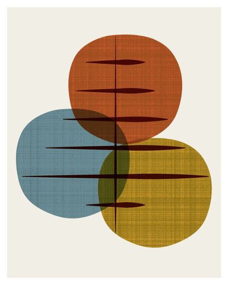
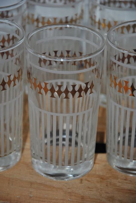
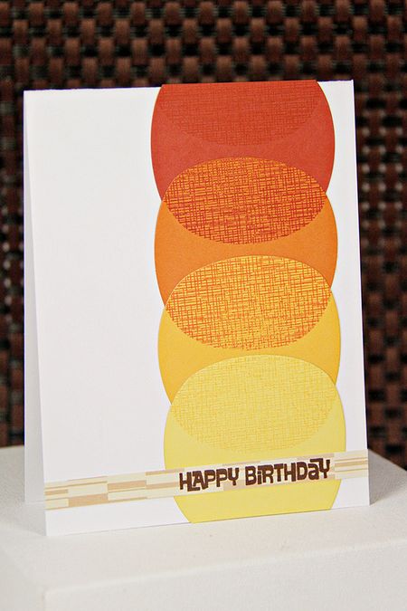
In a lot of the print work of the 1960's, funky, organic shapes got repeated in lines and columns. Often, these shapes overlapped. At the junctures of two individual shapes, a third color (and as a result, a new shape) was revealed. And so, something that was so simple initially (a single shape) gets infinitely more complex with a shift of perspective.
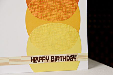
Papertrey Ink's Perfect Match System of color has various hues of the same color. We often refer to it as an "ombre" look. By using the negative shapes created by cutting the dies included in the 1960's kit as stencils and the large crosshatch stamp, you can expand the existing color palette and creative new shapes within the old ones. The results add up to a very 1960's look.
Use the negative shapes created by the 1960's dies as stencils. Stamp the crosshatch stamp through the stencils to create new tones and shapes for your project. If you didn't purchase the kit, get creative with the dies and stamps already in your stash!
–Now it's your turn! Create a project using layered stenciled and stamped shapes in true 1960's style. You can choose to re-create an exact project from the designer above or design your own. Your project must also incorporate at least one Papertrey product.
–Post your project on your blog, in your gallery or on any other photo-hosting site (such as photobucket or flickr).
–-Add your project to the InLinkz list below.
–You will have until 7am EST, Tuesday, August 26th, to add your link to the list to be eligible to win. And you can enter as many times as you like.
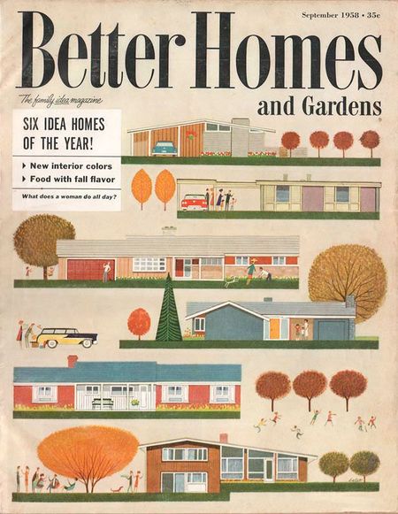
1960's advertising was all about grabbing your attention with a "big idea". The slogans seemed to talk directly to you, selling both confidence and the product itself. "One doesn't come without the other," they seemed say.
Naturally, you wanted whatever they were selling in order to feel that confidence boost. Those Mad Men certainly knew how to do their jobs and land those accounts.
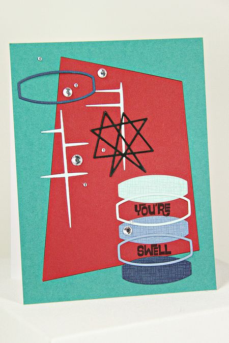
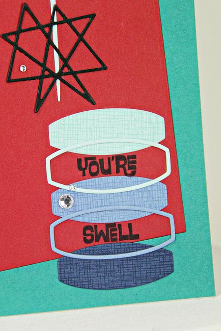
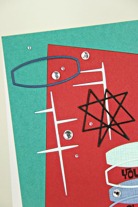
Your challenge is to grab the same sort of attention on your paper crafting project. Combine a sense of order within something asymmetrical. Use bold, clashing colors and overlapping shapes with confidence. The type was thick, whimsical, and black and often placed on the lower half of the ad. Inlaid die cuts help to add a slick and sleek appearance.
Overlap and repeat the die shapes on your project to create a 1960's advertising motif. Inlay your die cuts for a sleek look. Don't forget to use bold color choices, almost to the point of clashing, and black ink on your sentiments.
–Now it's your turn! Create a project that's inspired by 1960's advertising. You can choose to re-create an exact project from the designer above or design your own. Your project must also incorporate at least one Papertrey product.
–Post your project on your blog, in your gallery or on any other photo-hosting site (such as photobucket or flickr).
–-Add your project to the InLinkz list below.
–You will have until 7am EST, Tuesday, August 26th, to add your link to the list to be eligible to win. And you can enter as many times as you like.
–As a reminder, you will have until 7am EST, Tuesday, August 26th, to add your link to the list to be eligible to win. And you can enter as many times as you like.
–TWO randomly selected winners will be chosen from ALL the entries within this list on Tuesday, August 26th. The winners will be posted on our Tuesday night Stamp-a-faire winners page at 9pm EST. The randomly selected winners will each get a $25 PTI gift certificate to spend however they like!
Thanks for joining Erin Lincoln on this journey! We look forward to seeing your projects!






Leave a Reply