Many people have asked about both the name of our company and stamp line.

The concept behind the name of Papertrey Ink was actually formulated by my partner, Julie. For several days we had been trying to think of a name that incorporated the number "three" in some form (because there are three of us within the corporation) and our medium of choice, paper. Several ideas had been tossed around, we even came up with a few that we all loved, but they ended up having already been taken. Then one morning Julie sent an email out to Jane and I suggesting Papertrey Ink.
PAPER (because that’s what we work with)
TREY (according to Merriam-Webster)
Pronunciation:'trA
Function:noun
Inflected Form(s):plural treys
Etymology:Middle English treye, treis, from Anglo-French trei, treis three, from Latin tres
1 : the side of a die or domino that has three spots
2 : a card numbered three or having three main pips
3 : a shot in basketball that counts for three points
INK (because it was just cool to add that in place of Inc.!!!)
Within minutes I designed our logo. I knew I wanted a "tray" to hold the name. After I had added that, it looked a little bland, so I added the flower and finished it off with a polka dot center. It came together really fast; all of the pieces just fell into place. It was meant to be!

Text-style was my original pitch to Julie & Jane as a name for our Christmas Line, and the logo and name stuck and have been utilized in conjunction with all of our products so far. I made a list of what characteristics I wanted the name to emulate and this one fit the bill…
TEXT– I have a passion for fonts. Everything I create is usually originally inspired by a font. Our stamp images are no exception. If you notice, in the few stamp sets we have debuted thus far, the fonts play an important roll within the set as a whole.
STYLE– this word says to me trendy, hip & a "must have". That is how I feel about our products. I think they have signature look that is trendy & now. And yet they are timeless and versatile at the same time.
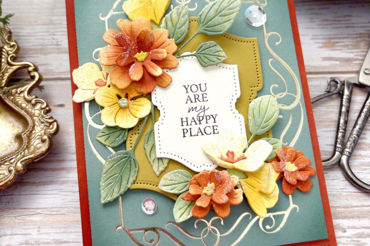
TEXT-STYLE together is also a play on words of "textile". I love the feel of great paper, a new stamp in my hand or the textured layers of a handmade card. And that is what matters in the end. The feeling you have when you have experienced something great, something that makes you happy. And that is how we wanted our customers to feel after they had a "text-style" experience. That is what this entire ride has been so far; one big "happy place" for me. I feel as thought the fit is just right! And here’s to hoping you feel the same!
Leave a Reply