
Good morning friends! Welcome to my new monthly guest post as your Color Ambassador! Whether I’m stamping solid designs or adding color to line images, I love color. Ink pads, markers, paints, pencils – you name it, I probably have it. And if I don’t, I’m likely to have it in two days, prime willing. From techniques and inspiration to coloring mediums, I look forward to sharing all kinds of color topics with you on the seventh of every month. So let’s get started!
Today, I decided to continue the color wheel conversation I began in this week’s Make It Monday and show you how I apply it to creating cards without the literal color wheel layout. I began my stamping session with the same basic colors I used in the video – a lighter, brighter “rainbow” spectrum, with the three primary and three secondary colors represented in some way – and made a couple of additional tweaks as I went along, ending up with the spectrum above.
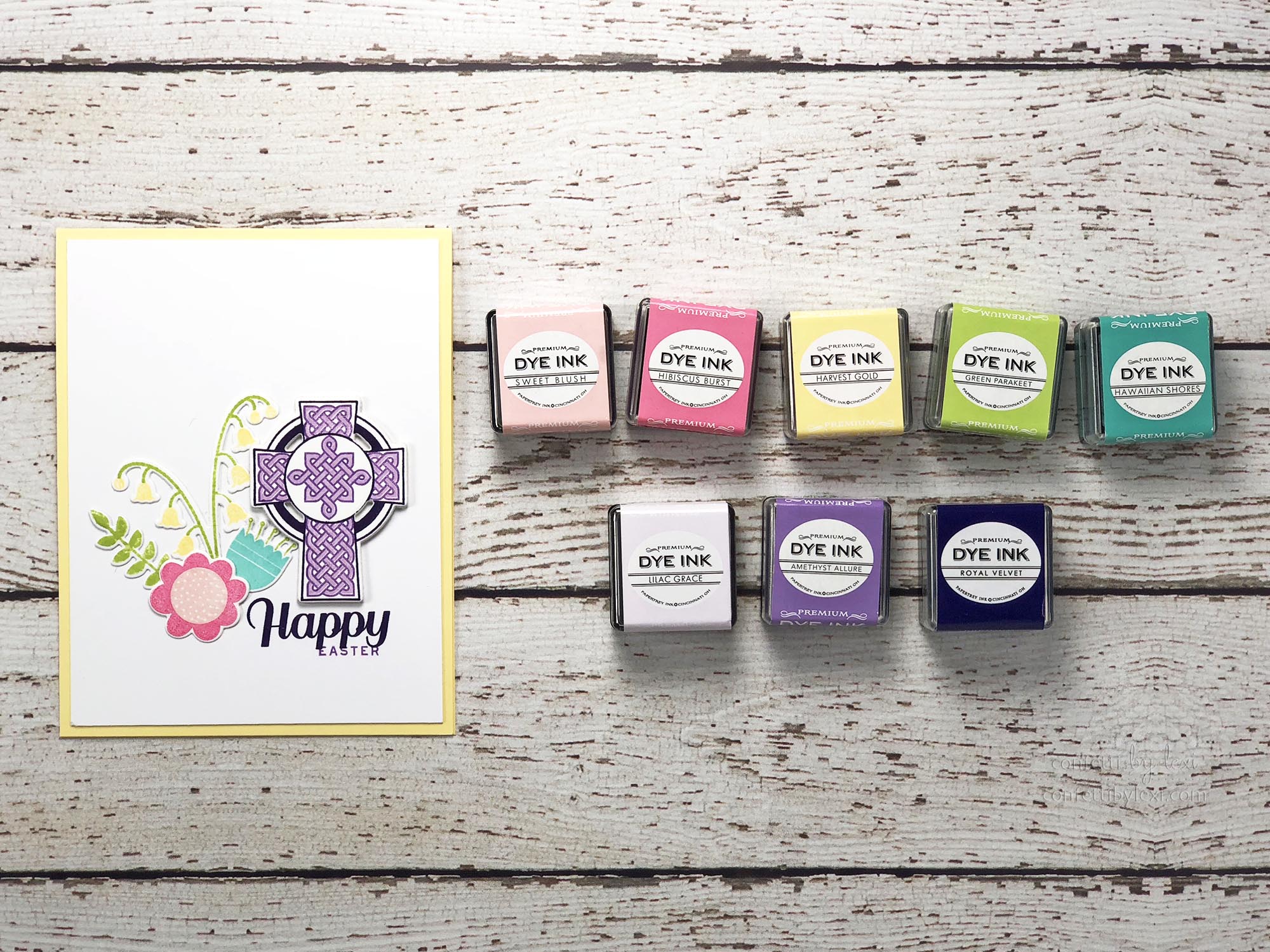
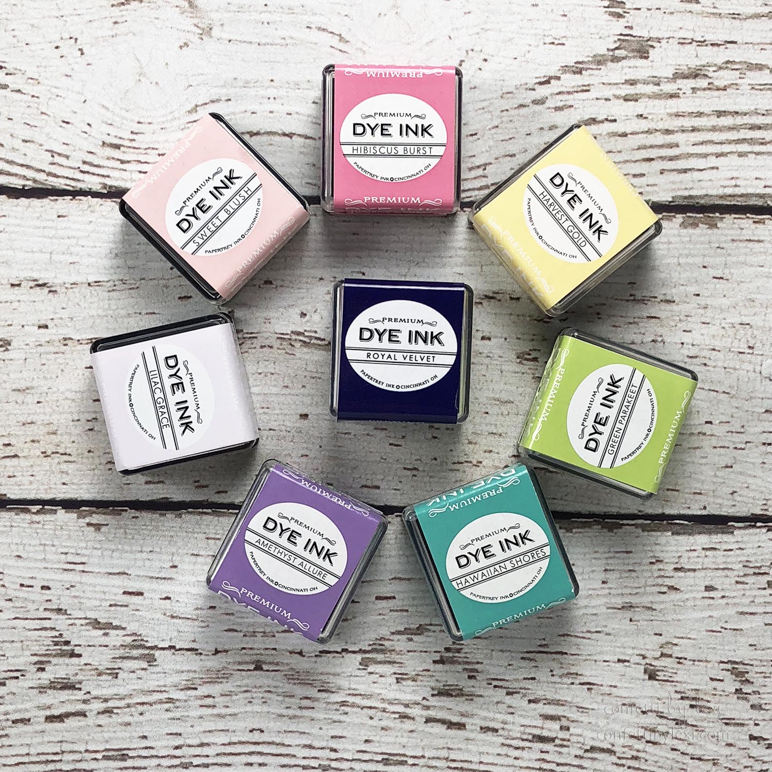
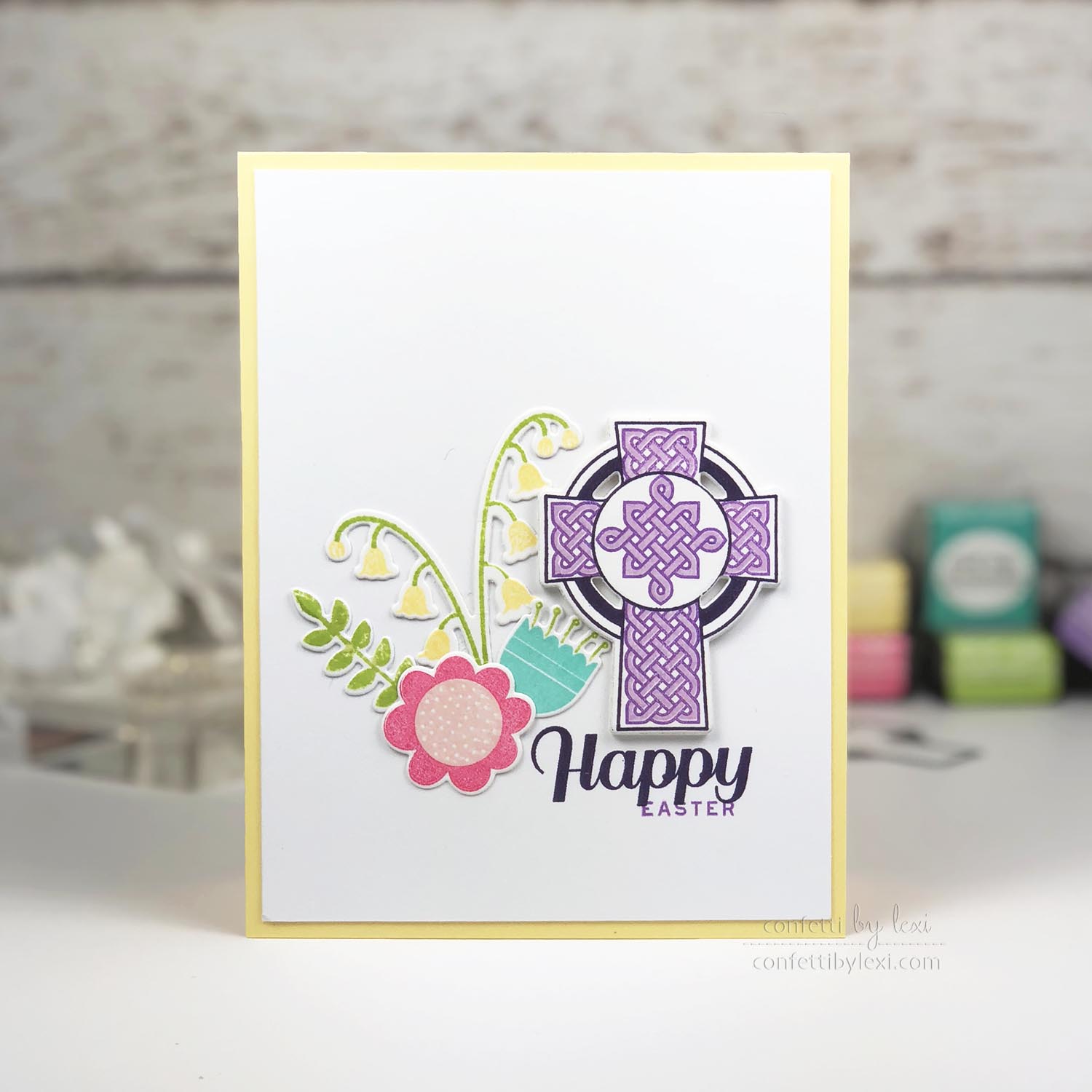
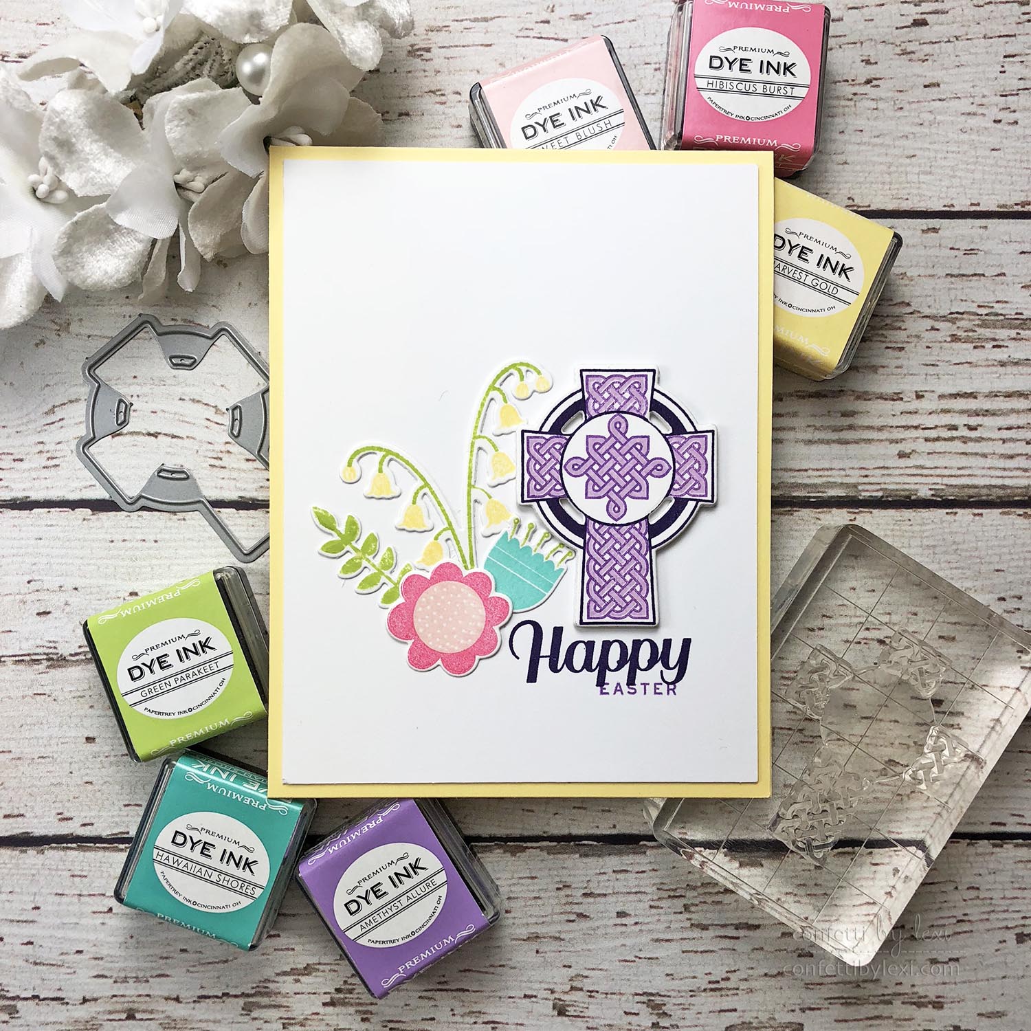
I rarely go into something like this thinking I’m going to use an exact full spectrum – except the actual color wheel card because, well, I wanted it to be a color wheel! – but I like a starting point. So as I started working, I decided that the cross from Celtic Knots in purples would be my focal point and I expanded my purple selection, including Royal Velvet in place of black as my line and sentiment color.
As a result, the orange started to stand out too much, competing with the purple, so I dropped it, adding in the lighter pink of Sweet Blush instead. This happened organically after trying it out. My first plan had been to have Summer Sun as my light orange in the center of the pink flower, and while it looked fine, it just didn’t let the purple shine as brightly as I wanted.

Obviously, I’m still loving Flower Power and flower clusters, but I also wanted a taller flower to bring the cluster up to the height of the cross a bit, so I added in the Lily of the Valley from Forest Floor: Spring (I’ve been dying to ink this one up!). And unlike my color wheel card, I have woven the Green Parakeet naturally among the flowers – a little on or near each one, in fact.

Because yellow is the complementary color to purple, I decided to go with Lemon Tart as my card base, to further support and call attention to the purple cross. I also considered Aqua Mist as an analogous color to purple, but it just didn’t have the same pop as complementary pairs do and a bit of color pop was definitely part of my plan.
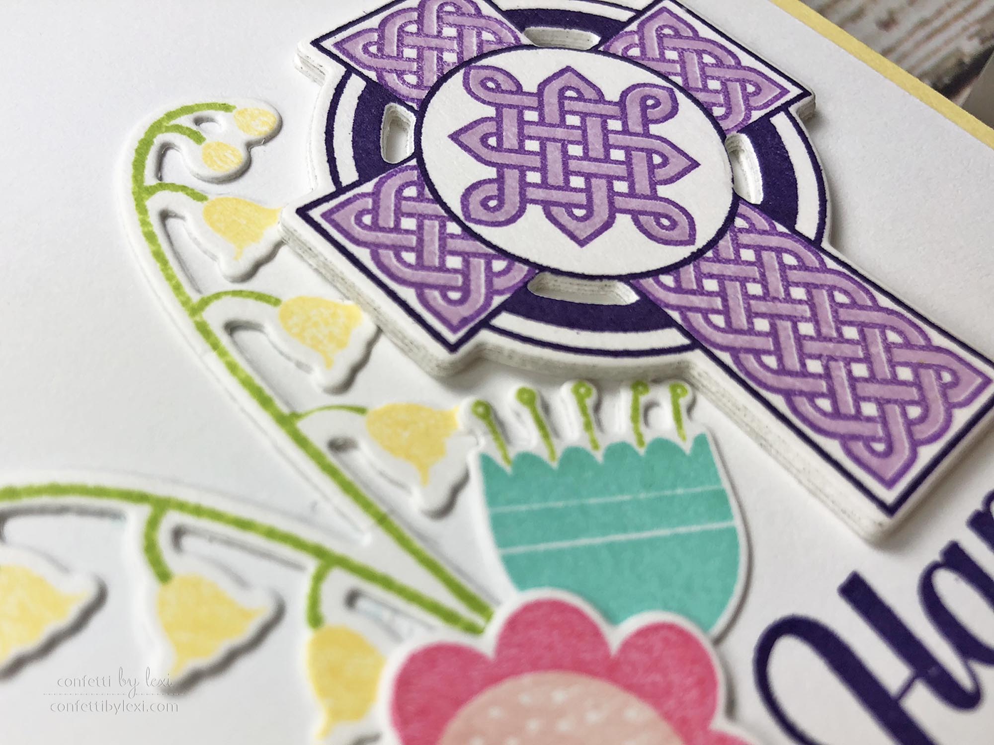
(Speaking of pop, I also popped up the cross literally with five layers of die cuts to make it stand out even more!)
Ultimately, by thinking of the color wheel as a starting point, my card has a cohesive feel to it even though I used a lot of different colors. I made swaps where it made sense, added in extra shades of my focal color, and took away one color completely. The end result is a card that both flows nicely and has points of interest that stand out.
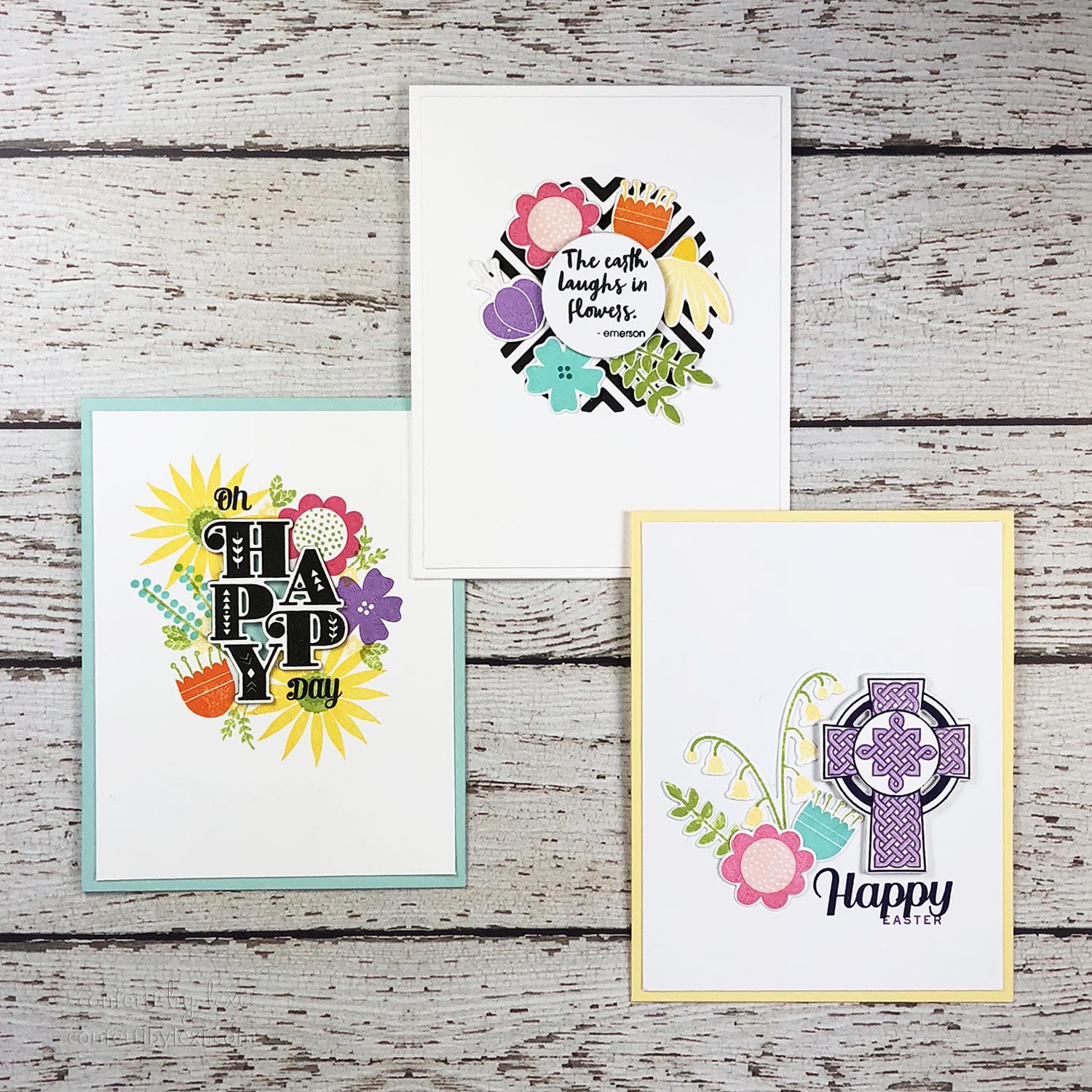
Looking back at the other two cards I’ve made recently with the same basic color spectrum, you can see that each has its own feel based on the balance and weight of the colors used. In the Stacked Sentiments card, I wanted a bright and bold color explosion around the black sentiment, so I used extra yellow and double stamping to accomplish that. In the color wheel card, I wanted the balance of the color wheel represented, so I worked with similar sizes and saturation of color. And today, I wanted a feeling of spring, with the colorful flowers setting the stage for the purple cross to shine. Mission accomplished, I think!
If you have any color topic requests, please be sure to let me know in the comments here or in the forum. I’d love to write what you want to read. And if there’s something I have yet to try, I’m definitely game!
Have a colorful day!
🙂 lexi
Supplies:
Happy Easter Card
STAMPS: Celtic Knots, Flower Power, Forest Floor: Spring
INK: Hibiscus Burst, Sweet Blush, Harvest Gold, Green Parakeet, Hawaiian Shores, Amethyst Allure, Lilac Grace, Royal Velvet
PAPER: Stamper’s Select White, Lemon Tart
DIES: Flower Power, Celtic Knots, Forest Floor: Spring
OTHER: Mini MISTI
The Earth Laughs in Flowers Card
CLICK HERE for the original post
Oh Happy Day Card
CLICK HERE for the original post
Leave a Reply