
Hi everybody, welcome to our new feature What do I do with this? For this challenge our designers will get to try out some of these new tools and share the projects they created using them. We’ve got some fun, new things coming to the Papertrey Ink store and our designers will show you how to use them so you’ll be comfortable incorporating them into your card-making and gift-giving. Stay tuned for exciting and creative things coming your way! We want to share what our designers love with you, and this gives you a first-hand look into their crafty-faves!
Let’s get started!
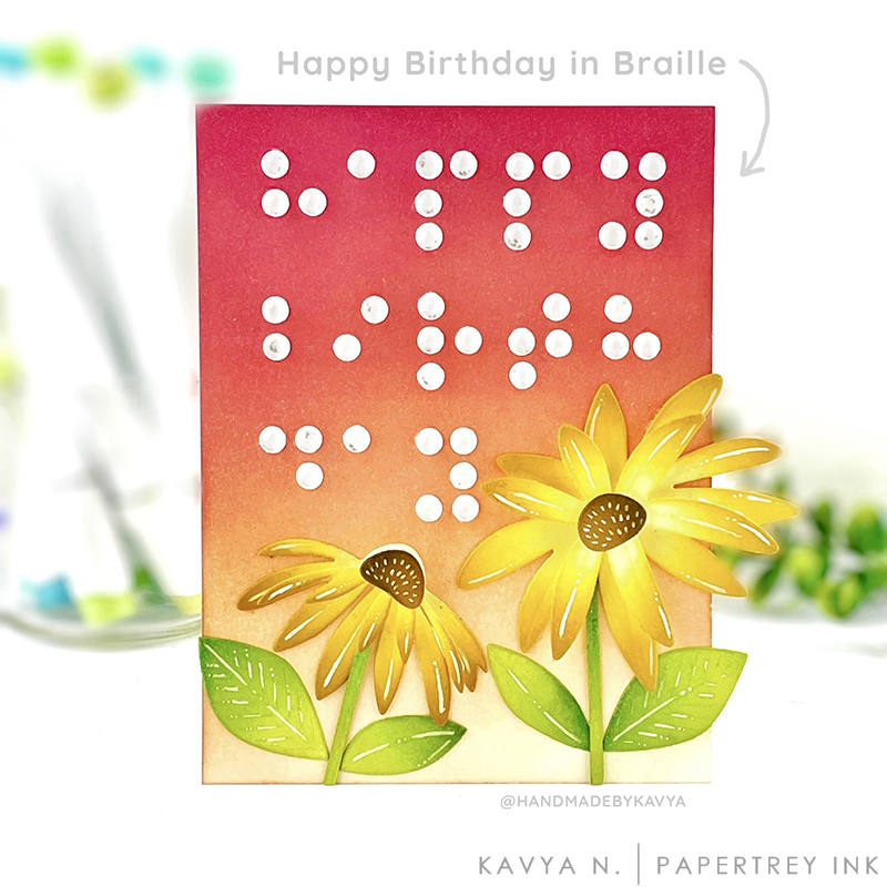
This month in the What Do I do With This Challenge we are playing with these gorgeous clear drops! I love using clear drops to almost all of my floral projects to make them a bit more ‘realistic’ but I have a totally new use for them here – Greeting Cards in Braille!
At my day job, I am currently working on making some components of the Windows OS more accessible. Accessibility is all about designing things that can be used successfully by people with a wide range of abilities and disabilities. For example, building ramps instead of stairs, screen readers for websites, tactile pavements, low-floor buses are all examples of accessible designs.
As I spent time on this project… I realized that not all of my greeting cards were accessible! Especially the sentiments! There is no way for someone blind to understand what the card says. Some of my cards are ‘tactile’ just because I tend to use a lot of foam or texture to make them realistic but they were definitely not intended to be accessible! When I saw these large clear drops from PTI, I knew they would be perfect for creating sentiments in Braille. I simply placed a smaller circle underneath the drop (used the circles punched out by a 3 hole punch!) just so that they are ‘visible’. Since these drops take the color of the paper underneath them, feel free to experiment!
I then found how to write Happy Birthday in Braille and arranged them on my card front.. please be careful of your spacing when you place them! There are amazing resources online to get you started 🙂
To make my card more ‘tactile’, I tried to create realistic sunflowers by using die cut flowers so that the receiver can feel the flowers. PTIs series of die cut flowers and birds are perfect for this! You can also add texture using embossing powders, different types of cardstock, embellishments like feathers, beads, rhinestones etc to make the card more tactile. Stacking multiple die cuts or heat embossing an image multiple times to create a raised object is also another amazing way to create tactile card fronts. Again, if you are lost for ideas, a quick search on tactile books leads you to so many interesting ideas! Together, let’s make cardmaking accessible 🙂

PAPER: Stamper’s Select White

PRIZE
One winner will be chosen at random to receive a $25 gift certificate.
RULES
To enter, participants are required to create a tactile card by using multiple dies or heat embossing using PTI/Ink to Paper supplies and Kavya’s technique or your very own. Share your finished project via the link below. We can’t wait to see what you make!
Only one entry per person and the deadline is July 26th at 6am. This post will be updated with the randomly selected winner.
CHALLENGE
EDITED TO ADD THE RANDOMLY SELECTED WINNER
Congratulations, JoAnn! Please send an email to customer service and provide them with your full name and the email address you would like your gift certificate sent to. Thanks so much to everyone for playing along!
Leave a Reply