
Good morning! Welcome to this month’s color installment! Today I thought it was a good time to take a look at neutrals. Gray, black, white, tan, brown and off-white are typically considered the basic neutral colors. Browns, tans, and off-white tend to make color schemes feel warmer, while black and white and greys can look warm or cool depending on the surrounding colors. While neutrals are an important component to almost any color scheme, today we’ll take a look at them as the main component.
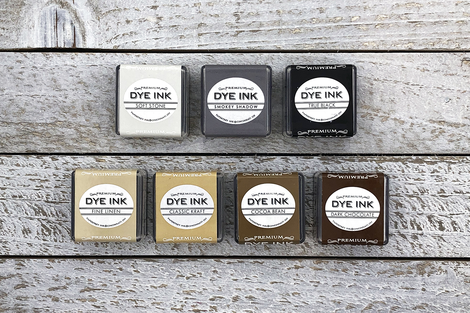
Currently, we have three inks in the black/gray color family (with one on the way!) and four basic browns – a nice range for monochromatic neutrals. Adding a single bright or bold accent color to either of these neutral palettes is one of the most basic color schemes to try. The idea is somewhat similar to designing with monochromatic colors but even easier to pull off. It’s also one of the most visually striking color schemes.
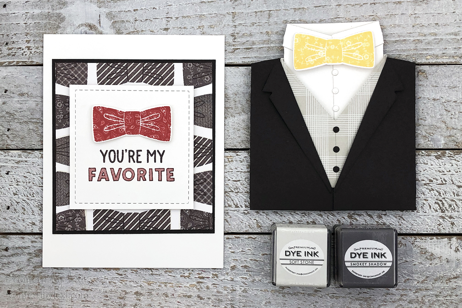
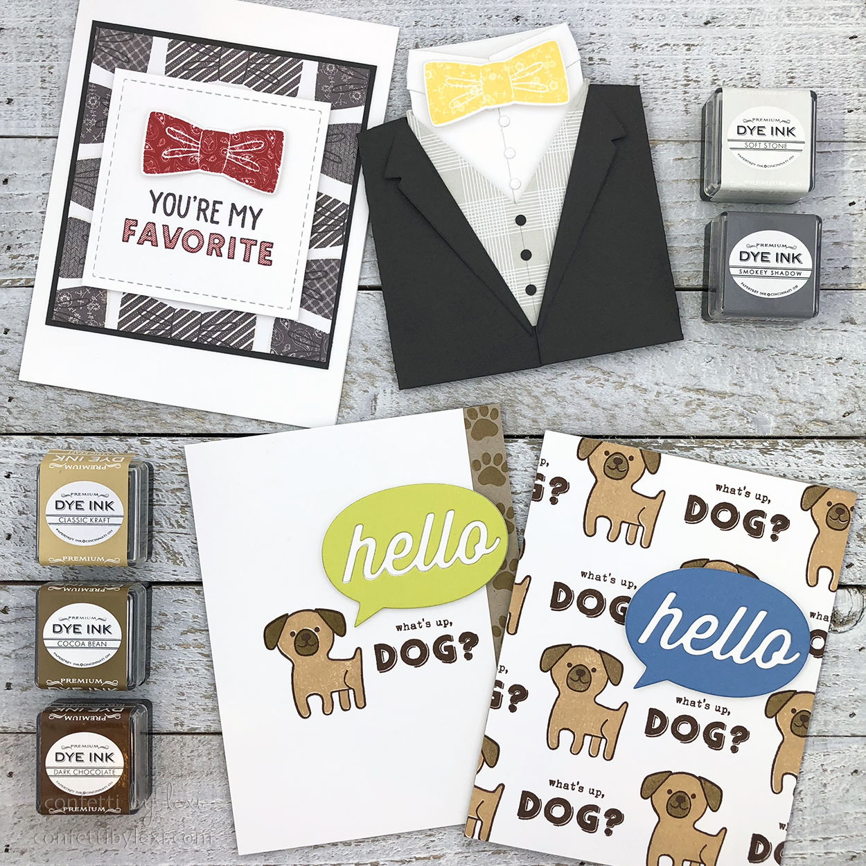
Let’s start with shades of gray. I made two cards using Soft Stone and Smokey Shadow along with Dapper Chap and Shape Up: Tuxedo. I just adore these bowties!
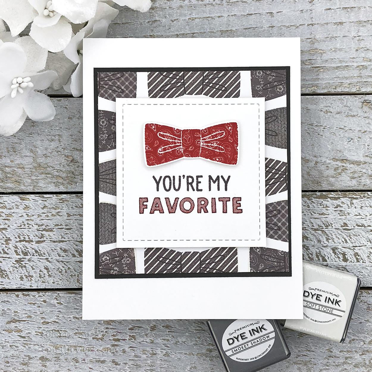
I’ve had this idea in my head for a while now – a pattern of gray or black ties with one highlighted in color. I went with Soft Stone as my base tie color with Smokey Shadow as my pattern color rather than a strict black and white for a slightly softer look. And then I decided to further set apart my bright colored tie, popped up on its own layer. Pure Poppy and paisley seemed perfect for the sentiment: You’re my favorite! But really you could do any color bowtie here – and that is the beauty of neutrals with a pop.
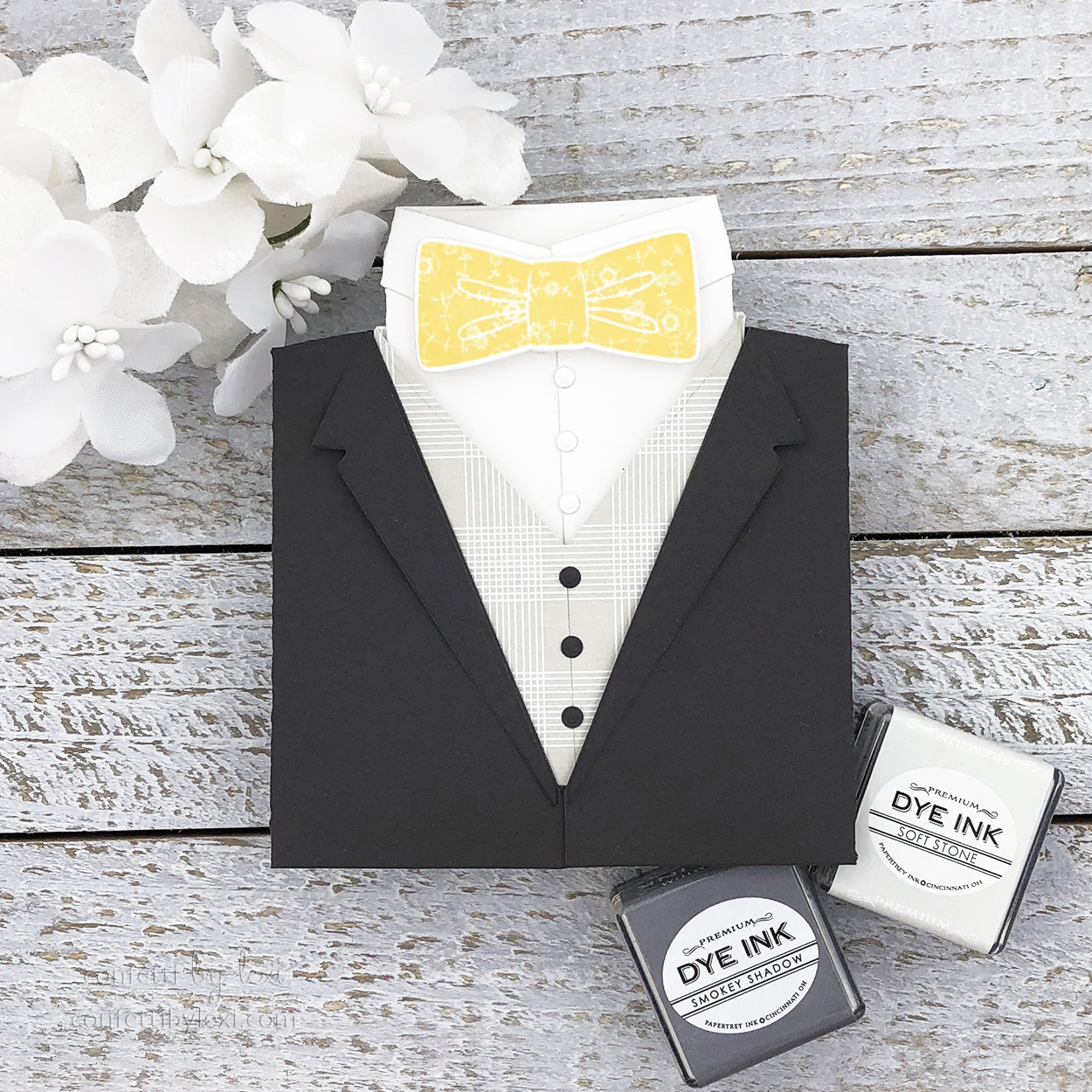
Next, I used papers for my shades of gray: Smokey Shadow for the coat, Bitty Big: Soft Stone for the vest. I love this gift card holder – it’s so fun and the styling possibilities are endless. Of course, you can’t go wrong with a strong gray suit combo and a brightly colored tie. As you know, I’m partial to yellow, but again, any color tie works here – match it to your recipient!
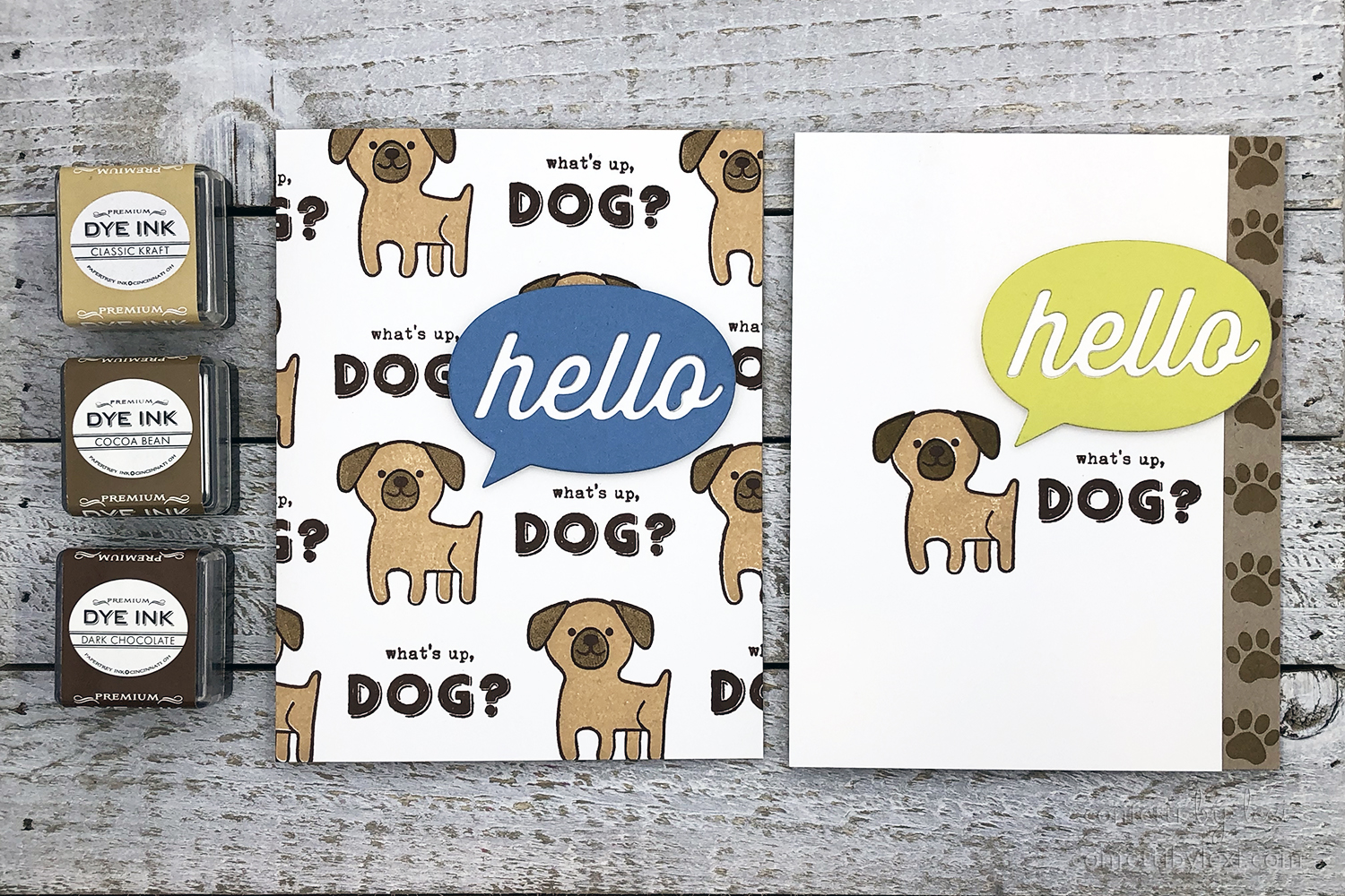
For the tan and brown color scheme, I made two cards using Classic Kraft, Cocoa Bean and Dark Chocolate with A Bit More: Paws & Kisses, paired with the hello speech bubble from Traveler’s Journal: Passport Cover for my pop of color.
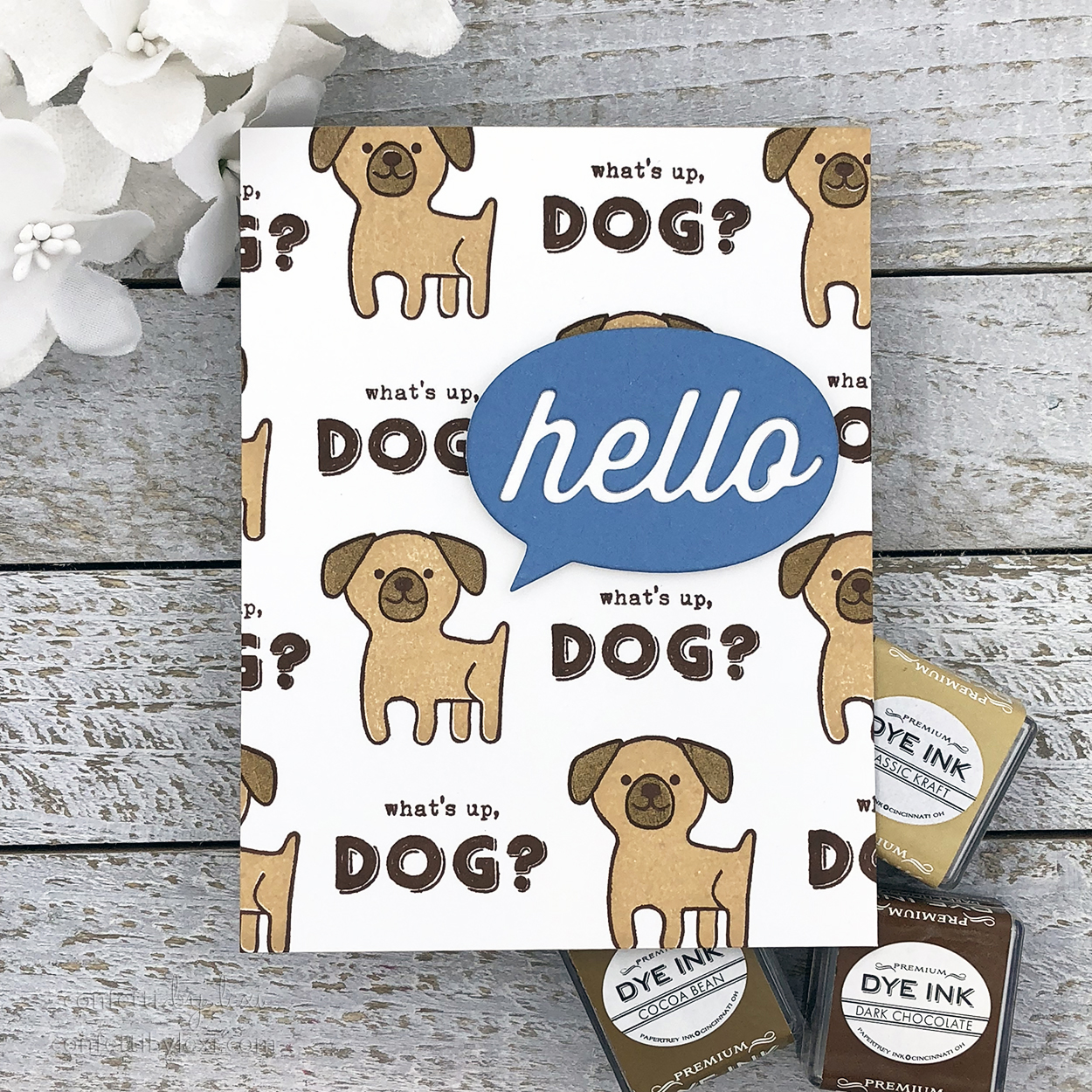
As you might remember, I tend to create designs with more white space (coming up next!), but I also really like using stamps to create pattern elements. Following suit from my shades of gray pattern, I created a cute little puppy pattern with the puppy and the best dog sentiment ever – what’s up, dog? Since it’s just a cool way to say hello, the oversized hello speech bubble was the perfect way to add my pop of color. Tip: stamp your first puppy and sentiment in the right place for your speech bubble and build the pattern from there.
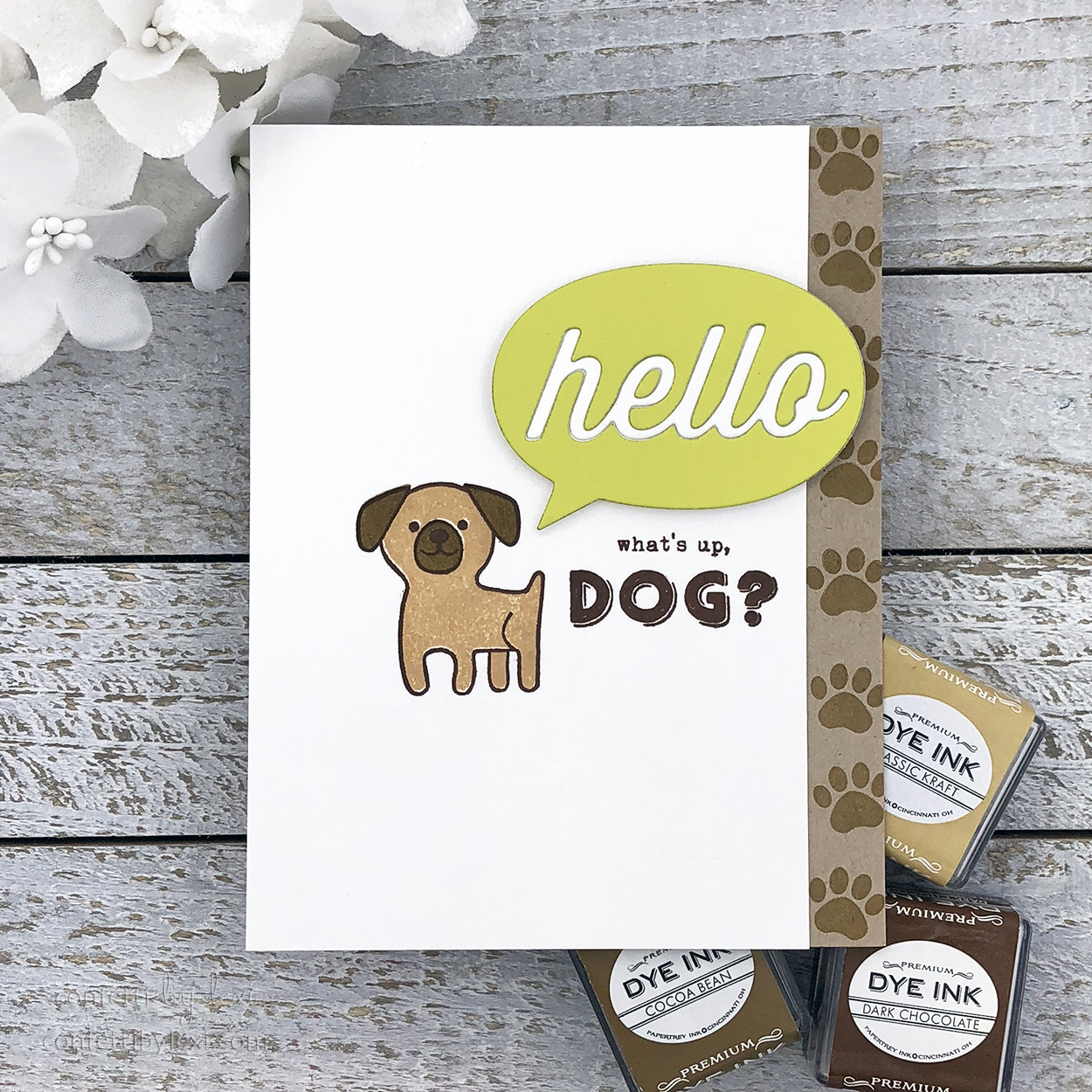
As promised, here’s the clean and graphic/white space version. Immediately upon stamping the first puppy and sentiment to start my pattern, I knew I would be making this one. I wanted to stay true to my pattern idea, but I had to stay true to my standard style too, lol! For added interest, I stamped the paw prints to the kraft card base before adhering my white panel, making sure that my speech bubble extended over the edge. Again, any color could be used for these speech bubbles!
So there you have it – one of the easiest, yet most striking color scheme ideas. Neutrals with a pop. While I created cards with subject matter that naturally led to neutral colors, there is plenty of room for experimentation with unexpected imagery. The next time you’re stuck in a rainbow or other rut, pull out your neutrals and add a single bright color – perhaps your favorite or one to match your mood! Is this a color strategy you use often? If not, what do you think? Please sound off in the comments!
Have a colorful day!
? lexi
Supplies:
You’re My Favorite card
STAMPS: Dapper Chap, Everyday Affection
INK: Soft Stone, Smokey Shadow, Pure Poppy
PAPER: Stamper’s Select White, Smokey Shadow
DIES: Shape Up: Tuxedo, Shape Shifters: Square 1
OTHER: MISTI, foam tape
Tuxedo card
STAMPS: Dapper Chap
INK: Harvest Gold
PAPER: Stamper’s Select White, Smokey Shadow, Bitty Big: Soft Stone
DIES: Shape Up: Tuxedo
OTHER: MISTI, Scor-tape, Mult Medium Matte, foam tape
What’s Up, Dog? pattern card
STAMPS: A Bit More: Paws & Kisses
INK: Classic Kraft, Cocoa Bean, Dark Chocolate
PAPER: Stamper’s Select White, Blueberry Sky, Classic Kraft
DIES: Traveler’s Journal: Passport Cover
OTHER: foam tape, 2-Way Glue Pen
What’s Up, Dog? pawprint card
STAMPS: A Bit More: Paws & Kisses
INK: Classic Kraft, Cocoa Bean, Dark Chocolate
PAPER: Stamper’s Select White, Limeade Ice, Classic Kraft
DIES: Traveler’s Journal: Passport Cover
OTHER: foam tape
Leave a Reply