
Good morning! Welcome to this month’s color installment. Thank you to the forum members for suggesting so many great topics for this new ambassador series. I can’t wait to get to them all! This month, I decided to continue the color wheel conversation with a look at complementary color pairs. Complementary color pairs consist of a primary color and the secondary color opposite it on the color wheel and when placed next to each other, they create the strongest contrast for those particular two colors.
When using the traditional red-yellow-blue color wheel, these pairings are red and green, yellow and purple, and orange and blue. Because of the striking contrast, these color duos are perfect for adding a bit of pop and pizazz to a project. I’ve used this color theory in a couple of ways. Last month, for example, when creating the colorful color wheel based card featuring purple as my focal color on the cross, I placed the taller yellow flowers right next to it and chose yellow as my card base and frame purposefully for that extra contrast and pop.
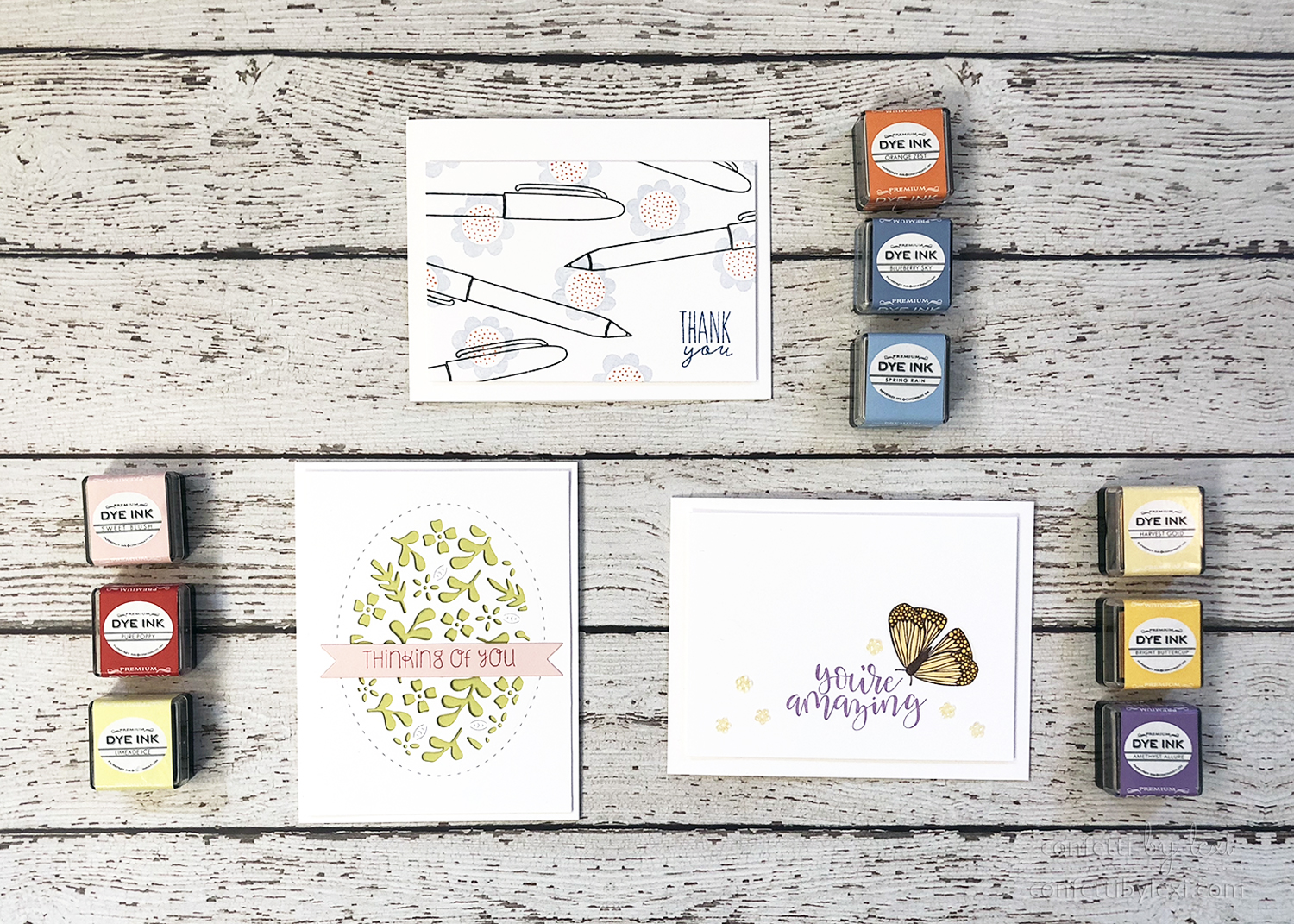
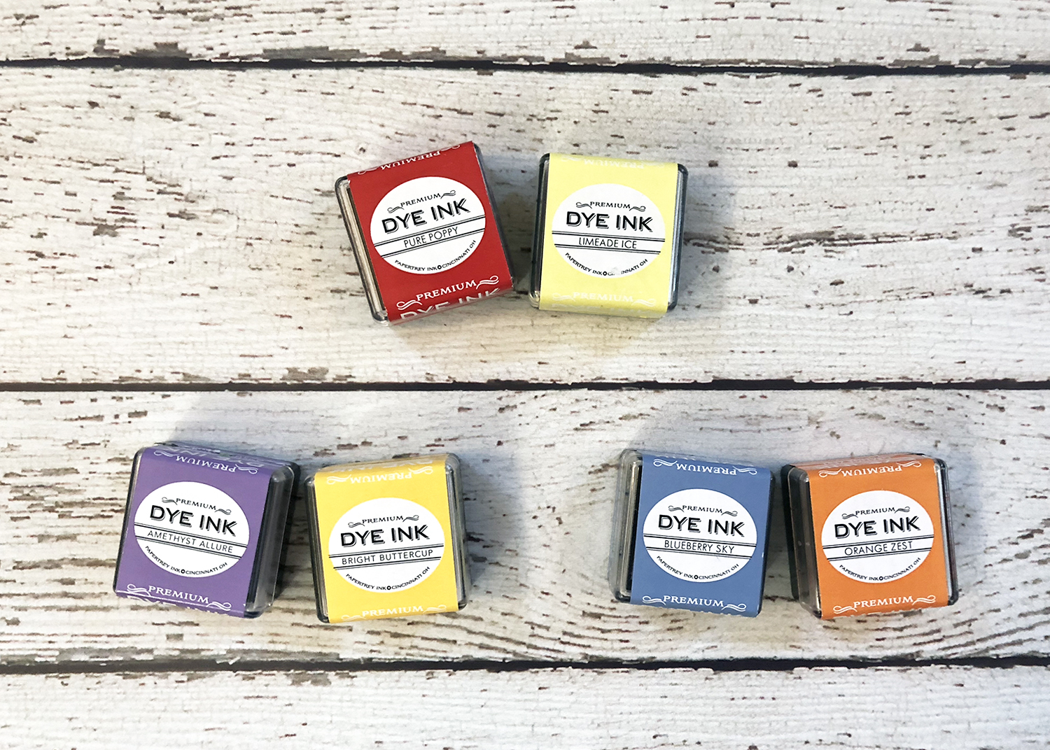
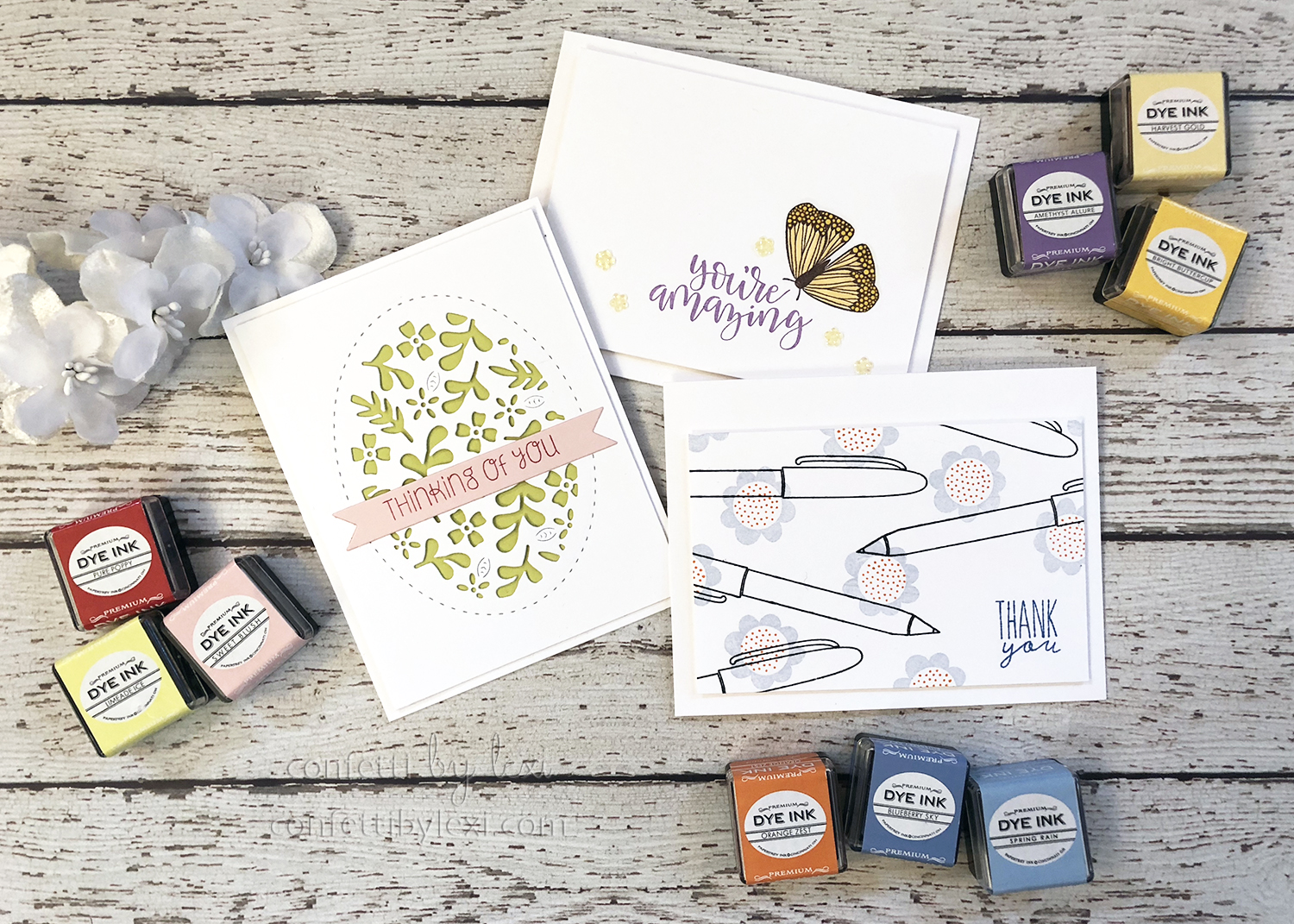
This month, I wanted to focus on the duos themselves, so I stamped a few clean and crisp cards, one with each complementary color pairing to show it off. On all three designs, I pulled in an extra shade of one of the colors and on a couple, I added a neutral as needed. (Please note: although I used paper and copic markers in a couple of instances, I’m using ink cubes to represent those colors for consistency and ease of presenting them to you.)
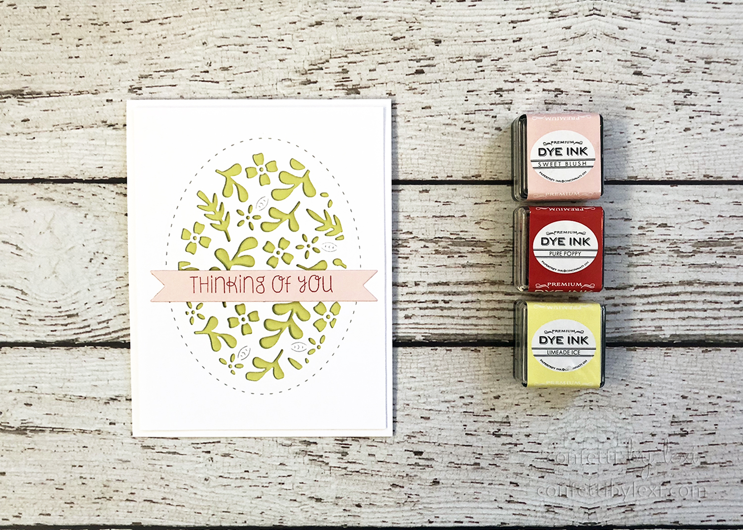
First up, red and green. We know and love this color duo as Christmas colors, but they don’t have to be just for Christmas. Think flowers and strawberries – perfect examples of red and green in the wild! And boy, do red flowers and strawberries pop in a field of green!
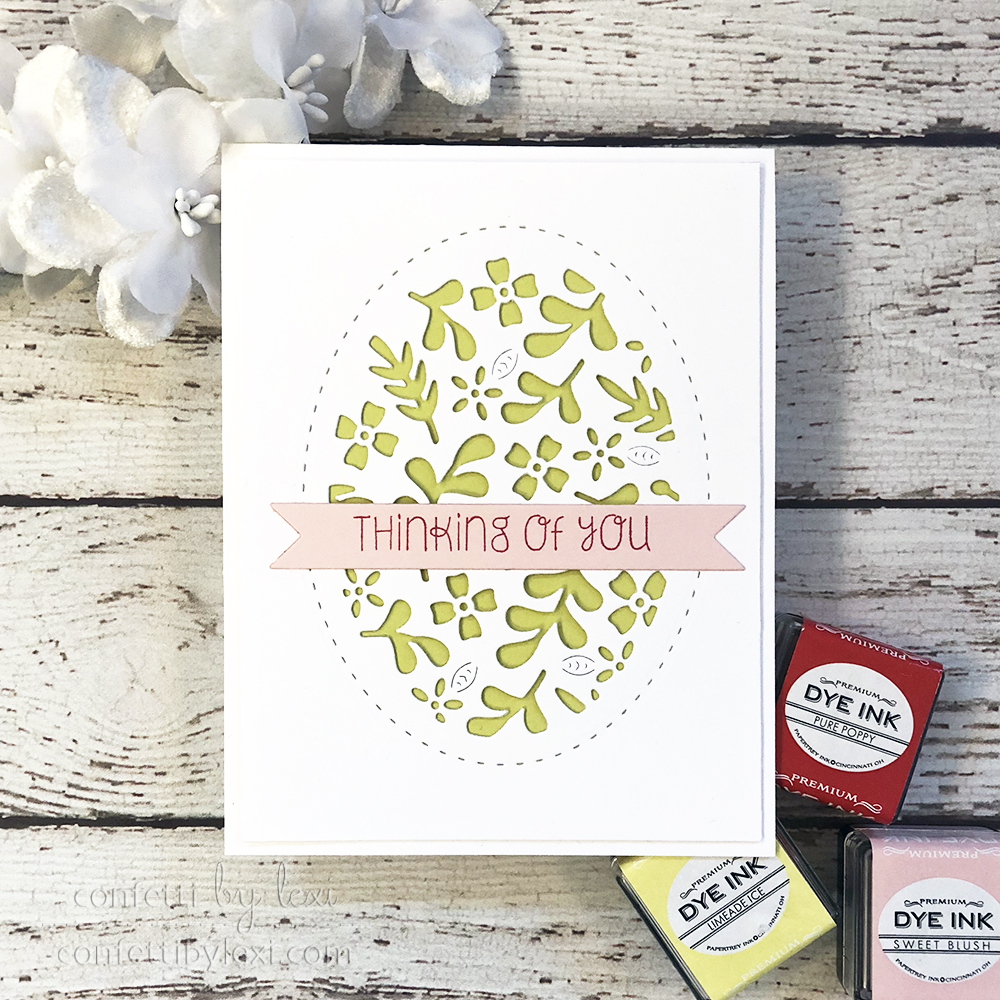
When I use red and green outside of Christmas, I often opt for a lighter green and add in pinks. For that matter, pink and green have the same complementary pop qualities. Here I chose Limeade Ice and Pure Poppy and added a bit of Sweet Blush. The result is bright and springy and the little bit of red and pink really shine on the green background.
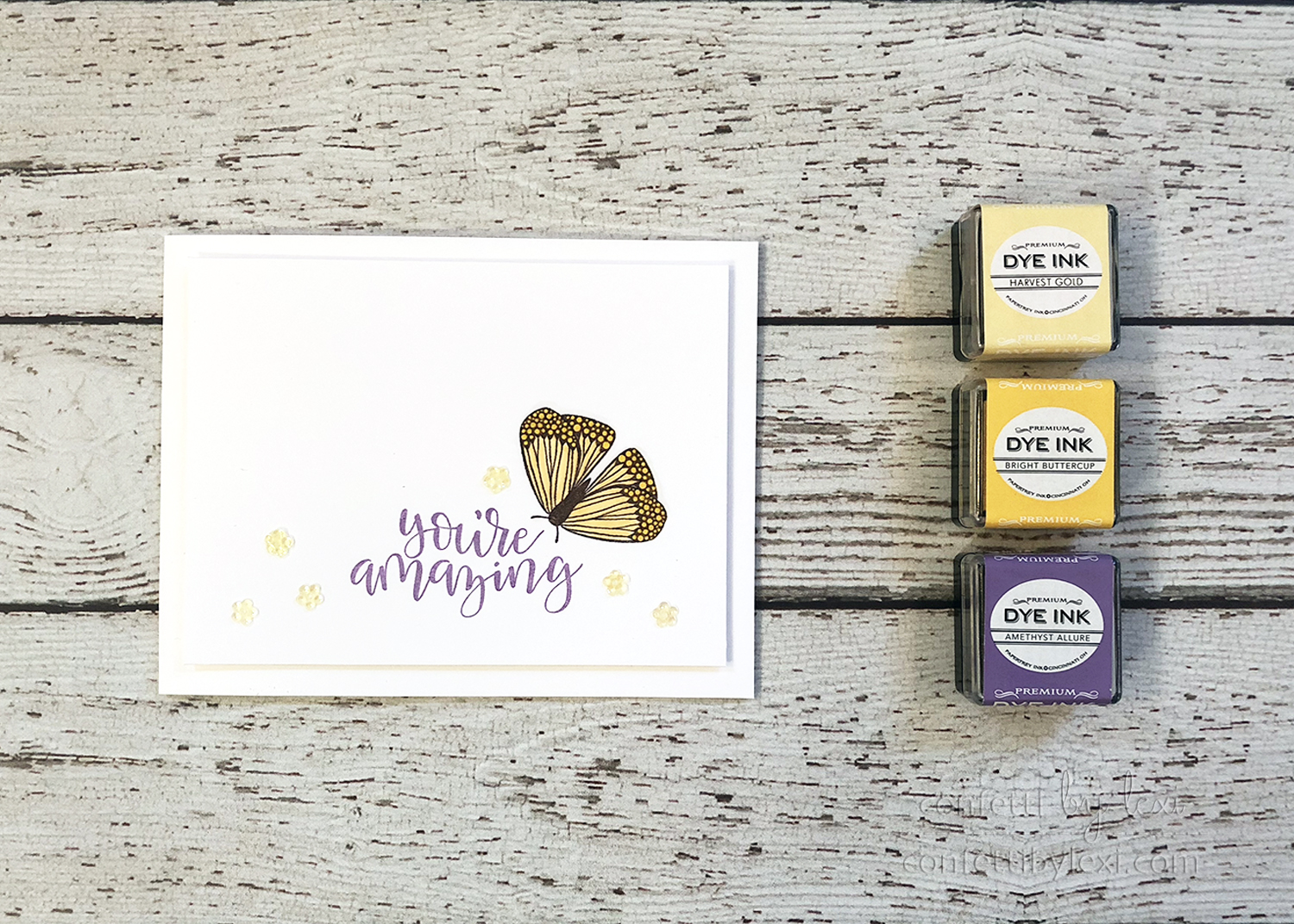
Next, yellow and purple. This is probably the complementary duo I use alone the least. Although as I pointed out, I placed them near each other on a more colorful card specifically for that complementary pop. I think I see football colors too easily for it to be a favorite pairing – I live in LSU country!! When you think about it, many football team colors employ this color theory – most likely to make the players stand out on the field.
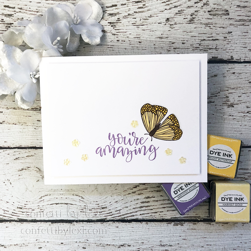
That said, I really love how this card turned out. Clean and simple cards are so satisfying to me and these color duos really add to the crispness of the design. The contrast and pop can really assist in the less is more idea of clean and simple. I originally tried stamping the butterfly in yellow and coloring it in with a lighter yellow copic, but ultimately I liked to see the lines more, so I went with smokey shadow as a neutral. To blend it in with the yellow a bit, I colored over the body as well as the wings. A few little flower sequins and that purple sentiment really pops!
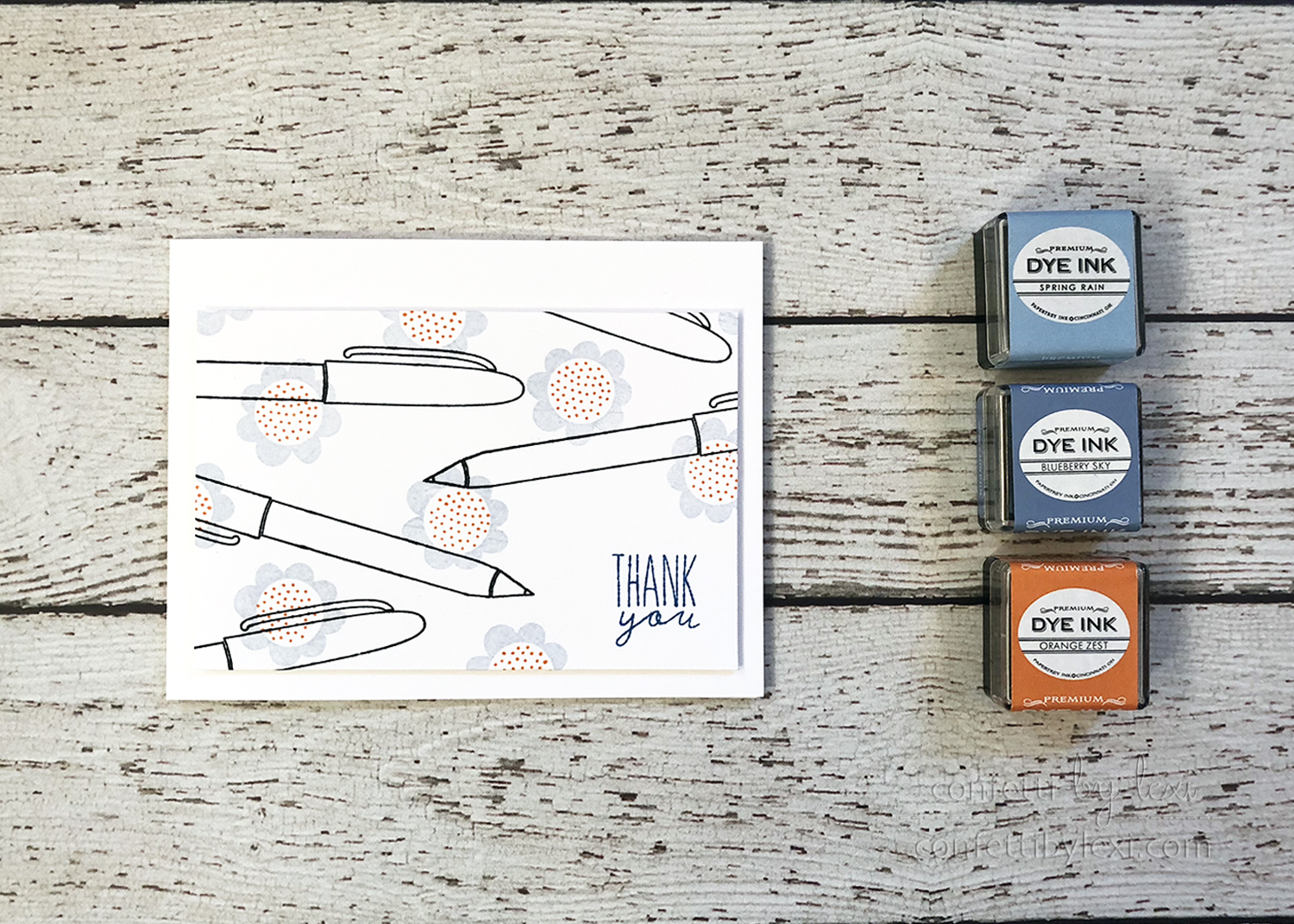
And last, but not least, blue and orange. This one’s probably my favorite of the color duos. I know there are football teams with this color combo, just like yellow and purple, but for some reason, it just doesn’t read football all the way to me. Anyway, I really liked Stephanie’s Make it Monday this week and decided to try my own twist on her idea.
Rather than using similar images for my solids and outlines like Stephanie, I chose a playful pairing of images – ink pens and flowers! I had tried to come up with an idea for a background of black line pens during the release but never could finish it up. Enter this random, offset scattering of flowers and I love it! Like Stephanie, I left a little space for the sentiment, but the constrasty background “pattern” of solid flowers and line art pens is the star of the show. Fun fact that I came across: life preservers are often orange specifically for the contrast with blue water so that they’re easy to spot.

In addition to the cards, I thought it would be fun to share a small sampling of possible papertrey ink colors that would “complement” each other well. If red and green is just too Christmasy, pink and green pop just as nicely!
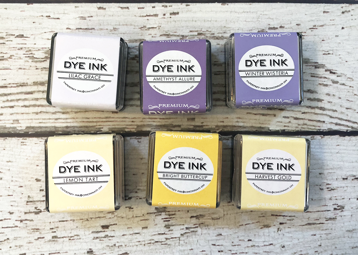
Papertrey Ink has some great purples and yellows to choose from as well. Rather than working with both strong colors from the middle, try using lighter shades of one color with a dark shade of the other. Those lighter shades will still support the complementary color nicely and the whole project will pop.
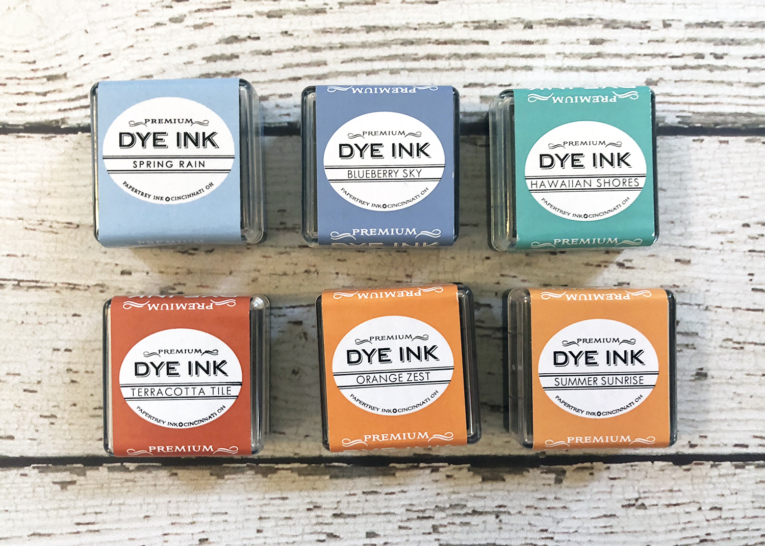
And finally, blue and orange. So many great choices here! And actually, teals can easily be read as blue or green depending on what you put them next to, which allows them to play perfectly with both oranges and reds or pinks!
I hope you’ve enjoyed this look at stamping with complementary colors. Other than Christmas, do you already stamp with these color combos? Which pairing is your favorite? As always, I love to read your comments and requests! Until next month…
Happy stamping!
🙂 lexi
Supplies:
Thinking of You Greens Card
STAMPS: Butterfly Blooms
INK: Pure Poppy
PAPER: Stamper’s Select White, Limeade Ice, Sweet Blush
DIES: Shape Shifters: Oval 1, Double-Ended Banners
You’re Amazing Butterfly Card
STAMPS: A Bit More: Butterfly Blooms, Penned Elegance
INK: Amethyst Allure, Smokey Shadow
PAPER: Stamper’s Select White
OTHER: Flower Sequins, Copics: Y08, Y21, Foam Tape
Thank You Pens Card
STAMPS: Ink It In, Flower Power
INK: Orange Zest, Blueberry Sky, Spring Rain, True Black
PAPER: Stamper’s Select White
OTHER: Foam Tape
Leave a Reply