I have been wanting to play around with this image from Boards & Beams ever since I first designed it. The city house is what I have been informally referring to it as, or in today’s case, the brownstone. The other night I envisioned being able to make the window transparent like real glass, and last night I figured out just how to do so!
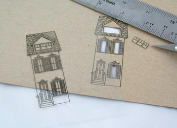
I started by stamping the image on both Classic Kraft cardstock & clear transparency using black palette ink. Using a ruler and a craft knife I cut out the windows of the version on the kraft cardstock.
……………………………………………………………………………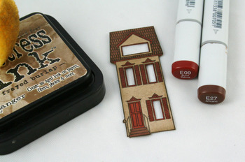
I cut the kraft house out and I then did some coloring with a few Copics, just on the shingled roof, door, shutters & trim. The remainder of the house I sponged with Frayed Burlap Distress Ink to help add some depth.
……………………………………………………………………………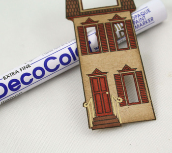
I used an extra fine gold paint pen to carefully trace over the stairway railing and emphasize the itty-bitty doorknob.
……………………………………………………………………………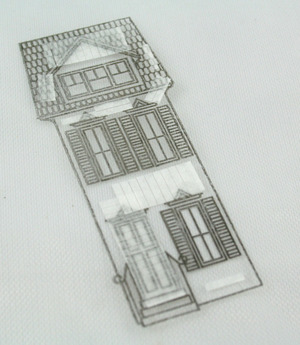
I applied adhesive to the FRONT of the transparency house, being careful to not apply any over the windows.
…………………………………………………………………………..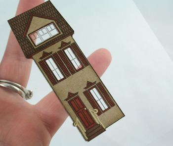
I then adhered the cut-out kraft house onto the transparency, being sure to line up the windows. What a fun effect, huh?!?!?
,,,,,,,,,,,,,,,,,,,,,,,,,,,,,,,,,,,,,,,,,,,,,,,,,,,,,,,,,,,,,,,,,,,,,,,,,,,,,,,,,,,,,,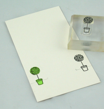
I wanted to create a little background for my brownstone to sit on, so I began with these adorable topiaries which are also included in the set. I stamped one on each side. I knew I was going to add some fencing too, so a mask was in order. I created one quickly form a post-it note and added that on top of one of the topiaries.
………………………………………………………………………….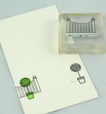
Notice the fence? If you go back and look at THIS POST, you’ll see that this one is a bit different than the one I used before! With two different styles of fencing, you can’t go wrong! I stamped the fence directly on top of the masked topiary. I repeated the same step on the opposite side after moving the mask.
………………………………………………………………………….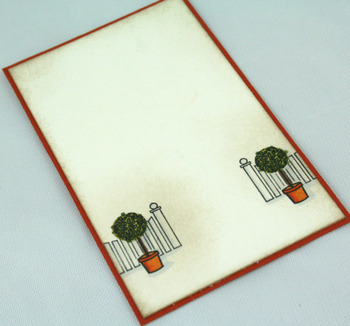
After a bit of coloring and sponging with distress ink, I am left with this!
………………………………………………………………………….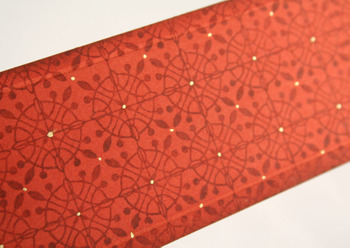
I wanted to also create a bit of background paper, so I pulled out my new trusty go to background set, Guide Lines, and stamped this patterns. Once I completed the stamping, I added small dots of gold at all the intersections of the grid with the same gold pen I used on the railing earlier.
………………………………………………………………………….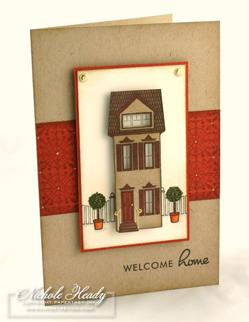
Once I assembled all of my bits & pieces together I ended up with this. I think it is so autumn!
…………………………………………………………………………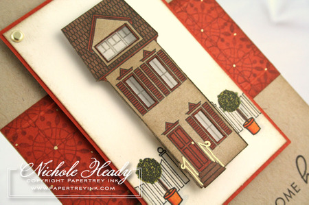
Here is a closeup view of the brownstone and all it’s little details. Notice the intricate shutters and the finials above the windows. Just love this images!!!
…………………………………………………………………………
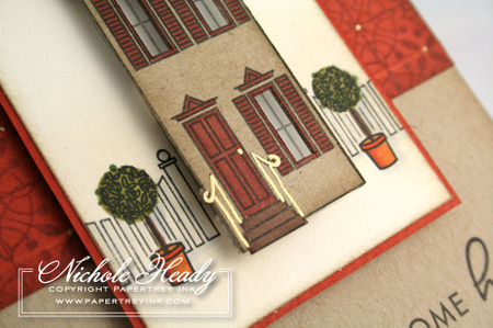
The railing detail & transparent windows are such a little addition, but they really help to bring this project to the next level! I hope you will play around with one of these techniques once you receive your very own Boards & Beams set!
Stamps: Boards & Beams
Ink: Noir Black & Burnt Sienna (pattern on accent strip) Palette, Frayed Burlap Distress Ink from Ranger
Paper: Classic Kraft, Vintage Cream from PTI, rust from Prism
Other: gold brads from Paper Studio, transparency from Office Depot, extra fine gold paint pen from Marvy, foam dimensionals from Fiskars

Leave a Reply