
Good morning! Welcome to this month’s color installment! Today we’ll take a look at monochromatic color schemes. Monochromatic literally means one color. A monochromatic color scheme is based on any single hue on the color wheel and can include various shades, tones, and tints of that color. In painting, these variations in color are created by adding white, gray or black to the pure color. For us, it’s about matching inks and playing with patterns.
As much as I love rainbow cards and a variety of color combos, I also love the look of a monochromatic card. Like analogous colors from last month, the resulting designs are usually calm, serene, and subtle because there is a focus on a single color or shades of that color that blend into each other. Let’s take a look at a few examples…
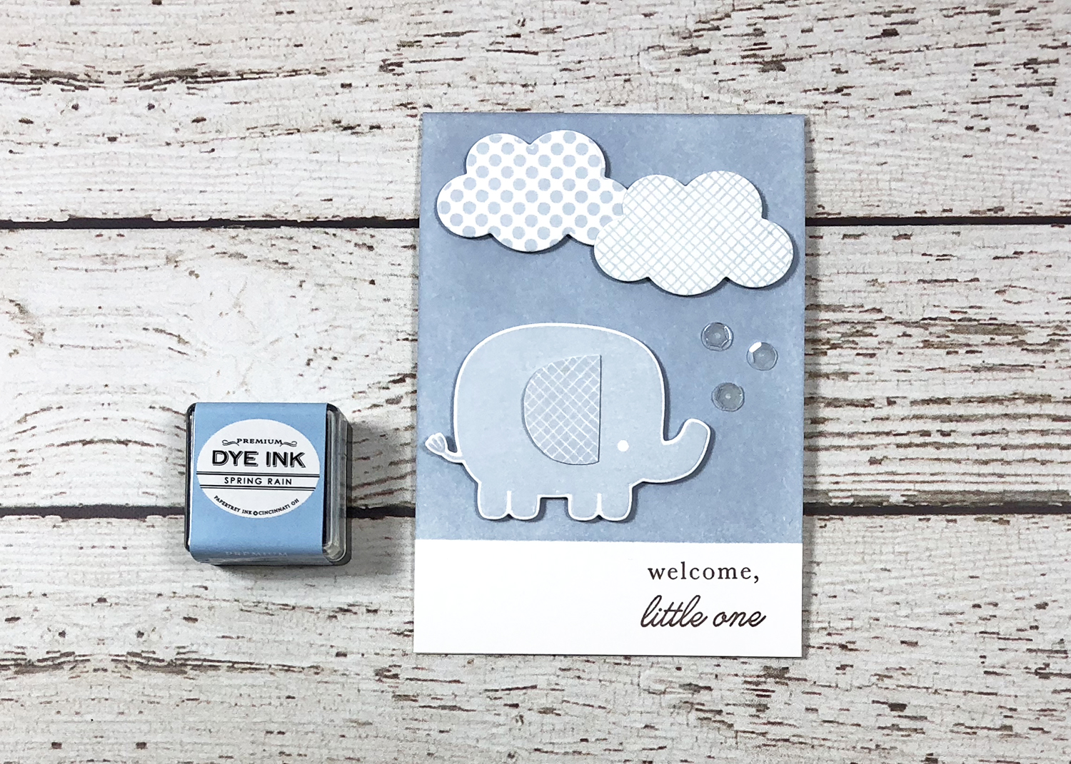
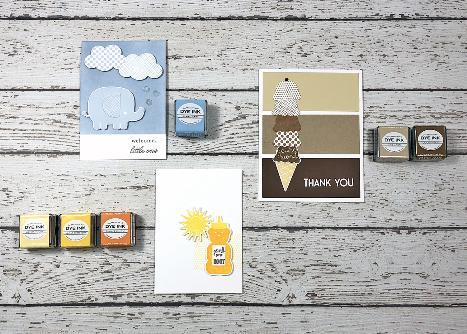
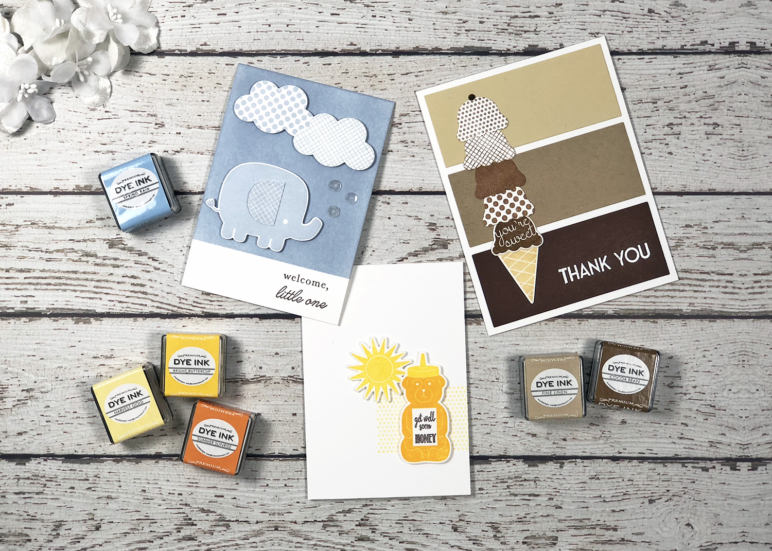
First up, I decided to make a new baby boy card. I used a single ink color plus white and Smokey Shadow as my neutrals. From a masked and blended background to stamped images, the spotlight is on Spring Rain. I followed one of my favorite monochromatic layout styles – remember my Pantone-inspired Make It Monday?
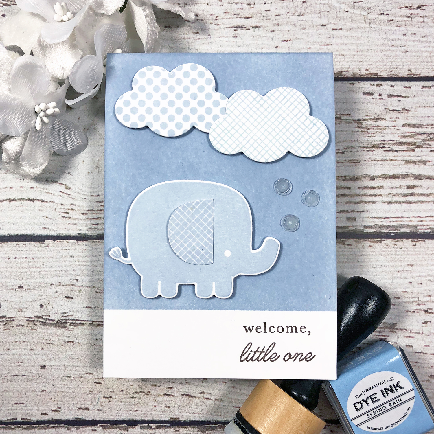
The simplicity of the Pantone card design sets the stage for focusing on a single color, while patterns like those in the clouds and on the elephant’s ear are key to keeping the end result interesting. I made a slight layout variation with my sentiment placement, which was better balanced on the right than on the left as on the original inspiration. A few clear sequins are the perfect finishing touch, adding a bit of bling and texture.
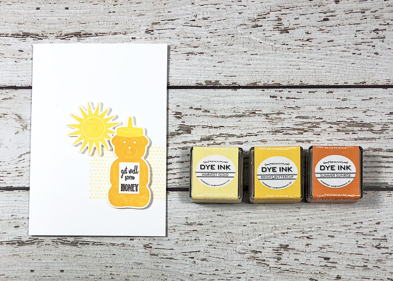
Next, I wanted to use more than one shade of a color. There are several good combos in the Papertrey ink collection, some of which I will highlight below. For this card, I decided on three different shades of yellow (surprise!), and a clean and graphic layout (surprise again!)…
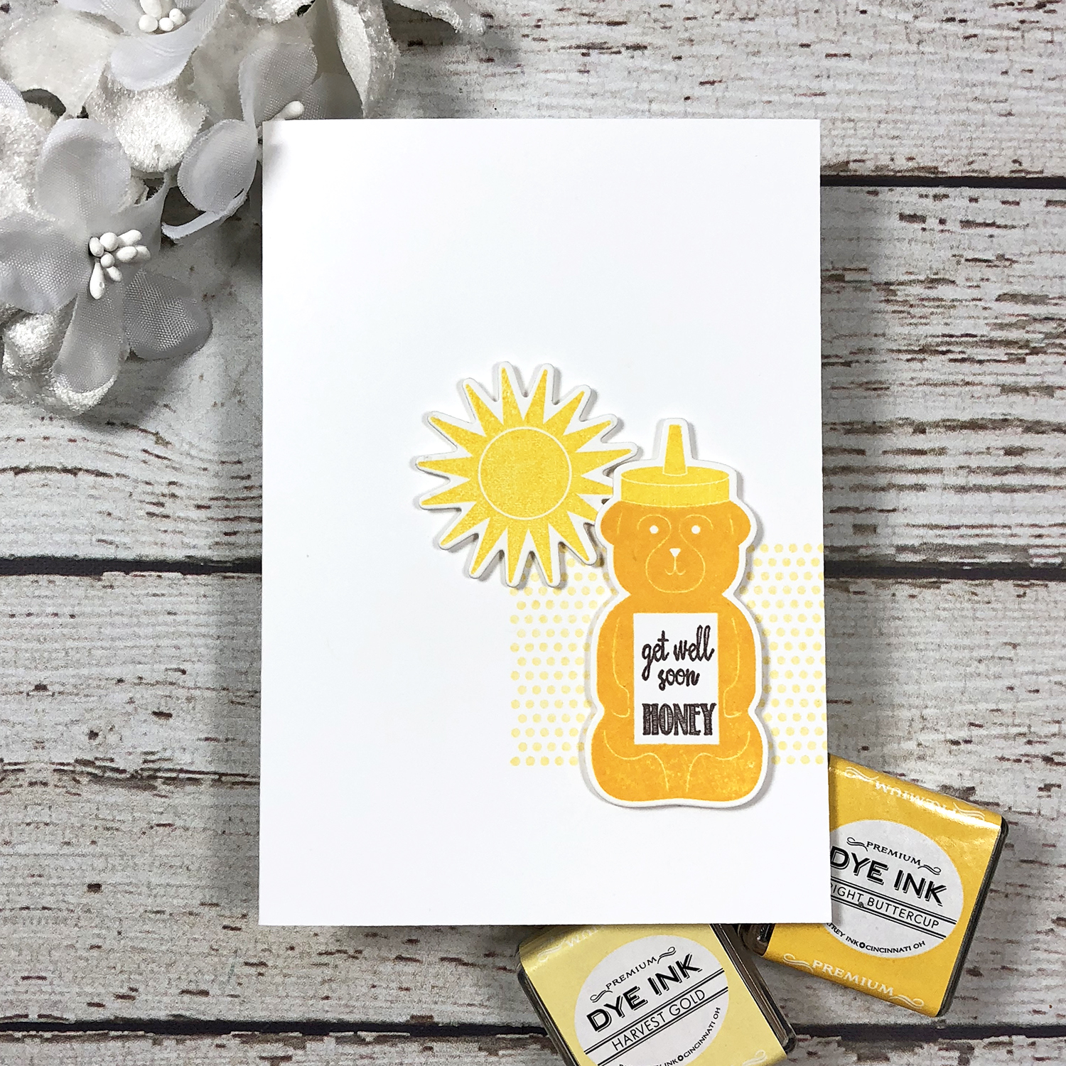
Building forward with the lightest shade, I used Harvest Gold for a grounding element behind my stamped die cuts, Bright Buttercup for the sun as well as on the honey bottle, and Summer Sunrise for the honey portion of the bottle after stamping it in Bright Buttercup, selectively inking all but the cap. Although the dot pattern is nice here, it’s less important since I’ve combined different shades of the color. Again, my neutral ink of choice for the sentiment was Smokey Shadow. It’s great for sentiments when lighter colors are used.
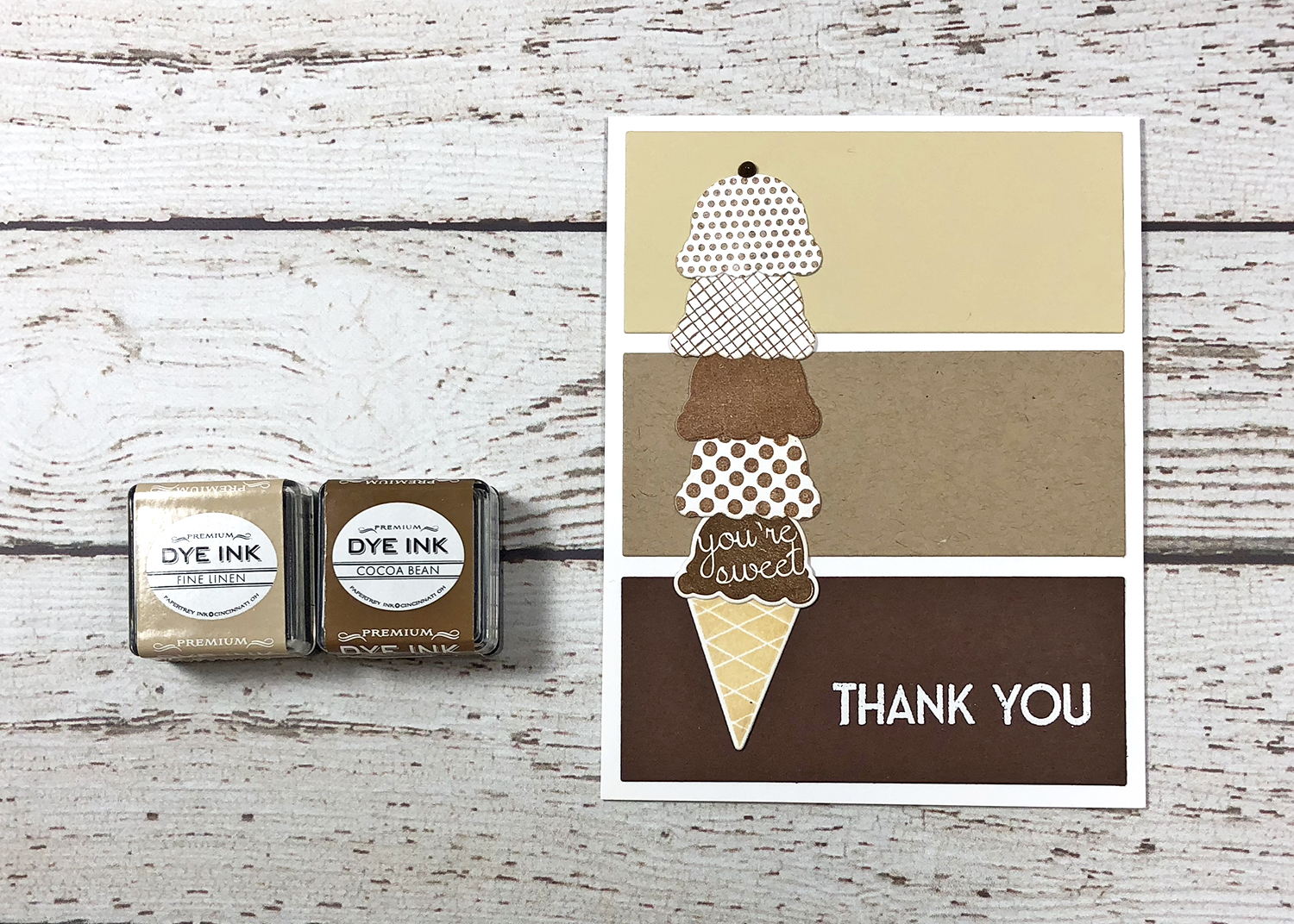
And finally, a two-ink, three-paper grouping. Paper is another way to add to your monochromatic color scheme. Similar to the Pantone chips above, I was inspired by paint chips for this one. Many paint sample cards represent a family of shades and tints for a specific hue – the perfect inspiration for a monochromatic card! I used three papers to mimic such a paint chip for my background (Cocoa Bean, Classic Kraft, and Fine Linen), all cut from Cover Plate: Comic Book. Then I focused on two inks for the ice cream cone – Fine Linen for the cone specifically and Cocoa Bean for the ice cream scoops.
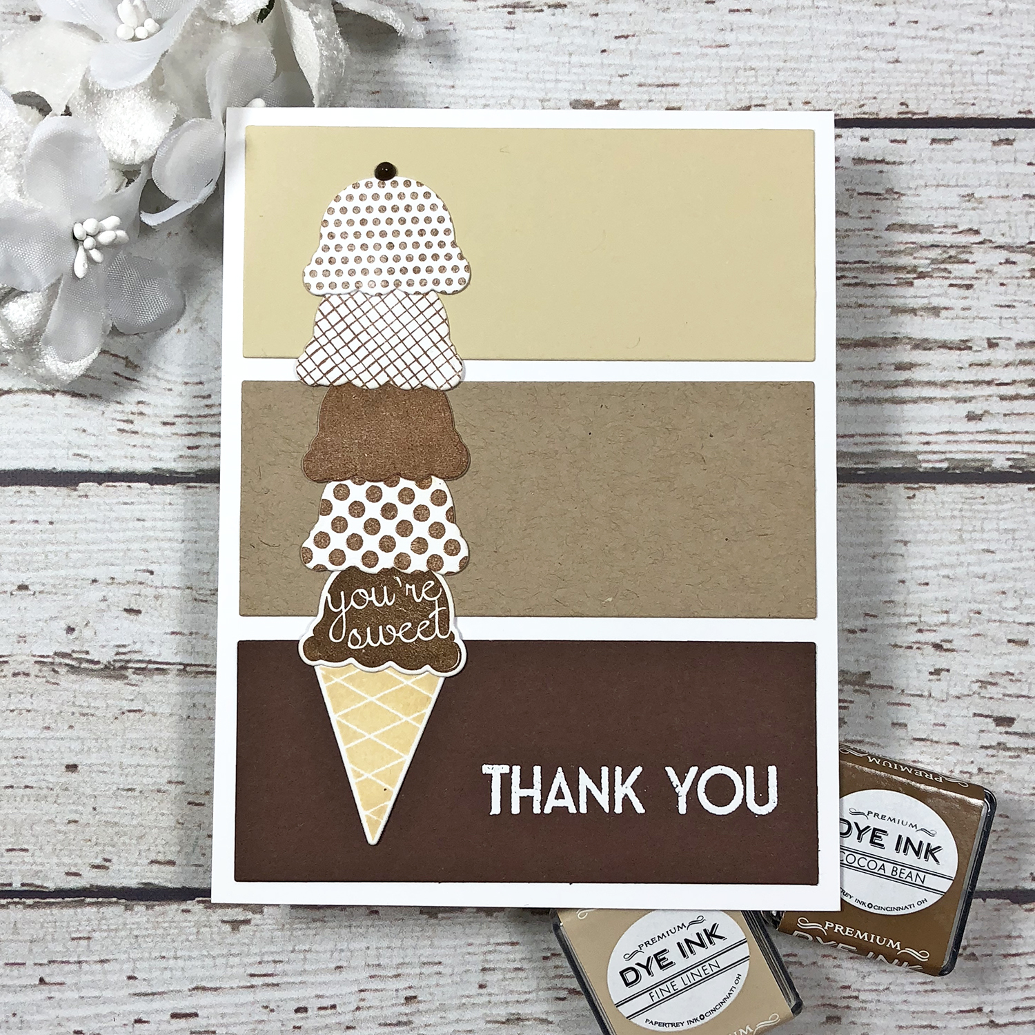
Again, pattern plays a huge part on this card since I went with one ink color for all of the ice cream scoops – patterns that I got from different stamp sets! I stamped the cute clouds still sitting on my desk from the first card and the dots from the second, all of which I used to die cut cool ice cream scoops. Pun intended – and I love it when I can come up with an idea that stretches my stamps! I finished off my ice cream cone with a Nuvo Dot chocolate chip right on top. The white embossed Thank You not only completes the sentiment perfectly but also really pops on the Cocoa Bean panel. Who wouldn’t love a chocolate thank you?!
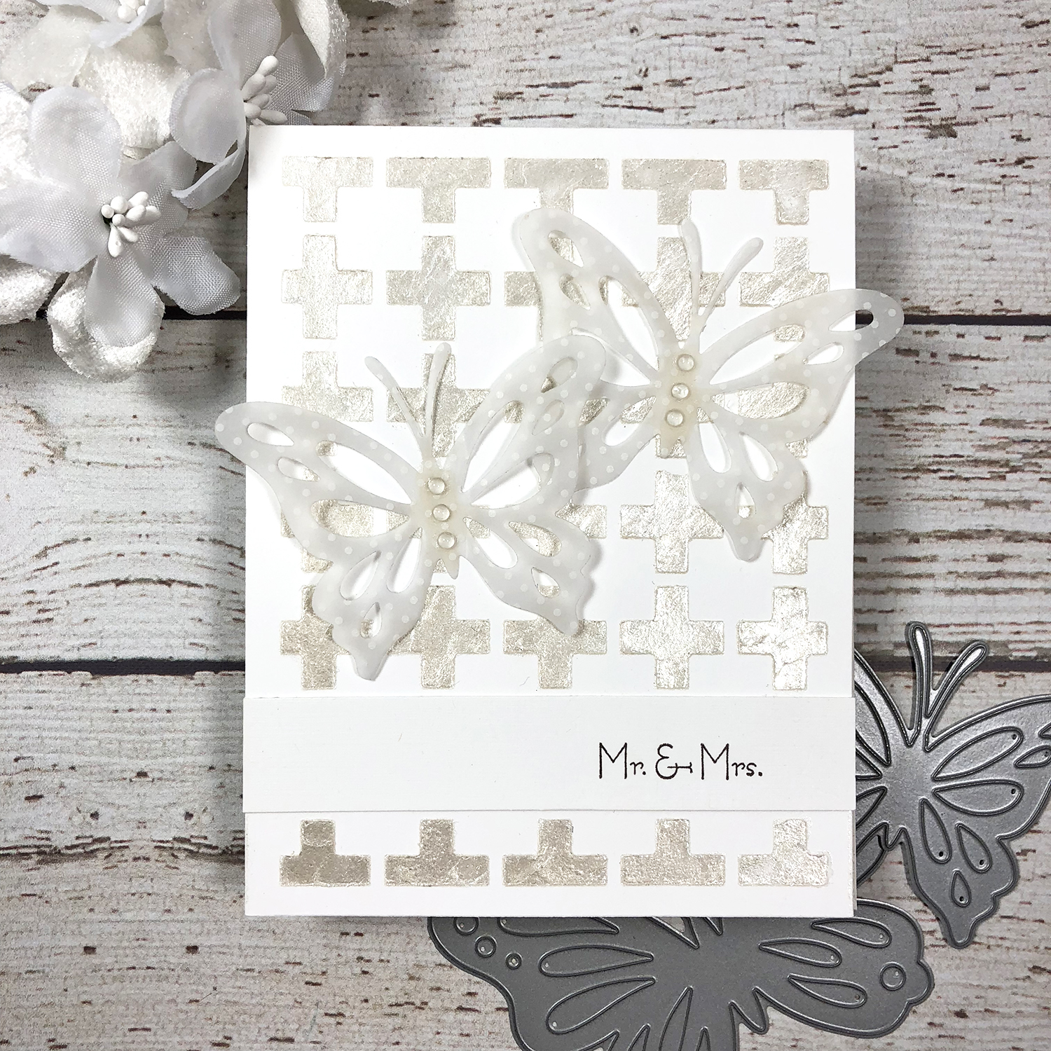
Last, but not least, I also wanted to share an oldie but goodie, with a focus on texture. Adding texture is another great way to add interest to a monochromatic card – particularly an all white one. Pearlescent embossing paste (by Dreamweaver) and vellum add so much to the smooth white cardstock and really bring this all white card to the next level. (Click here for the original post.)
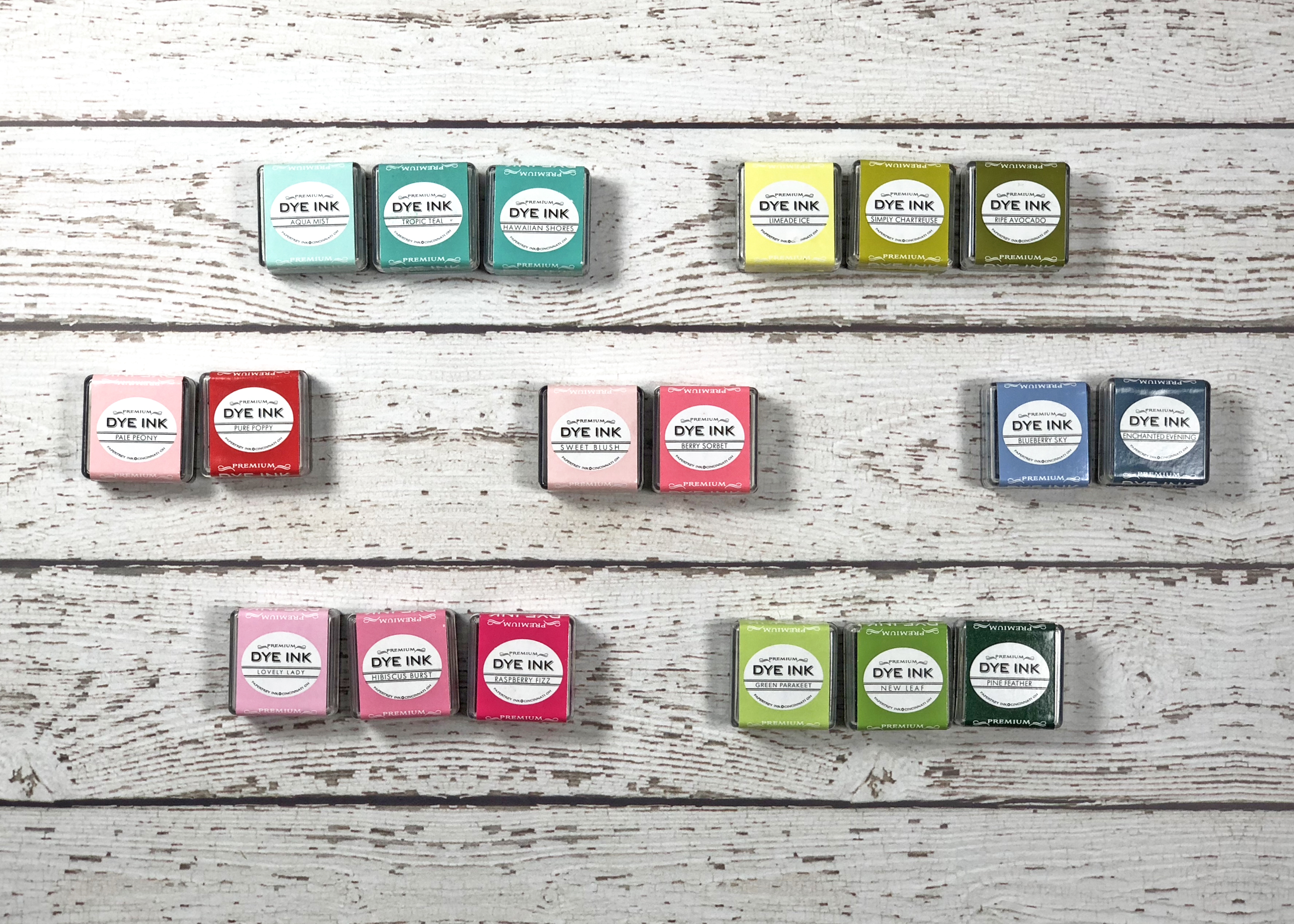
So, here are a few of my favorite monochromatic color schemes. These are by no means all of the options within the Papertrey collection – just a few of my tried an true. You can do a lot with just one color, but these groupings, whether you use all three or only two, will layer, blend, or work side by side beautifully for interesting one-color focused cards.
And there you have it! I hope you enjoyed this look at monochromatic color schemes and tips for creating with them. Do you have a different monochromatic grouping of Papertrey inks that you love? Do you have a favorite color you like to focus on? Please share in the comments!
Have a colorful day!
🙂 lexi
Supplies:
Welcome, Little One card
STAMPS: Baby Mine
INK: Spring Rain, Smokey Shadow
PAPER: Stamper’s Select White
DIES: Baby Mine
OTHER: post-it tape (masking), blending tool, MISTI, foam tape, clear sequins
Get Well Soon Honey card
STAMPS: Sunshine & Honey, Superhero
INK: Harvest Gold, Bright Buttercup, Summer Sunrise, Smokey Shadow
PAPER: Stamper’s Select White
DIES: Sunshine & Honey
OTHER: post-it tape (selective inking), MISTI, foam tape
You’re Sweet, Thank You card
STAMPS: Fun Lovin’, Baby Mine, Superhero, Sentiment Staples: Thank You
INK: Fine Linen, Cocoa Bean, Versamark
PAPER: Stamper’s Select White, Fine Linen, Classic Kraft, Cocoa Bean
DIES: Fun Lovin’, Cover Plate: Comic Strip
OTHER: MISTI, white embossing powder, Nuvo Drops in dark walnut
Leave a Reply