
Good morning! Welcome to this month’s color installment! Today I thought we’d take a look at triadic color schemes. By definition triadic color schemes are a combination of three colors with equal space between them on the color wheel. Because the colors are in high contrast to each other, these color schemes can be quite bold. To help visualize the triads or triangles of color, I decided to put together a more complete color wheel than I have for previous posts.

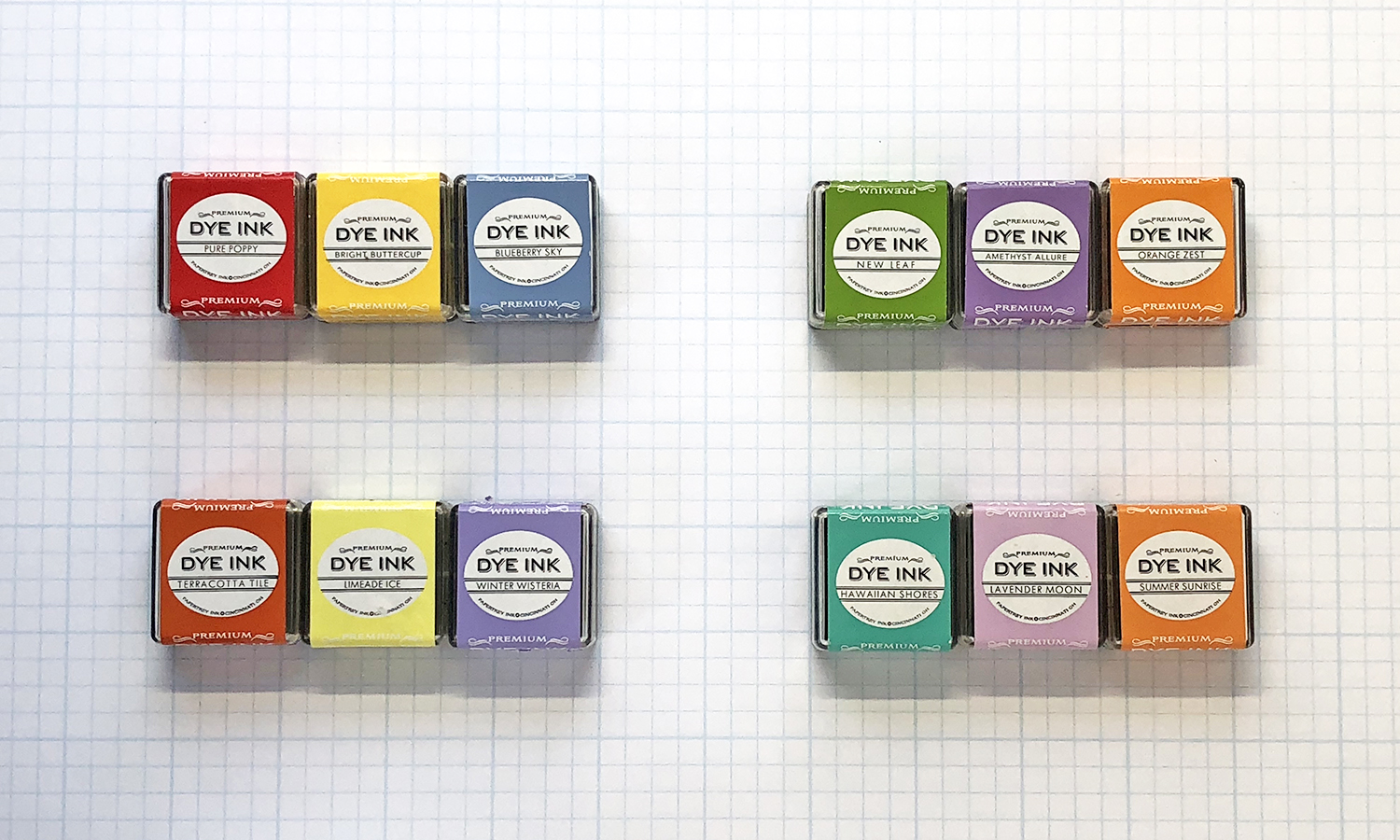
So far, I’ve focused on the primary and secondary colors of the color wheel, but most color wheels include tertiary colors as well – six additional colors created by mixing primary and secondary colors, and thus falling in between the two colors on the wheel that were used to mix them. Obviously, I didn’t mix the colors above, so it’s really just a simple interpretation based on the colors we have available. But I wanted to expand the wheel as best as I could to better illustrate the possibilities. With a twelve-color wheel, you end up with four triangles. The primary and secondary triads plus two tertiary triads. I use the first two often and associate each with specific occasions or topic as you will see next with a couple of examples from the archives. But I rarely use the tertiary triads, so I wanted to give more attention to those and create something new with them in order to play outside of my typical box – or triangle as the case may be! First up, the basics.

The most well known triadic color scheme is the primary color triad of red, blue, and yellow. Or for us, Pure Poppy, Blueberry Sky, and Bright Buttercup. Many of us probably use this trio a lot. For me, it’s an ideal color scheme for kids’ cards. I love a bundle of primary colored balloons or even simple design elements for a pop of color! It’s a perfect gender-neutral color scheme or with a swap of pink in place of red, it can be a little more purposefully girly.
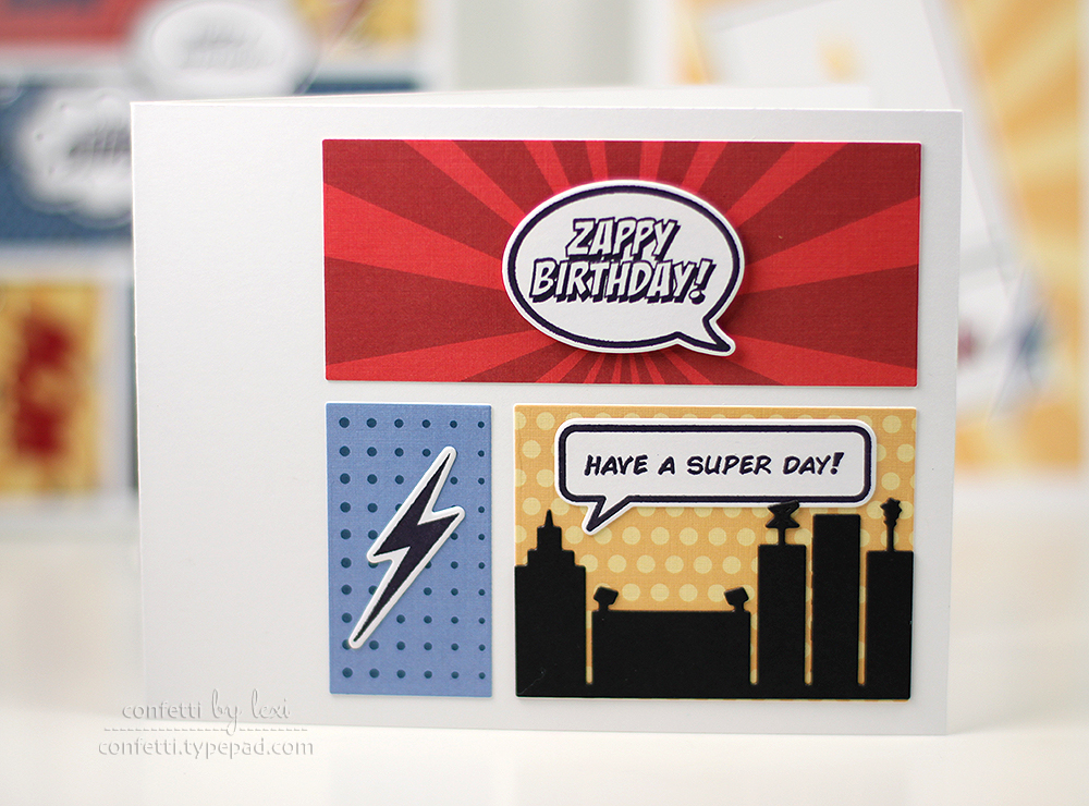
I also think of primary colors when it comes to superheroes too. I even created my whole Zappy Birthday and Superhero collections with these colors in mind. This card from the original release of Zappy Birthday is the perfect example. The high contrast is very upbeat and fun and really pops.
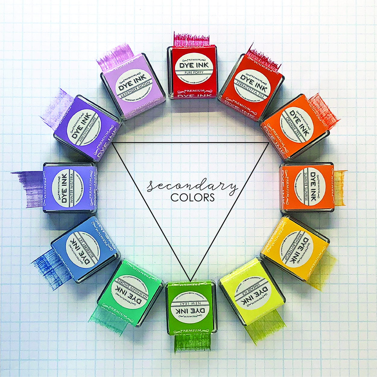
The secondary color triad of orange, green, and purple is also probably well-known, although perhaps not used as often as the primary triad. From our wheel, we have Orange Zest, New Leaf, and Amethyst Allure. I do use this color scheme often, but usually for one specific holiday… Halloween!
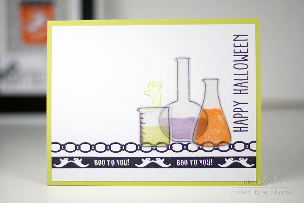
I get tired of simple orange and black, preferring a more colorful Halloween look. Since purple and green are typically used for witches and ghosts, this triad and minor variations of it are very Halloween to me. The card above, from a long-ago release of the now retired Haunted Borders, is a great example. Spooky potions, right?! And because I think of ghosts in a lighter green, I swapped Limeade Ice in for New Leaf, but on a pumpkin or witch card, a darker green would be perfect.
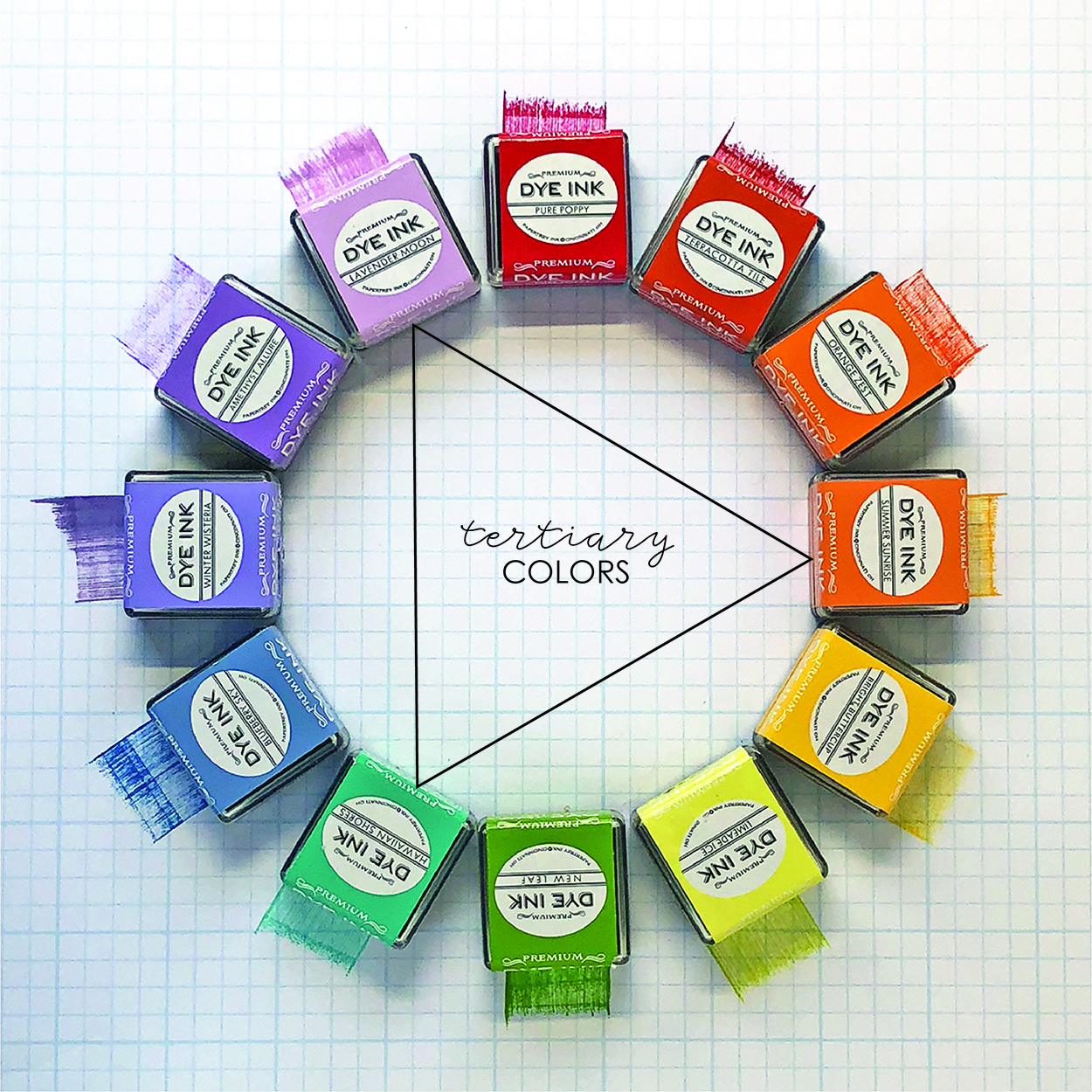
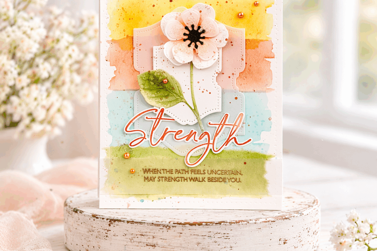
So now, let’s take a look at the two tertiary triads. In basic color terms, this one consists of yellow-orange, blue-green, and red-violet. Or as I’ve gathered, Summer Sunrise, Hawaiian Shores, and Lavender Moon. Once you get into the third level of color mixing, the colors are a little less sharp. They still have more contrast than analogous colors, for example, but they’re a little more subdued than the first two triads.

I immediately thought this color trio would create a nice flower. I also thought it had a bit of a vintage feel, so I reached for Vintage Linens and I love the results. I would never have pulled these colors specifically if not for the color wheel! For a card with a little more pop, you could swap in a stronger hue of red-violet.
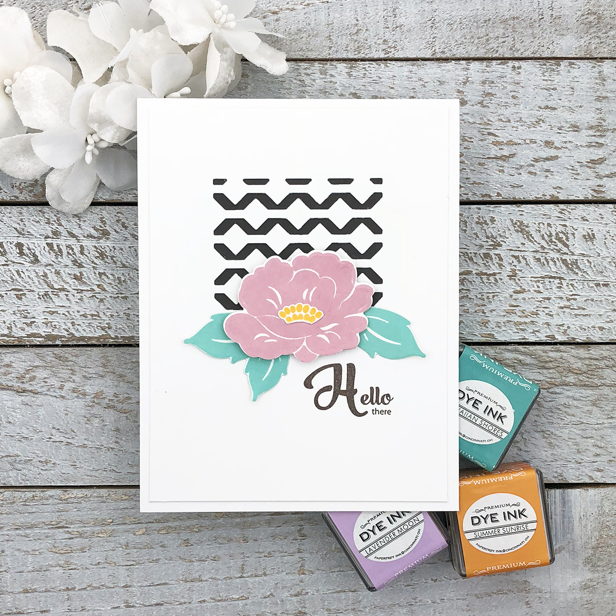
Luckily, the flower pieces helped me portion out the colors, kind of naturally following the 60-30-10 percent rule of thumb for three colors on its own. Sometimes I like an equal balance of color – it depends on the design for me – but this little rule is perfect for colors that might compete with each other too much. The resulting flower looks really crisp on the white, while the smokey shadow behind the die cut pattern grounds it nicely and adds interest.
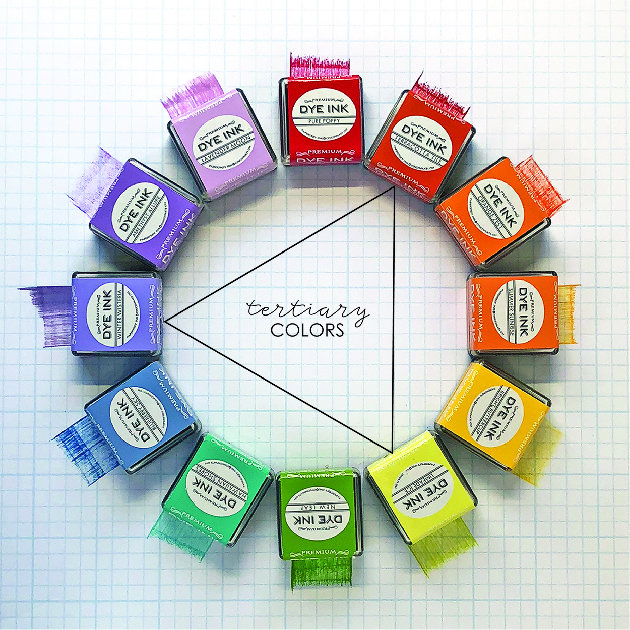
The second tertiary triad includes red-orange, yellow-green, and blue-violet. Or from our wheel, Terracotta Tile, Limeade Ice, and Winter Wisteria. At first, I thought these colors were speaking Halloween to me like the secondary colors automatically do. But once I got into them and saw more red than orange in the Terracotta Tile, I thought they would make a pretty butterfly.
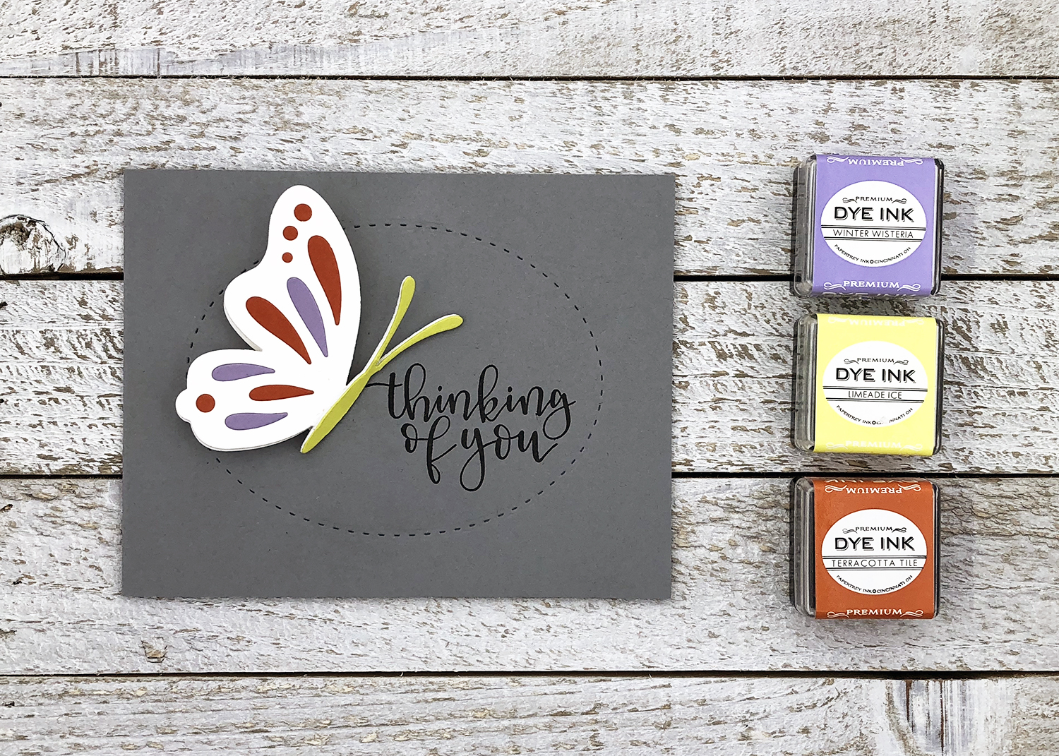
So out came my favorite Life is Beautiful butterfly die. I decided to use paper rather than ink on this card, die cutting open butterflies in each color plus one in white, along with a solid butterfly, also in white. I pieced the colors into the white butterfly adhered to the solid one, again somewhat following the 60-30-10 percent rule. I tend to use it more as a guideline of more, less, and a little than actual measurements.
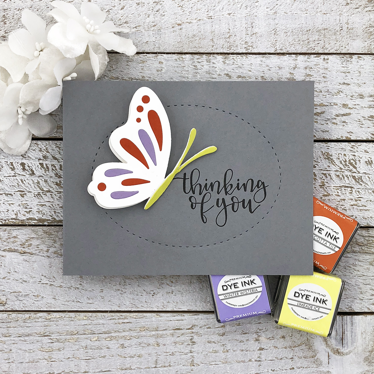
I decided to showcase half the butterfly with a larger sentiment inside of the stitched oval detail, kind of like it’s landing on the sentiment. Weathervane is the perfect neutral base color, allowing the color trio to really shine on the white butterfly. Again, we have three colors that I never would’ve put together on my own and I love the result!
So there you have it! Just like every other concept, I encourage you to use these color combos as kind of a jump start. You can try one of the basic triangles or make trades that represent the same colors for a similar effect. While I don’t think the tertiary triads will end up on my go-to list, it really was fun working with colors I normally wouldn’t choose and I do like the results. So who knows? Maybe they’d be good for when I find myself in a rut! What do you think? Do you like the contrast? Have you used these colors together before? Often? Will you try them out now? Please share in the comments!
Have a colorful day!
🙂 lexi
Supplies:
Hello There card
STAMPS: Vintage Linens
INK: Hawaiian Shores, Lavender Moon, Summer Sunrise, Smokey Shadow
PAPER: Stamper’s Select White, Smokey Shadow
DIES: Vintage Linens, Shape Shifters: Square 1
OTHER: MISTI, foam tape
Thinking of You card
STAMPS: Penned Elegance
INK: True Black
PAPER: Stamper’s Select White, Terracotta Tile, Limeaide Ice, Winter Wisteria, Weathervane
DIES: Life is Beautiful, Shape Shifters: Oval 1
OTHER: Quickstik Craft Tool, Zig 2-Way Glue Pen, foam tape
Zappy Birthday card
CLICK HERE for the original post
Happy Halloween card
CLICK HERE for the original post
Leave a Reply